Thinking about adaptive menus for tracking
Posted: - Modified: | design, development, geek, quantified, researchI’ve been thinking about building more tools for myself. Some of the ideas I’ve been playing around with are around simplifying activity tracking further, possibly getting it to the point where it suggests things for me to do when my brain is fuzzy.
My current tracking system has two tiers. For my most-common activities, I use a custom menu that I can open from my phone’s home screen. I created the menu using Tasker. It’s easy to configure menu items to update my Quantified Awesome activity records as well as run other logic on my phone. For example:
- “Eat dinner” creates an activity record for “Dinner”, then starts MyFitnessPal so that I can log the meal
- “Walk home” creates an activity record for “Walk – Other”, then starts step-by-step navigation of the walk back to my house
- “Sleep” creates an activity record, then launches Sleep as Android
- “Ni No Kuni” creates an activity record, prompts me for what I want to do after an hour of playing, opens a page with tips for the game, and then reminds me of my plans after that hour passes
One advantage of using something on my phone is that I don’t have to wait for the initial web page from Quantified Awesome to load. My keyboard occasionally takes a while to come up, too, so the menu-based interface gets around that as well. Also, as I get the hang of using Tasker, I can set up more intelligent processes. The menu has a link to open the web version, so if I want to track something less frequent, I can always use the web interface.
In the web interface, I usually type a substring to identify the category I want to track. For example, “kitch” results in an activity record for “Clean the kitchen”. I use this interface if I need to backdate entries (ex: -5m), too.
In addition to the two interfaces above, I’ve been thinking about taking advantage of the predictability of my schedule.
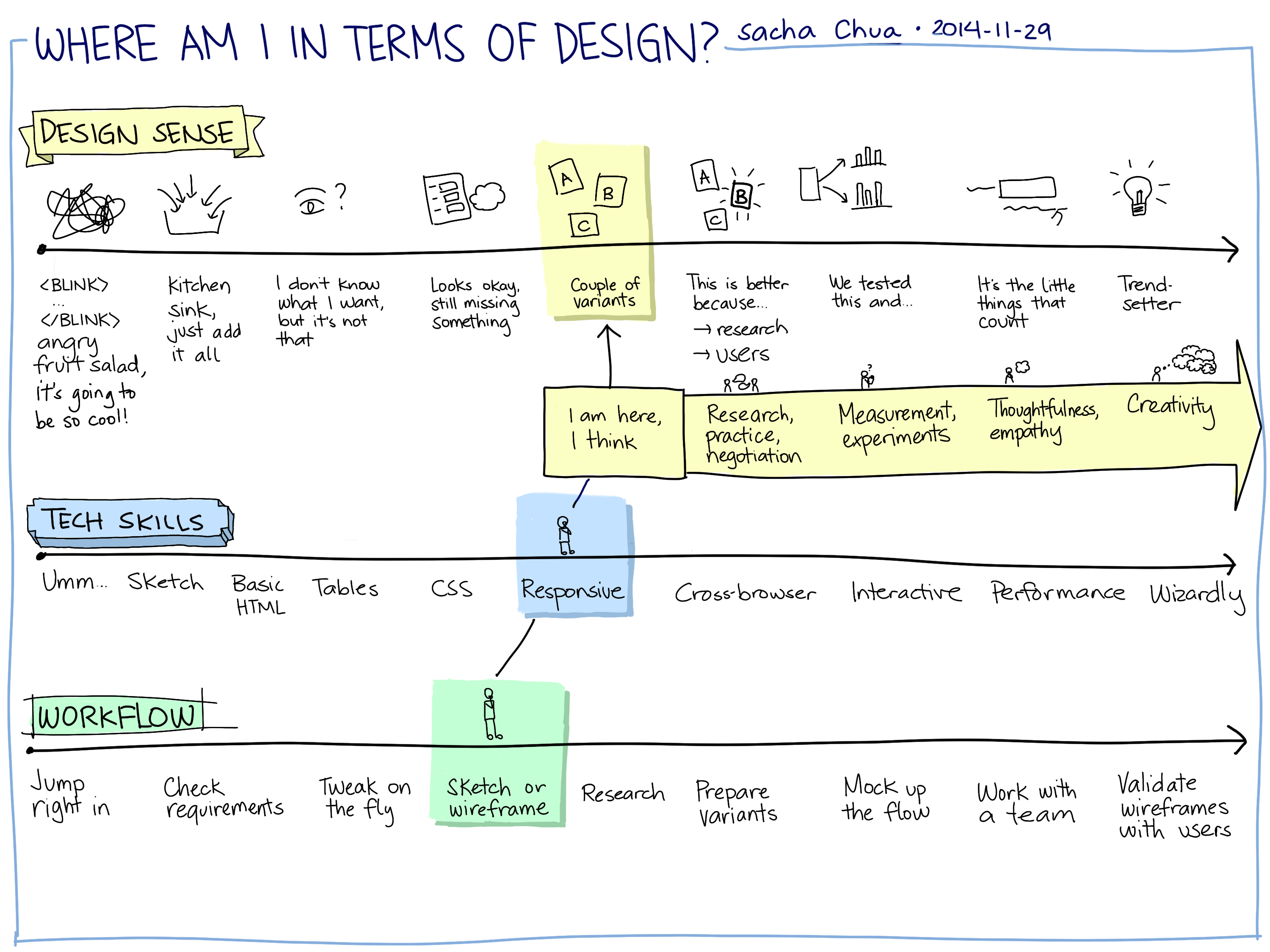
Research into adaptive menus turns up quite a few design ideas and considerations. Since I’m building this for myself, I can get around many of the challenges of adaptive interfaces, such as privacy and predictability. I’m curious about the following options:
- Text-based input with minimal cues, as part of a more powerful command line
- Context-sensitive menu with a handful of items (3-4, with a link to more): I can probably suggest candidate activities based on the past two activity records. That might mean a little bit of latency as I check, though. It also means that the menu will keep shifting, so I’ll need to read it and find the item I want to click on.
- For everyday use?
- For really fuzzy moments?
- Static menu of frequent items, but adaptive highlighting (ex: green or bold, or fading out other things slightly)
- Abrupt onset, others fading in over 500ms
- Colour?
- Weight?
- Split menu: frequent items on top, everything else below
- Static
- Adaptive
- Hierarchy of menus: speedy, but lots of tapping
- Cut off menu: show only the activities that come after the one I’ve just tracked
Hmm… It might be interesting to play around with different menu options. It would be good to experiment with NFC as well, especially early in the morning. =)
Related:
- “Dynamic versus static menus: an exploratory comparison (Mitchell, Schneiderman 1989): people preferred static menus
- “Comparing static, adaptable, and adaptive menus” (Findlater, 2001): people liked split adaptable menus
- “Exploring the design space for adaptive graphical user interfaces (Gajos, Czerwinski, Tan, Weld, 2006): spatial stability – copy instead of move, adapt slowly
- “Ephemeral adaptation: the use of gradual onset to improve menu selection performance” (Findlater, Moffatt, McGrenere, Dawson, 2009): abrupt onset + fading in other items
- “Predictive menu selection on a mobile phone” (Bridle and McCreath, 2005): Mobile considerations