Tags: support

RSS - Atom - Subscribe via email

Designing Help and Support: Skype

Posted: - Modified: | design

I've looked at Adobe and Apple, both of whom run their support communities on Jive. Here's a look at Skype.

2014-07-02 14_35_54-English - Skype Community

Skype uses a typical forum layout (categories, forums, # of topics, # of replies, latest post) with extra widgets to highlight announcements, contributors, solutions, and blog posts.

2014-07-02 14_39_50-Windows (desktop client) - Skype Community

Forum pages list threads, number of views,  replies, and kudos. Sticky threads are labeled as “floated”. As with Apple, I'd probably link to relevant knowledgebase categories from here, to save people the navigation and to encourage them to explore.

2014-07-02 14_40_58-Welcome to the Skype Community - Skype Community


The forums include a link to this welcome post. It includes brief instructions and quick links.

2014-07-02 14_42_55-News and Announcements - Skype Community

The News and Announcements section is a list of blog posts with excerpts. The light blue line that separates each post practically disappears into the page background. I would probably make the author photos consistent-width, post titles more prominent (probably darker, larger, and flush left with the margin) so that they're easier to scan, include a slightly longer excerpt, and maybe make the kudos icon less prominent. The bright green makes the kudos icon the most salient thing on the page.

By golly, I'm actually starting to develop opinions! =)

Learning to design Help and Support communities: Apple deep dive

Posted: - Modified: | design

I'm looking at how people design help/Q&A communities to support a wide range of users. After looking at Adobe's examples, I'd like to focus on another company well-known for design savvy: Apple.

2014-07-02 14_10_47-Official Apple SupportApple uses a two-screen automatically advancing carousel on its front page. I find that curious because the carousel doesn't pause when you hover over it, although I guess that with only two slides, you can always wait until the icon you want slides back into place. If Apple did that in order to keep the Apple Support Communities and Contact Us links above the fold, I wonder why they didn't move those links up higher and then keep a static list of icons underneath it instead. Anyway…

2014-07-02 14_15_15-Welcome _ Apple Support Communities

The main overview page has a big, simple Ask a Question widget that dynamically searches as you type. Underneath it, there are icons to the featured communities.

2014-07-02 14_16_48-Welcome _ Apple Support Communities

Clicking on an icon shows icons for subcommunities.

2014-07-02 14_17_21-Community_ Using iPad _ Apple Support Communities

All the communities I've checked out seem to follow these lines. Big group icon, group title, ask a question box right underneath the group title. There's a manual slider with a custom category filter that loads the discussion list using AJAX, avoiding a page refresh.

2014-07-02 14_20_04-Community_ Boot Camp _ Apple Support Communities

Some of the communities have a Top Participants widget along the bottom.

The Apple communities focus exclusively on Q&A – they don't link to tutorials or other resources to help people get better at using things. IF you click on the Content link, you can find tips, but they're hidden and tend to fall off the recent content list. The Content link lists content for all the communities, not the particular community you're interested in – the Apple discussions theme doesn't include a link to the content for your particular community.

The discussion-focused approach is interesting, but probably a little too severe. Providing links to tutorials and frequently asked questions can help people who are getting started and don't know what they don't know. This information is available elsewhere (ex: http://www.apple.com/support/mac/), so that could explain why it's not duplicated in the support site. Anyway, Apple's support communities are clean and stripped down to the essentials.


Learning to design Help and Support communities: Adobe deep dive

| design

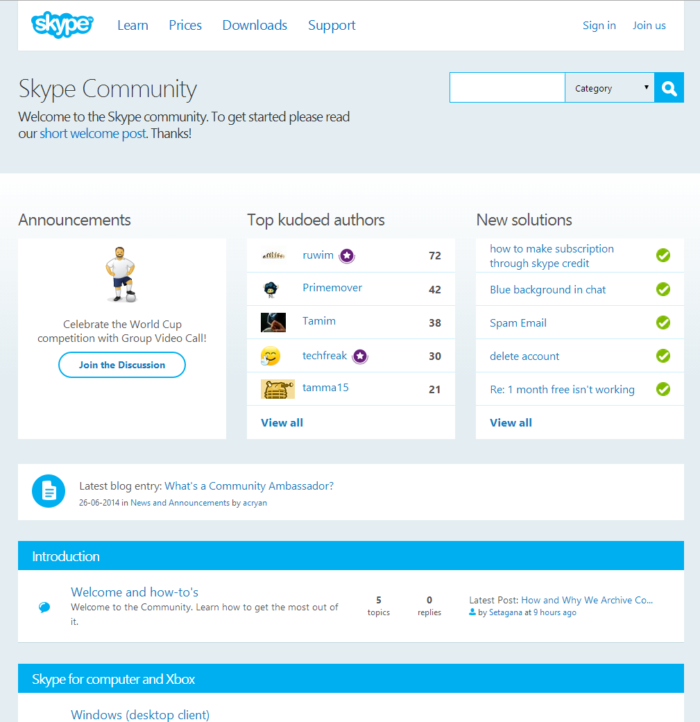
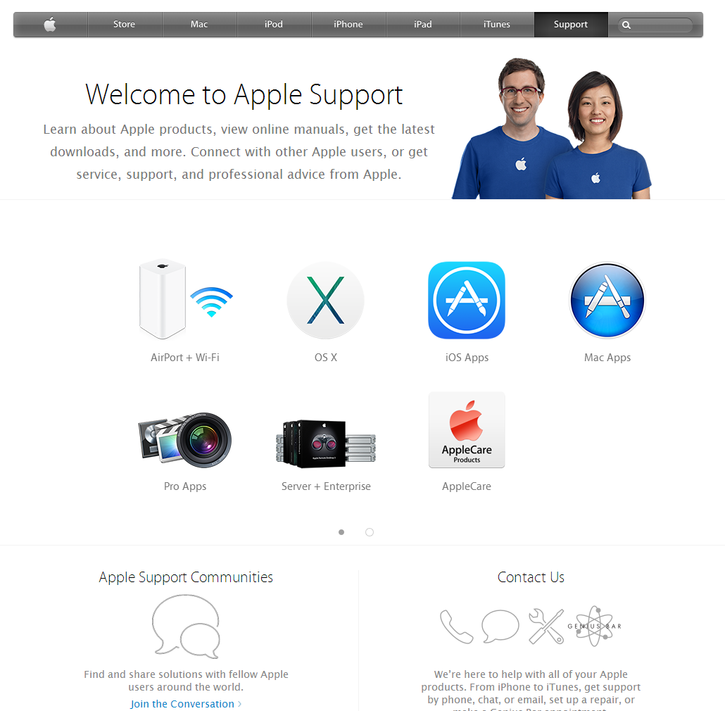
Design seems like magic, but it's probably a skill that I can develop. If I just focus on coding, the things I build can end up looking like an accumulation of little ideas designed by committee. If I learn more about design and develop my own opinions, I can make recommendations that simplify the experience and make it more coherent. For example, on one of my consulting engagements, I could probably take the initiative in redesigning the help and support community for a better user experience. I have to work with the technical limitations of the platform, but as a coder, I have a little more latitude than most people do. By looking at how other people have structured their support experiences, maybe I can pick up ideas that I can try.

It's interesting to see how much variety there is even within one company. Adobe uses the Jive platform for its support communities, and the different products have slightly different configurations. Here's the overall product page that leads to the community page:

Adobe

Adobe

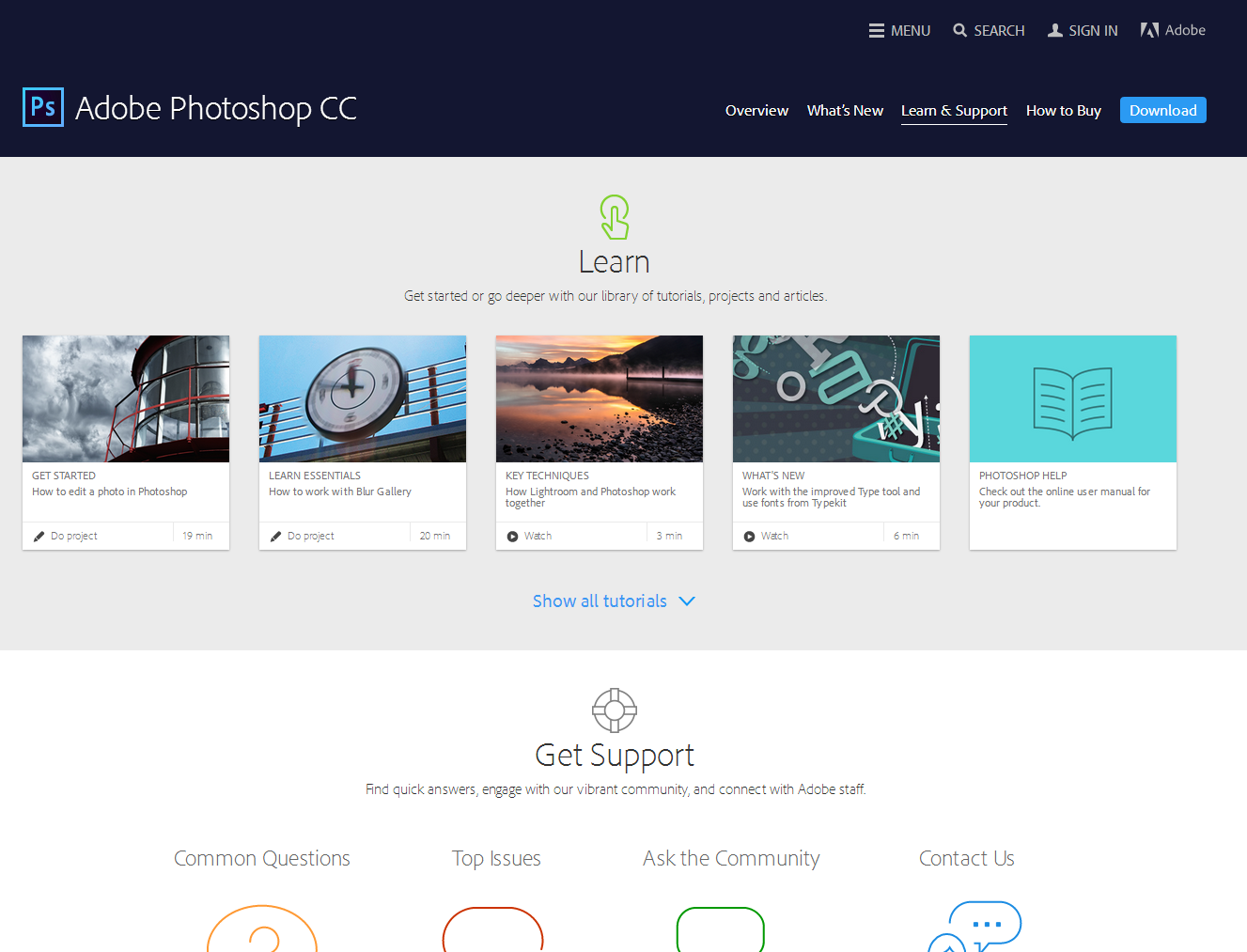
http://helpx.adobe.com/photoshop.html

Adobe starts with graphical icons for tutorials that have time estimates clearly indicated.

2014-07-02 13_37_08-Community_ Photoshop General Discussion _ Adobe Community

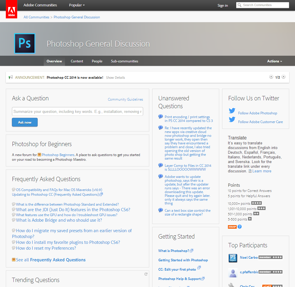
https://forums.adobe.com/community/photoshop

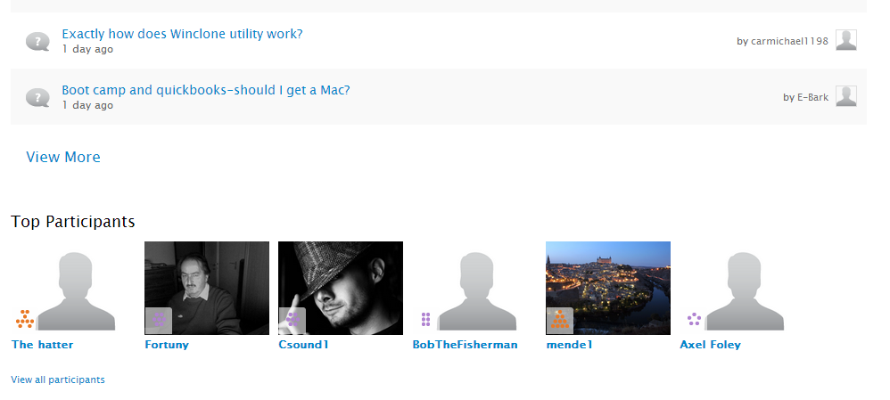
The “Ask the Community” page leads to a page with a lot of things going on, but there's an “Ask a Question” widget in the top left with a quick way for people to ask questions. With the emphasis on points and the leaderboard of top participants, it seems that this community focuses on user-to-user support. That's probably why the Unanswered Questions and Trending Questions widgets are so prominent. Still, the page feels a little cluttered to me. I'd probably prefer to set it up with fewer calls to action. Ask a Question would still be in the top left, but I would probably organize the resources by skill level. I like the way some of the frequently asked questions are highlighted, but they feel somewhat random and not well-formatted.

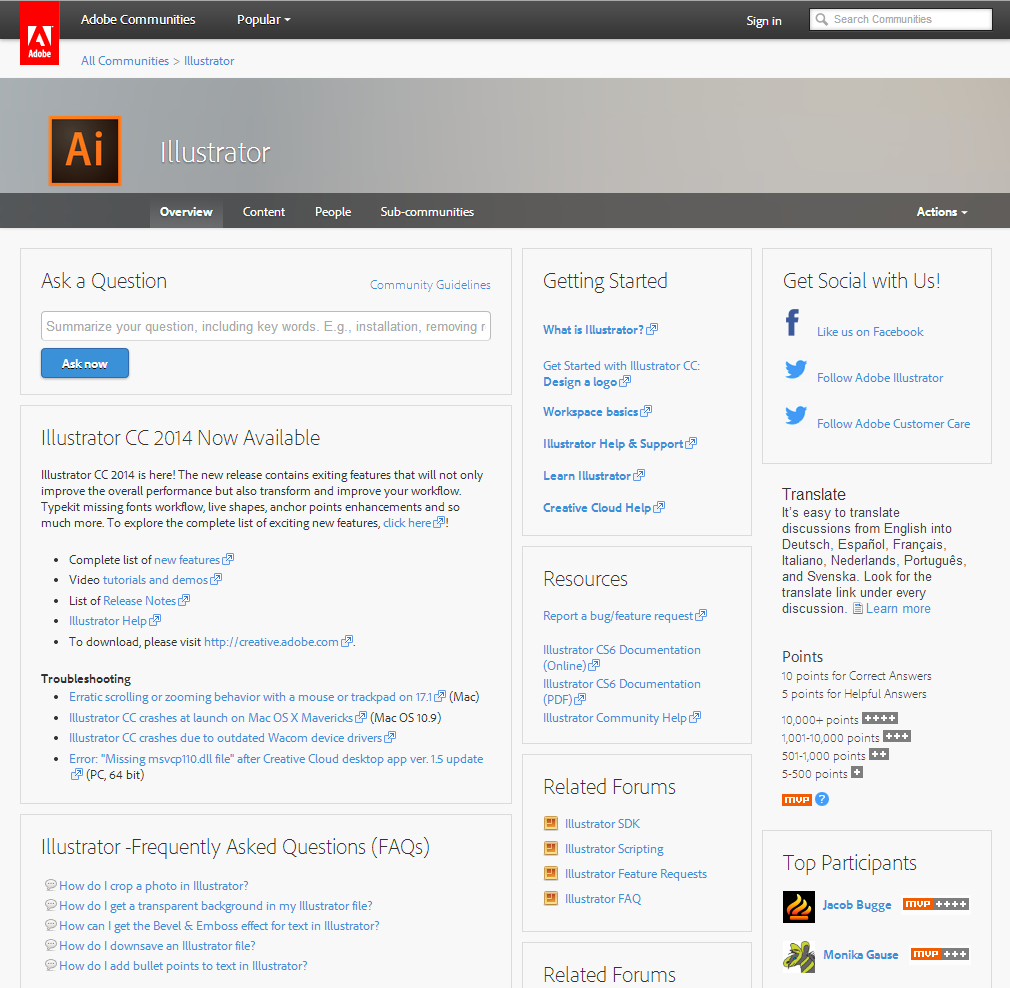
Different products have different community pages. The Illustrator one is slightly more neatly organized:

2014-07-02 13_43_51-Community_ Illustrator _ Adobe Community

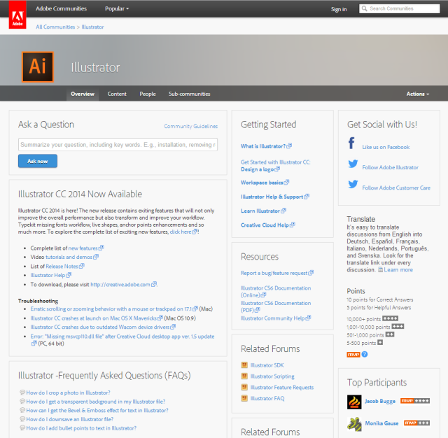
https://forums.adobe.com/community/illustrator

I like the announcement box for Illustrator CC 2014 and the Getting Started box in a prominent place. This page feels more oriented towards new users. It still has trending and unanswered questions, but they're below the fold.

2014-07-02 13_46_28-Community_ Premiere Pro _ Adobe Community

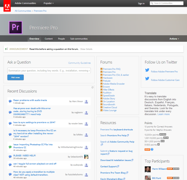
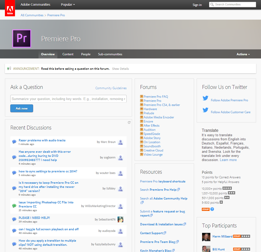
https://forums.adobe.com/community/premiere

The Premier Pro community focuses on sub-forums. Based on the forum activity, it looks like the Forums widget does a decent job of directing people to the appropriate place to ask, although the main community still gets many questions. This community is less newbie-focused (no tutorial link). The Recent Discussions widget seems to be a better choice than having both Unanswered Questions and Trending Questions, since the other widgets are visually similar and often have duplicate content.

2014-07-02 13_50_10-Community_ After Effects _ Adobe Community

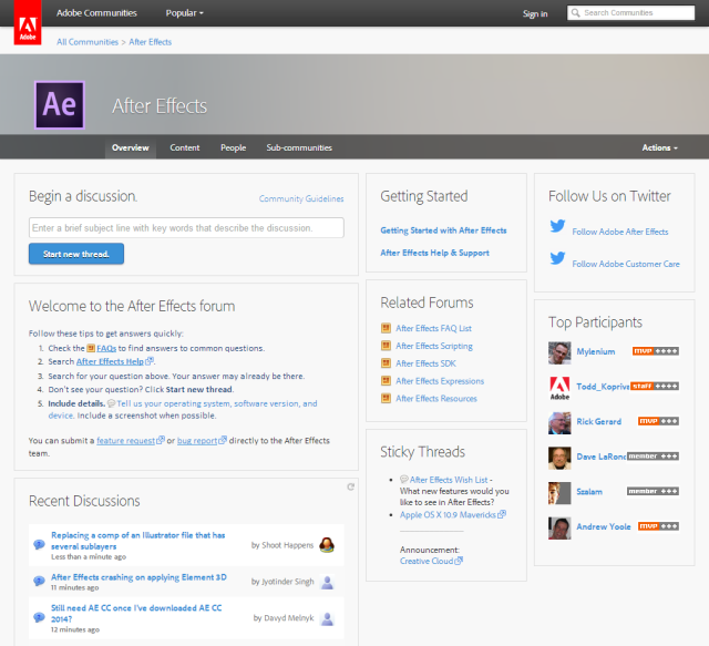
https://forums.adobe.com/community/aftereffects_general_discussion

The After Effects community has a welcome message and a Getting Started box, which I think are good ideas. They've decided to highlight some discussions as Sticky Threads, too. Unlike the other communities, this community doesn't include messages about translating pages or earning points. I wonder how de-emphasizing points affects user-to-user support…

2014-07-02 13_54_57-Community_ Lightroom for Beginners _ Adobe Community

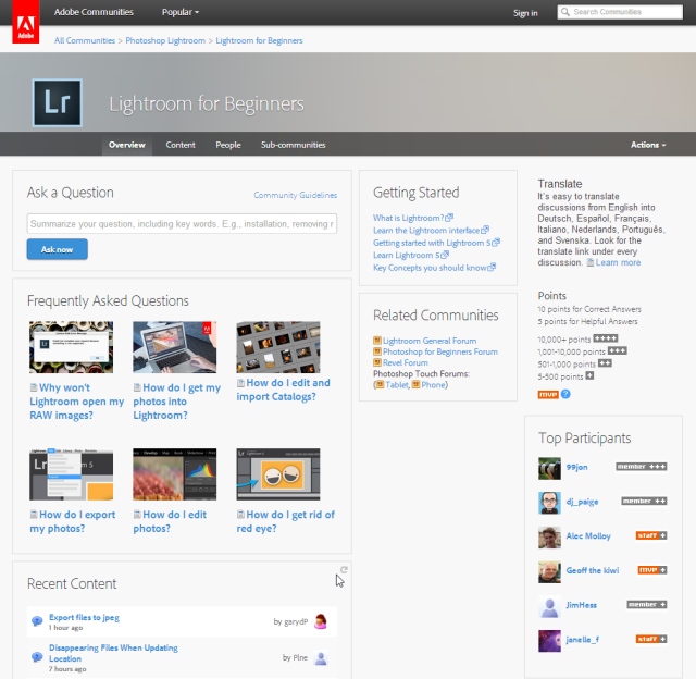
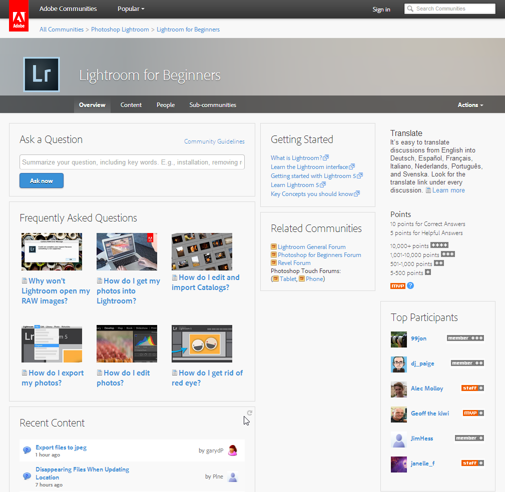
https://forums.adobe.com/community/lightroom/lightroom_for_beginners

The Lightroom for Beginners community uses graphics (that responsively resize, even!) to make frequently-asked questions more visually interesting.

2014-07-02 13_57_21-Community_ Acrobat _ Adobe Community

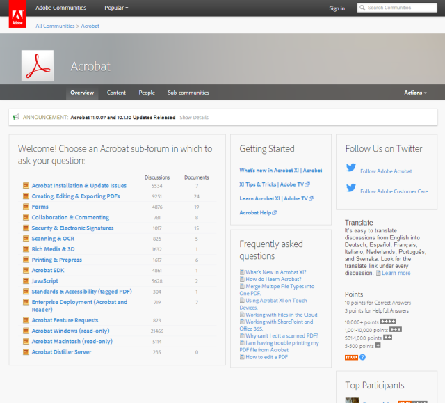
https://forums.adobe.com/community/acrobat

The Acrobat community directs people to the appropriate sub-forum.

2014-07-02 13_59_54-Welcome _ Adobe Community

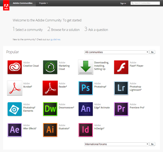
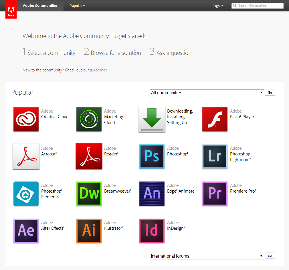
https://forums.adobe.com/welcome

The overall welcome page for the site is static and graphical.

I think the key points I'll pick up from Adobe's support communities are:

  • A Welcome box makes a support community less intimidating.
  • Although having separate widgets for unanswered questions or trending content makes it easier for community managers and volunteers to find questions to respond to, that can lead to visual clutter. Recent discussions or recent content will do the job well enough.
  • Consistent formatting helps resource lists look more professional. Some of the resource lists had different font sizes or bullet types within the same box.
  • Images go a long way towards making a site look more polished.

Know any well-designed community support sites that offer both tutorials and Q&A? I'd love to take a closer look at them! Up next: Probably Apple, who use Jive as well.