: stefanvdwalt suggested using hue-rotate in the filter, ooooh. I tweaked my CSS to do hue-rotate to get back to the original colours and boosted the brightness slightly so that the yellow feels more like a highlighter. I also changed my dark red colour to a medium-gray colour, which is more flexible for shading and for layout cues.
The Supernote A5X is an e-ink notebook that lets me draw in black, white, and two shades of gray. It has a drawing app that supports other shades of gray, but the main notebook app and the PDF annotation is limited to those two shades of gray.
I like to use a dotted grid in order to write in neat lines. I used to manually change this template to a white one before exporting. Then it occurred to me to make a coloured template:
.png)
Using colour lets me use a darker grid, which is more visible on the Supernote, while still letting that grid blend into the background if I export without processing. Screen mirroring shares the grayscale version, though.
I use my recoloring script to change #a6d2ff (light blue) to #ffffff (white).
Here's the SVG source in case you want to customize it. When I exported the PNG from Inkscape, I needed to make sure that antialiasing was turned off. This involved unchecking the "Hide export settings" checkbox in the Export dialog, then setting Antialias to 0. source
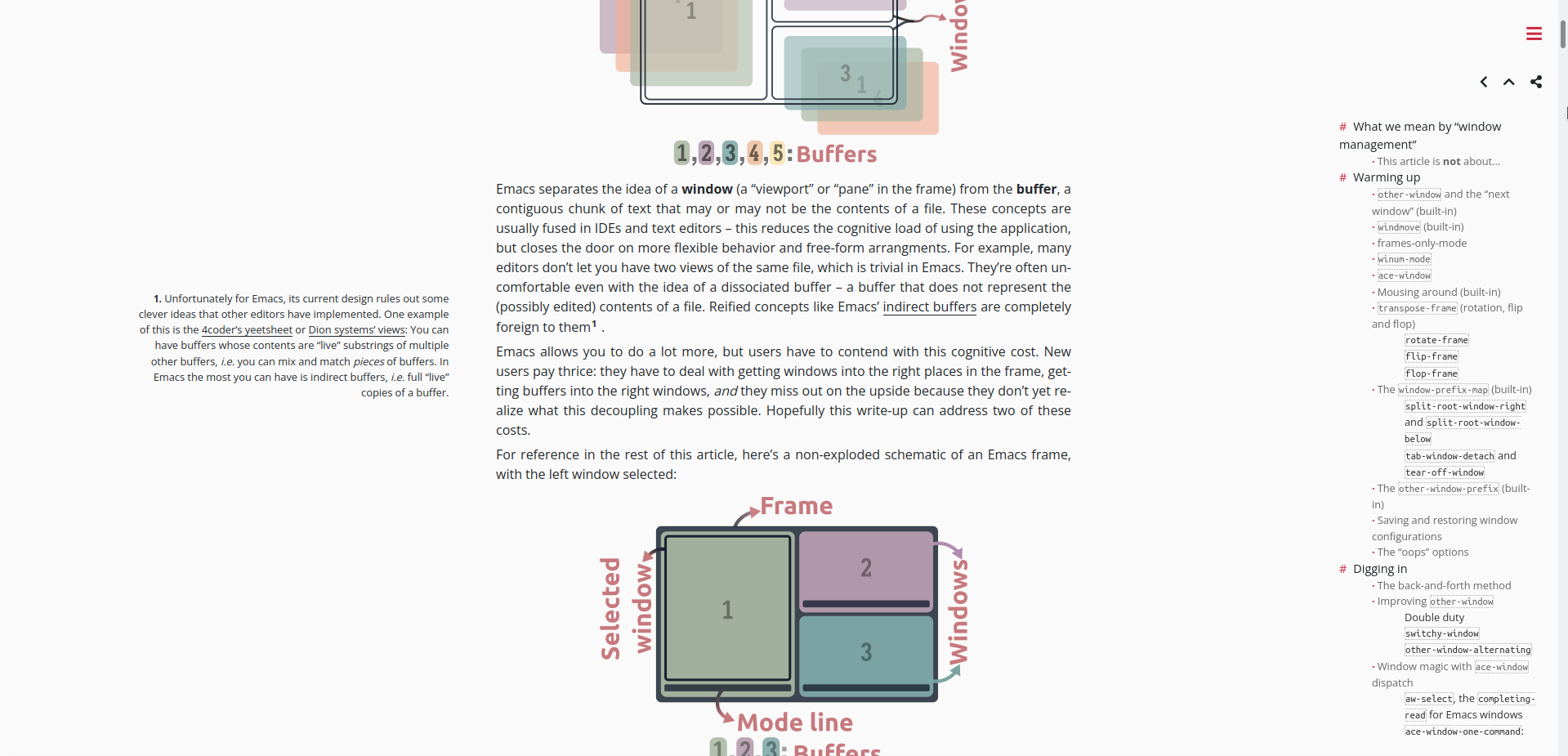
My current color scheme is
9d9d9d,c2c2c2,c9c9c9,f6f396,cacaca,f6f396,a6d2ff,ffffff',
which maps light gray to a highlighter sort of
yellow and dark gray to a light gray. I used to
map the dark gray to a dark red like the links on
my site, but light gray is more flexible for
shading and layout.
Anyway, here's an example of the export from my Supernote and the result after processing:
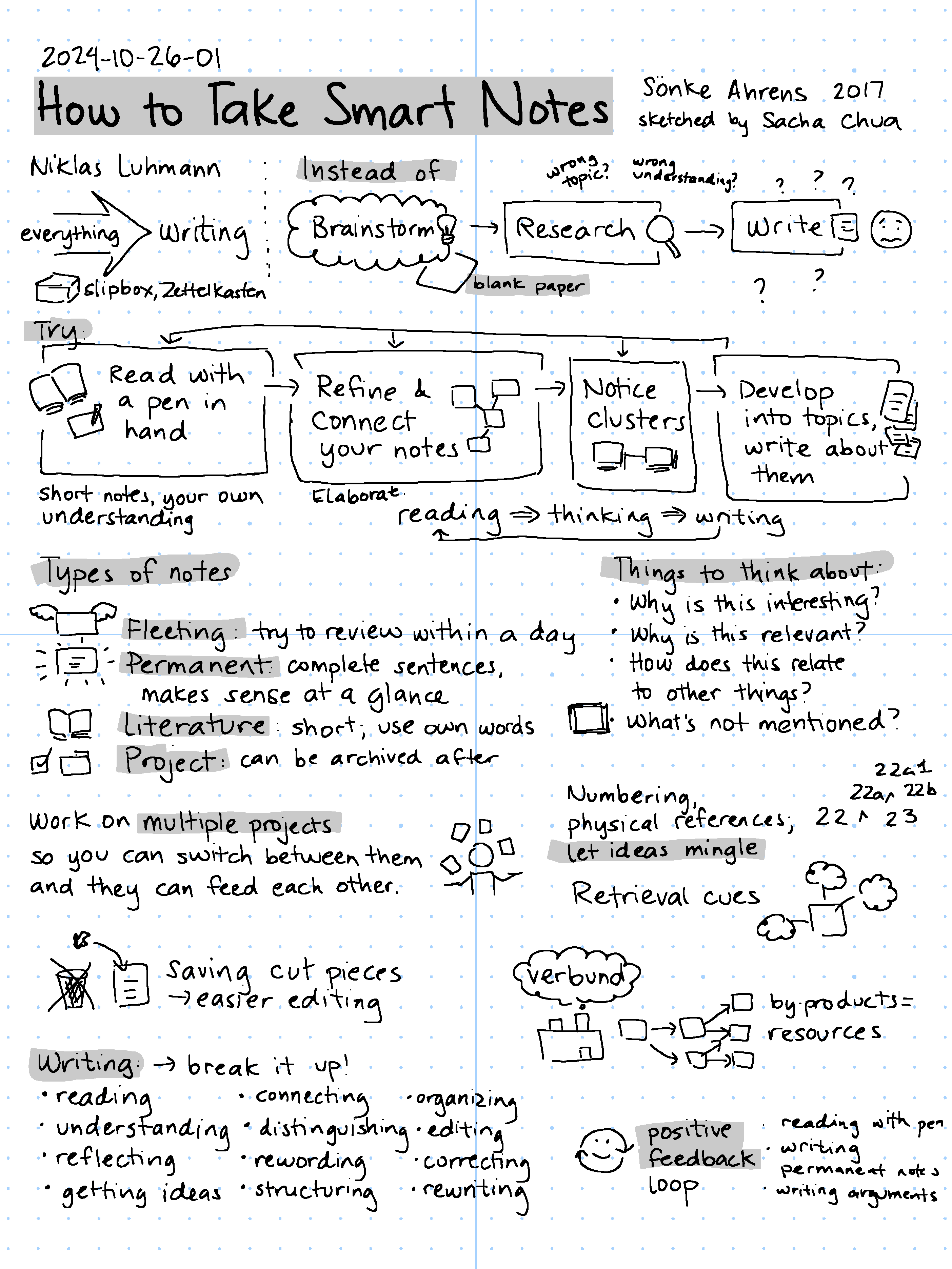

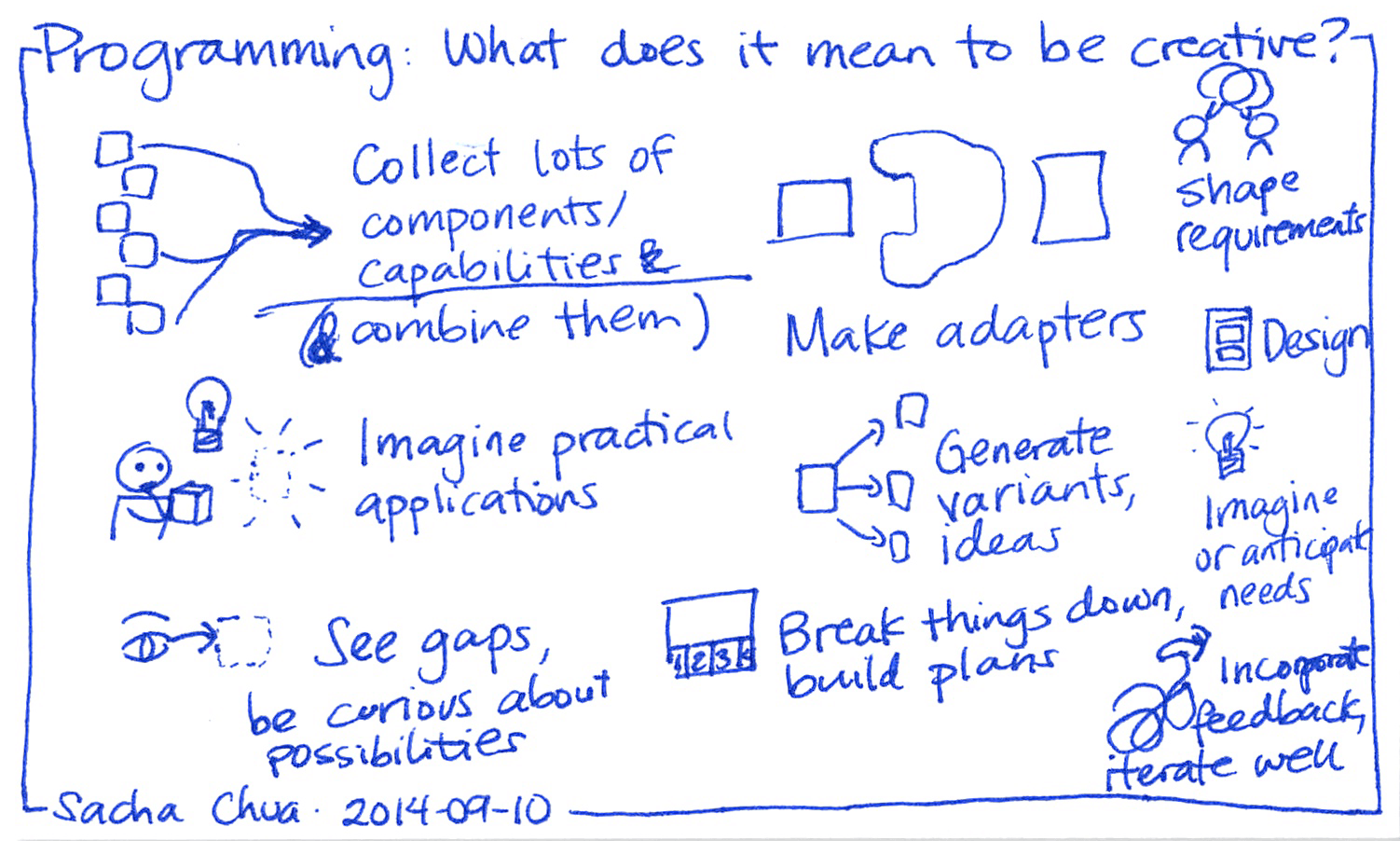
(This sketch is How to Take Smart Notes, one of my visual book notes.)
I use a CSS rule to invert my sketch colours when viewed in dark mode:
@media (prefers-color-scheme: dark) {
    .sketch-full img, .gallery img, .left-doodle, .right-doodle, .center-doodle { filter: invert(1) hue-rotate(180deg) brightness(150%) contrast(0.9); }
}
which is not fine-tuned or amazing, but it reduces the glare from the white background when I browse on my phone at night.
Sometimes I switch things around and use blue/dark blue instead. I now have some Emacs Lisp code to let me somewhat interactively recolour a sketch from the Emacs text editor so that I can change the colours in a sketch as I'm writing a post about it.
Using a coloured template and a script to change the colours around has made my Supernote workflow more convenient. I don't need to change the template on new pages. I just export the image, sync with Dropbox or use the Browse & Access feature, and run my processing script. My processing script also uses Google Cloud Vision to recognize the text, rename the sketch, and file it in the appropriate directory, so it's pretty smooth. It's pretty idiosyncratic, but maybe you might be able to adapt the ideas to your own setup. Hope this helps!
You can view 2 comments or e-mail me at sacha@sachachua.com.
]]>


