Visualization resources
One of my coworkers asked me if I knew interesting examples of visualizations. I mentioned quite a few sites and she found them super-helpful (like, give-Sacha-a-hug helpful! =) ). Just in case you find these handy: (no hugs required)
Flowing Data is one of my favourite blogs for data graphics inspiration. Data Visualization is cool, too.
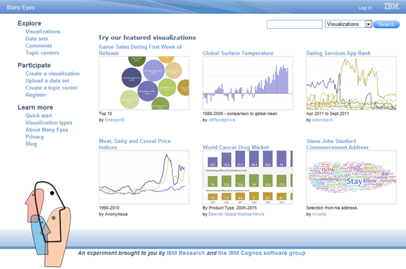
IBM Many Eyes
This collaborative visualization project makes coming up with charts and graphs so much easier. Lots of data sets and lots of examples to explore, too. Note: don’t upload private data.

Protovis has a graphing library and a gallery of pretty examples. I’d love to play around with graphs like this. RaphaelJS has a few examples, too. Graphing libraries generally do.
Hans Rosling shows you can do play-by-play commentary for statistics and have people on the edge of their seats.
OKCupid visualizations are fascinating. It turns out that one can get all sorts of insights out of a massive online dating database. The blog posts are cleverly written and often include practical tips, like this one on profile picture attractiveness, camera types, flash, depth of field, and time of day. They have mind-boggling data. You may not want to open the blog posts in a school or work context, though.
What are your favourite sources for visualization inspiration?

1 comment
Charles
2011-11-09T03:56:46ZSacha,
This is a subject dear to my heart and of great interest.
Check out the work of David McCandless. I have his "Information is Beautiful" book
http://www.davidmccandless....
Nathan Yau's book Visualize This is brilliant. He introduces the "R"
language for creating Statistical graphs.
The Processing language is great for coding your own interactions:
http://www.processing.org
I have dozens of links on my Delicious account:
http://www.delicious.com/oz...
Charles