Looking at landscapes; art and iteration
| art, supernote, learning, educationI want to get better at helping A+ learn more about art, and I want to learn more about art myself. She'll learn whatever she's ready to learn, but maybe I can help her get past the initial frustrations by breaking it down into smaller skills. As for me, there's plenty I can learn about seeing, getting stuff to look like what I'm seeing, imagining things, and communicating them. If I go about learning the things I want to learn, maybe she'll come along and pick things up too.
A+'s grade 3 virtual teacher assigned a landscape art project focusing on depth (foreground, middle ground, background) and value (highlight, midtone, shadow) using images from The Hidden Worlds of the National Parks. A+ was curious about Glacier National Park, and following that thread led us to this photograph of Saint-Mary Lake by Angelo Chiacchio (2018), so we used it as a reference. Angelo Chiacchio took this picture during a 300-day solo journey focusing on the precarity of our relationship with the world around us. He called this project .
Anyway. Back to the assignment. When A+ started her artwork in Procreate the other day, I noticed she was getting frustrated with her lines and curves not going where she wanted them to go. I suggested approaching it as a painting instead, blocking in masses of colour (… am I even using these words correctly?) and then gradually refining them based on what she sees, kind of like how you can smoosh some clay and then push it around until it feels right. She liked that approach better. We talked about fractions as we figured out how much space the background features took, and she painted land and sky and land and sky until things felt right to her. As she added details, I sometimes mentioned things I saw in the photo that I was trying to add to my painting, and she figured out her own interpretations of those. I liked how we both got the foreground/middle ground/background distinction using size and detail, and how the shadows helped the rocks look like they were part of the landscape.
Here's my take on it. Not entirely sure about the derivative work status of these ones, but I'm fairly sure they're no threat to Angelo Chiacchio's professional prospects as a designer/photographer/filmmaker. The first one is done using the Atelier drawing mode on my Supernote A5X, and the second one using the regular note app on the Supernote and just white/black:


Now that I've had a chance to look at the reference photo on my external monitor instead of on my phone screen, I can see a few more details, like peaks behind the forests on the left side. Working with just black/white is handy as I don't need to slow down to change pen colours. Maybe I can experiment with a midtone background so that I just need to add white and black.
Yesterday, we logged off from virtual school early to go to the Art Gallery of Ontario. I knew the class was going to do some more work on landscape art, so I figured it might be nice to check out the gallery and see things at a different scale. We could look at actual landscape paintings. As we wandered through the galleries, A+ was particularly interested in the Lawren S. Harris paintings like South Shore, Bylot Island, which had two other variations:
- Bylot Island Shore, Arctic Sketch XXXII
- Bylot Island, South Shore From Eclipse Sound, Arctic Sketches XXXIV
We looked at the foam on the waves, the contrast of the mountains, the clouds, the light, the shape of the peaks and the level of detail, the overlapping of the ridges of the mountains, the proportion of water to land to sky. She pointed to the elements of the paintings and looked closely at how it was put together.
By Lawren S. Harris, paintings from https://ago.ca, all rights reserved:
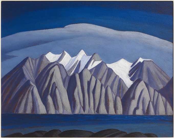
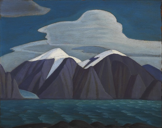
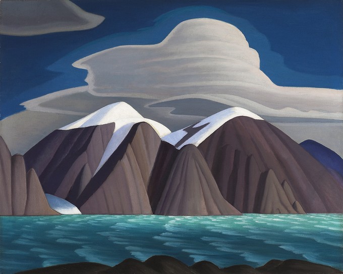
(I think it's okay to use these thumbnails under the Fair Dealing clause of AGO Terms of Use.)
Reading more about Lawren S. Harris, I learned that he invited artists to come together, provided them an inexpensive space to work, and financed trips for them, and helped form the Group of Seven (of which he was one) in 1920. That reminds me a little of William Thurston's thoughts on how mathematical knowledge can move so much more quickly through informal, in-person discussions compared to lectures or published papers. Connection: A group of painters thinking about Canadian art together. And a small-scale connection: the bouncing around of ideas in the Emacs community. But I am trying to squeeze too many tangents into this post.
I liked being able to look at versions of the same idea and discuss the differences between them. Today I looked up the paintings so I could write about them. I told A+ about how the two sketches were numbered #32 and #35, which means the artist probably did lots of studies to figure out how to paint what he wanted to show, and that even accomplished artists try lots of things in order to figure things out. It's interesting to get a glimpse of what happens behind the scenes of a polished piece of art.
I brought the iPad and my Supernote so that A+ could finish her digital landscape painting and so that I could work on mine. A proper class field trip came in, too. We watched the grade 6/7 students sprawl on the floor, pick paintings to study, and sketch with pencil and paper. A+ got her painting to a point where she really liked it. I liked the way her digital brushstrokes textured the rocks in the foreground where mine still felt flat, and the attention she paid to the snow in the peaks. Anyway, homework done, we explored some more. She found the AGO energizing and pulled me from exhibit to exhibit, although we did have to reluctantly save some galleries for the next trip.
I was a little envious of A+'s familiarity with Procreate. Maybe when I get the hang of value and if art becomes more of a thing, I might consider getting my own iPad for digital painting, since she often uses W-'s iPad for reading, watching, or drawing. I'd love to work with colours again. In the meantime, I still have much I can learn on the Supernote, even though it can only do white, black, and two levels of gray. When I browse through /r/supernote for inspiration (there's a filter for just artwork posts), it's… ah… easy to see that the hardware is not the limiting factor. Besides, I can practise using Krita on the X230 tablet PC. And it's been helpful, actually, limiting myself to just what the Supernote can do. I don't have to spend time trying to figure out colours that reflect what I see and that somehow work together with the other colours in the image. I can focus on learning how to see in terms of value first, and maybe dig into more of the techniques around black and white drawings.
Towards the end of my father's life, he took up drawing and watercolour painting, teaching himself through YouTube tutorials and tons of practice. As an advertising photographer, he had already spent decades thinking about composition and light, so I think he had a bit of an unfair advantage, especially since drawing meant that he didn't even have to have the right dramatic sky to Photoshop into an image.
When my dad asked me which of his drawings or paintings I wanted to keep, I asked for his sketchbook. I wanted the rough sketches, the in-between steps, the experiments. He gave me his one sketchbook and a bunch of loose sketches in a small case. I think he must have drawn in other sketchbooks, but maybe he didn't keep them, or maybe he really just leveled up that quickly. So here's a series of sketches by John K. Chua (all rights reserved). I'm pretty sure he was following this tutorial on How to Draw a Lighthouse, the Sea and Sky, but I'm just guessing at the sequence of these sketches.

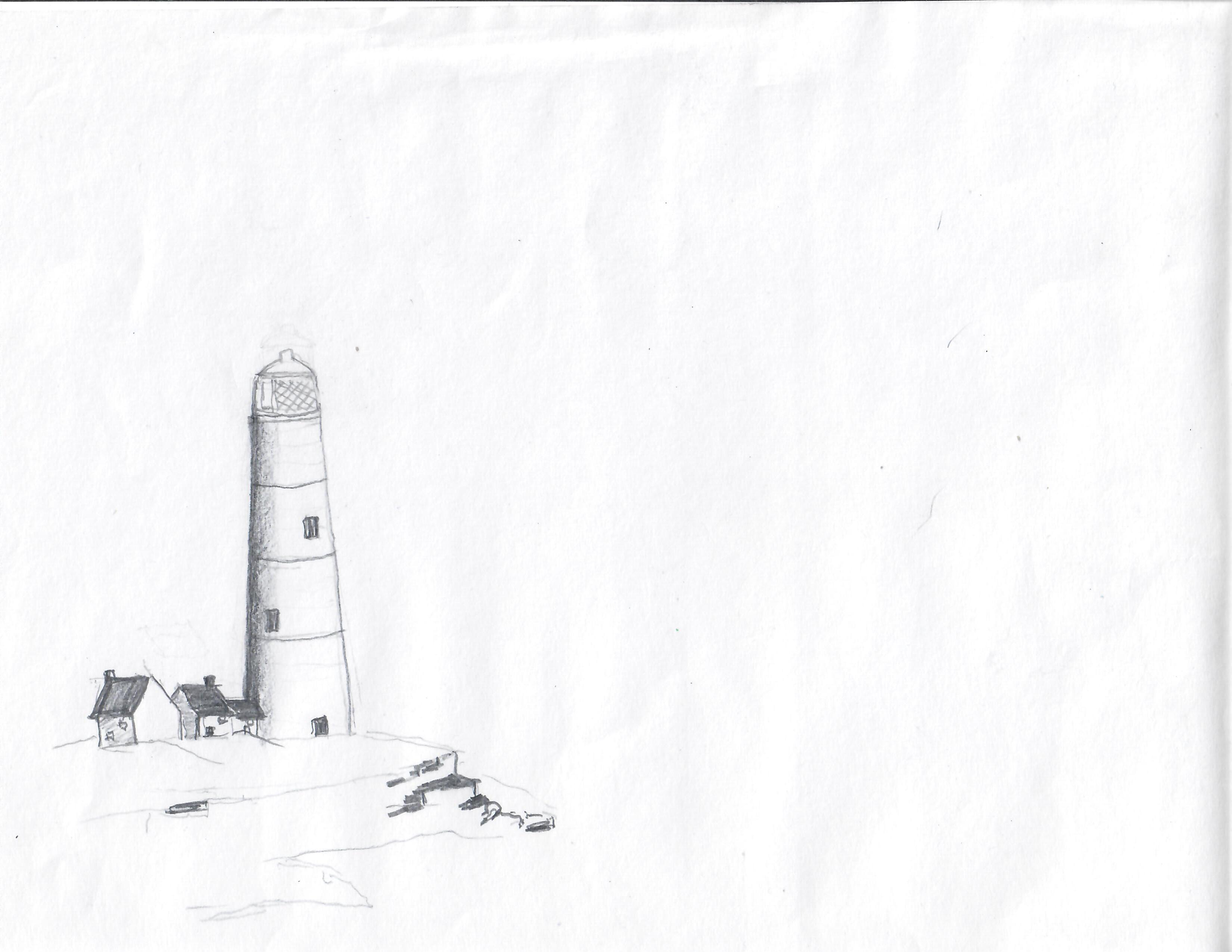
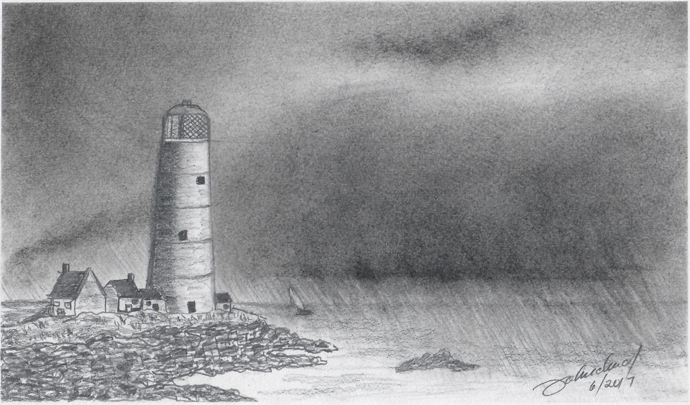
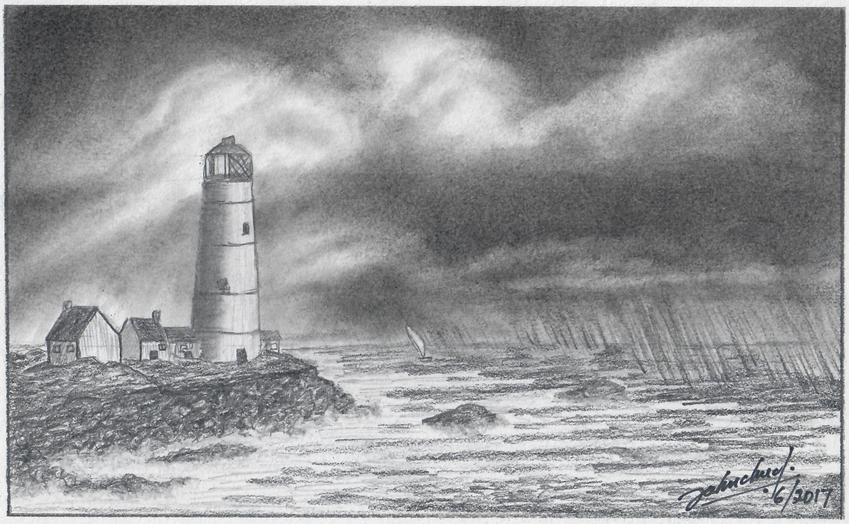
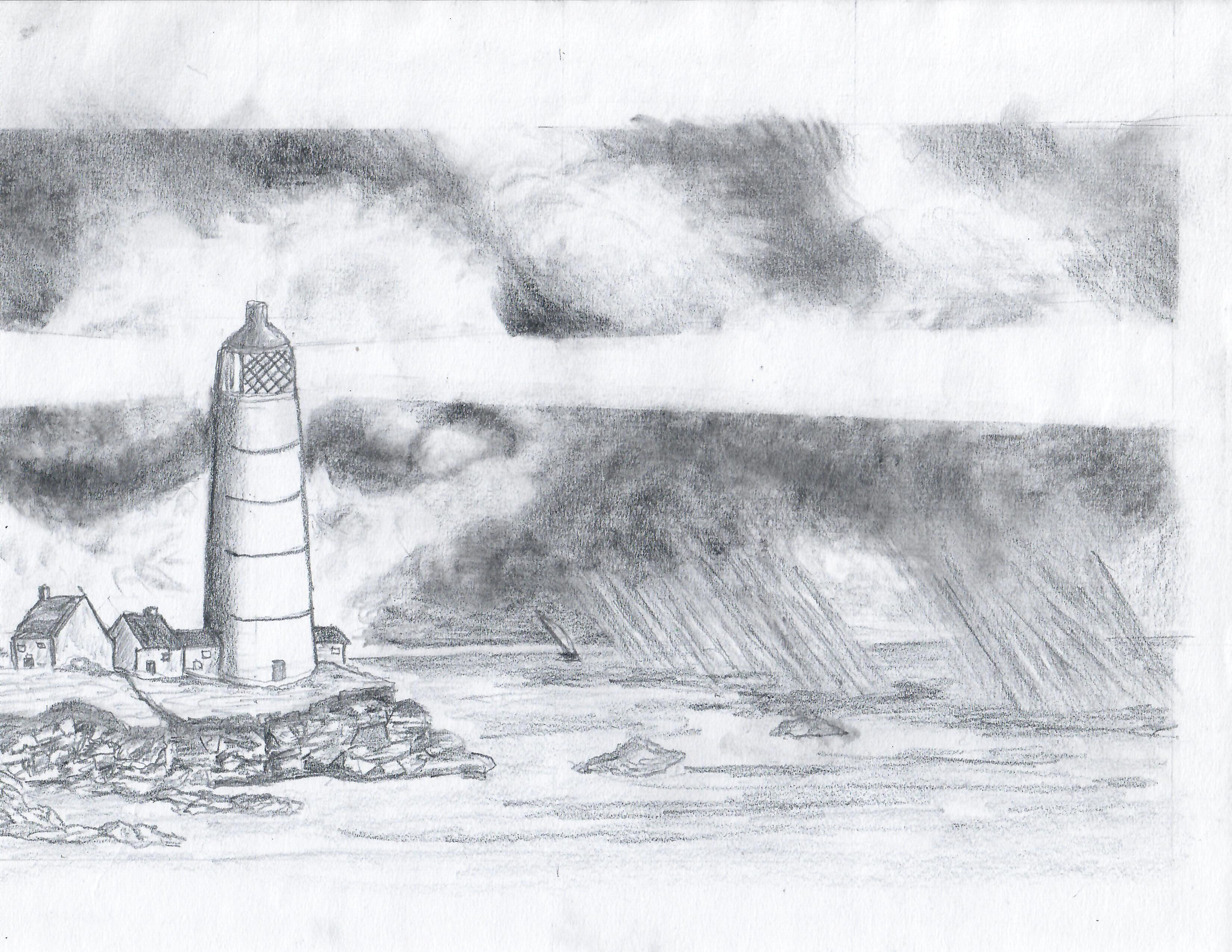
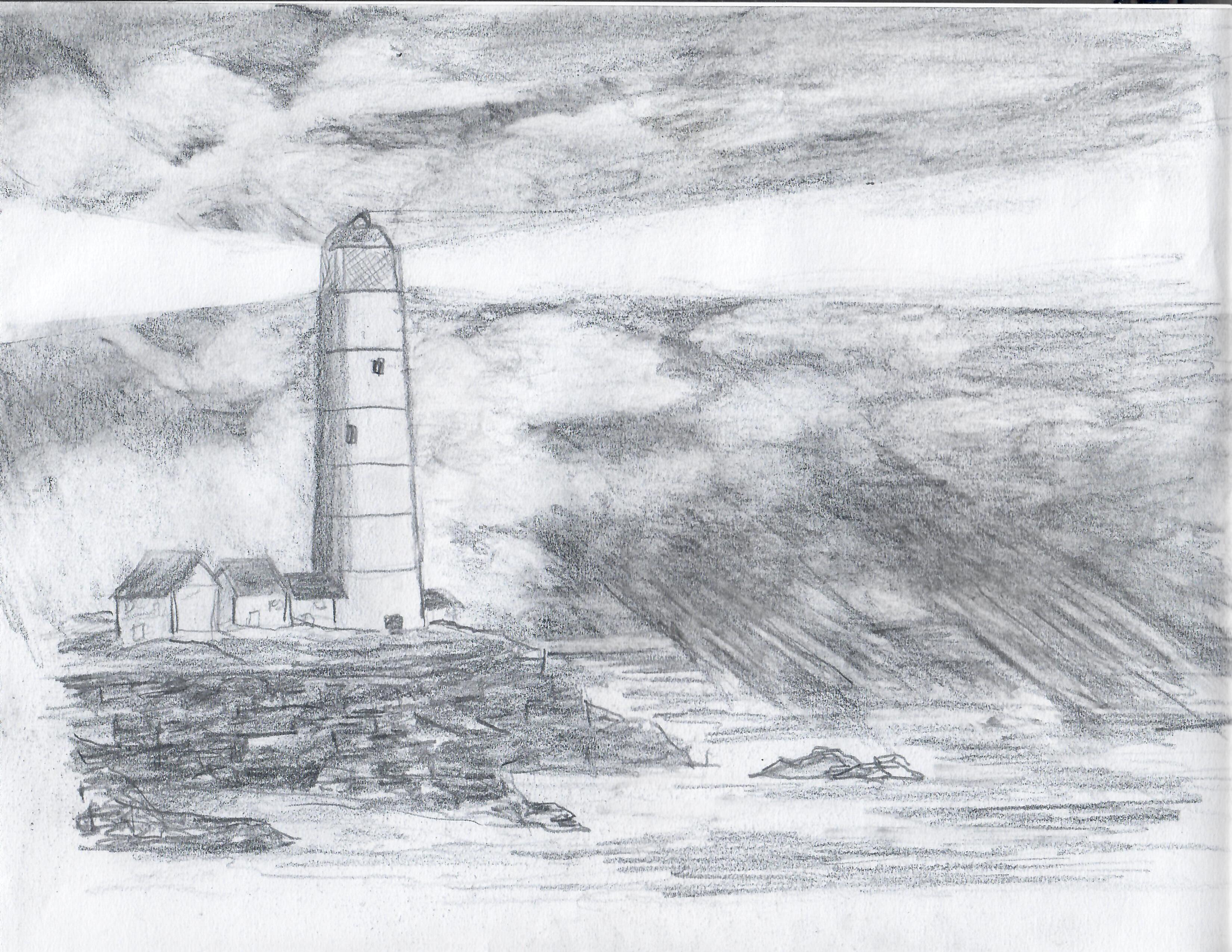
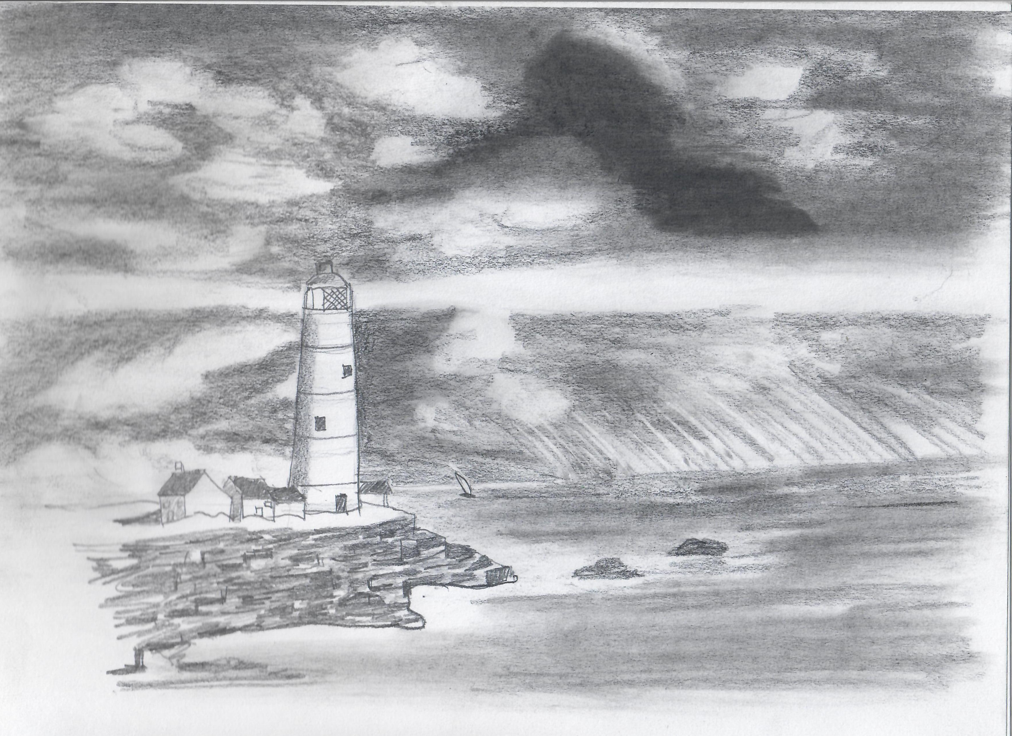
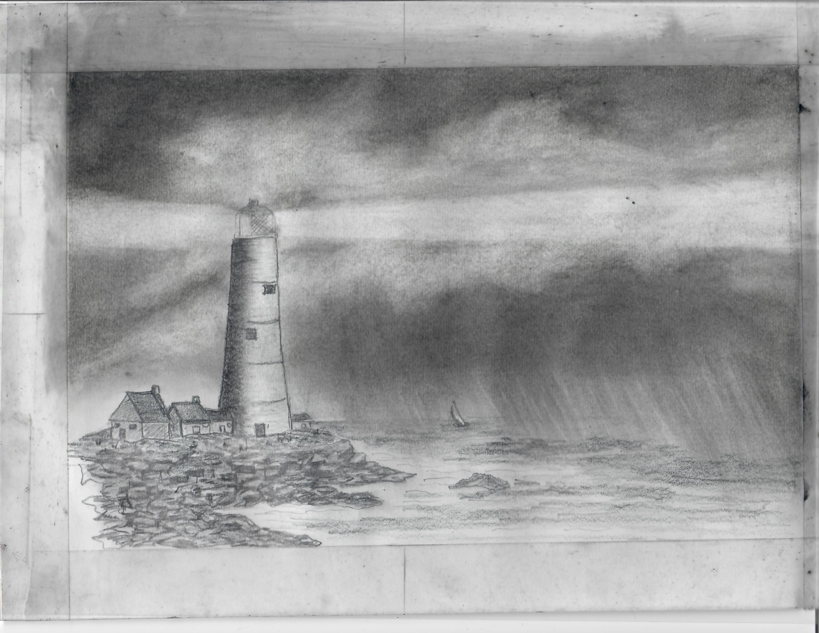
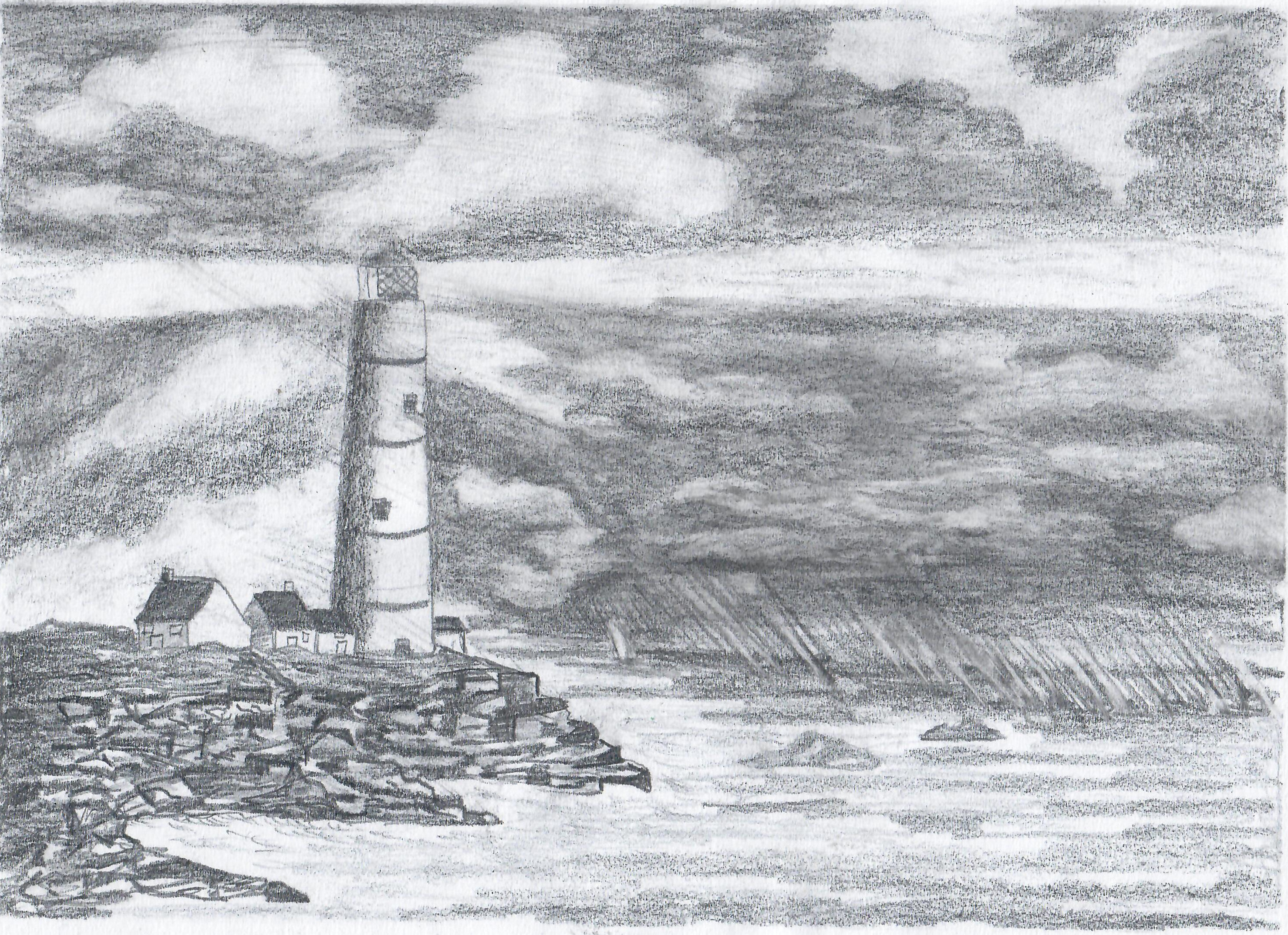
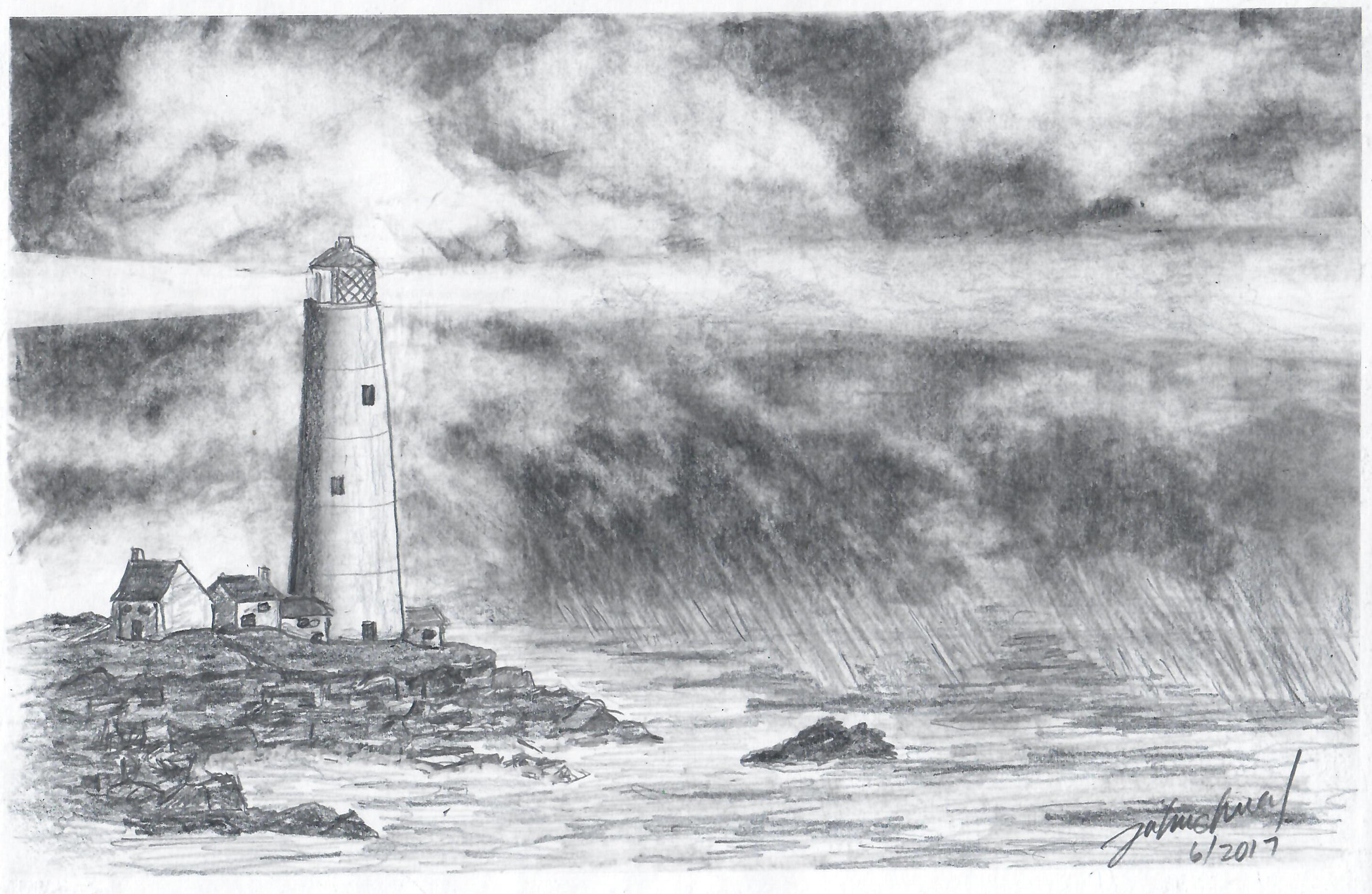
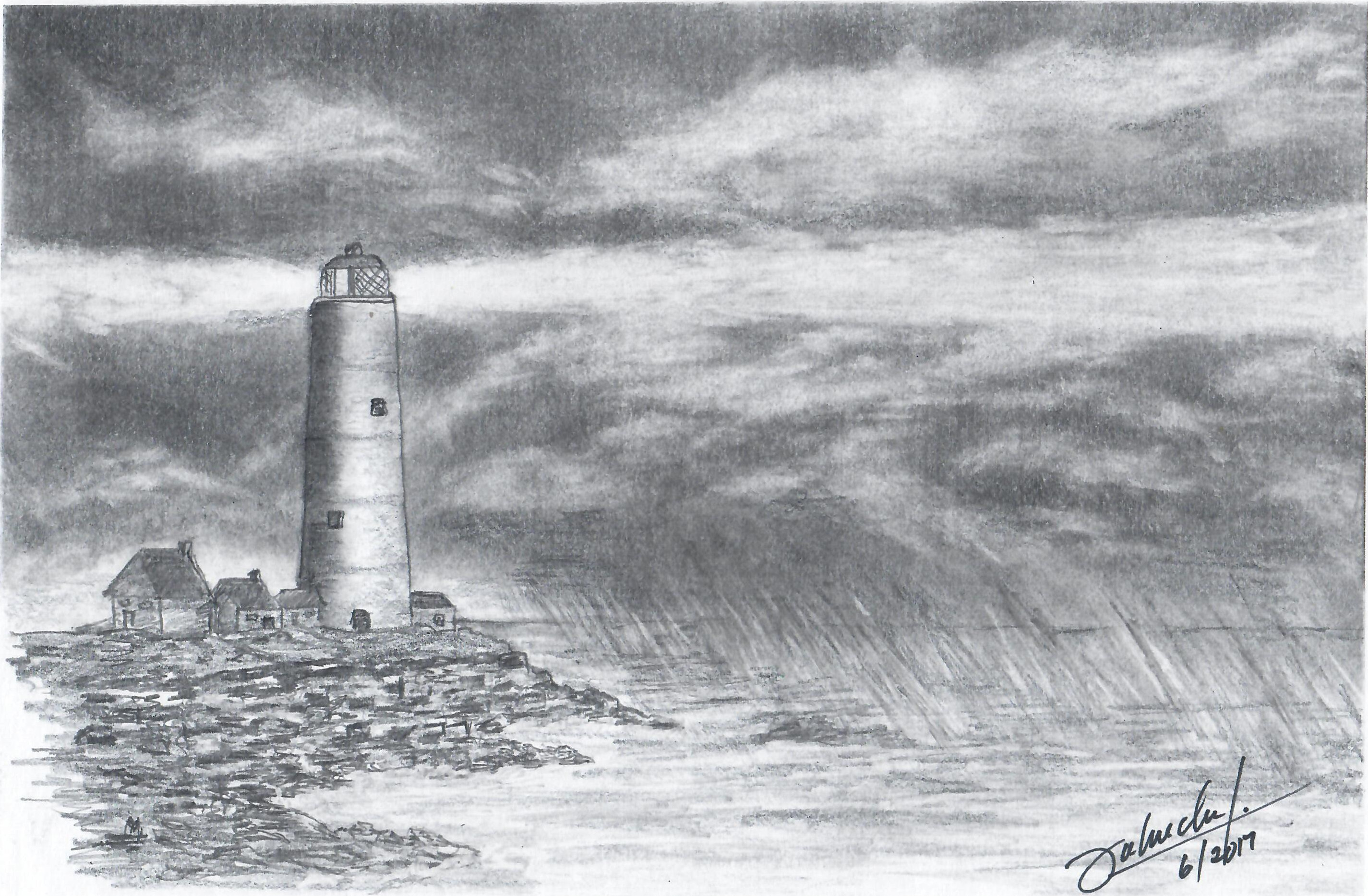

This was about half a year before his death. Cancer meant he couldn't get out as much as he used to, so he had to channel his passion for photography and learning into something else. It's interesting to see him experiment with the shapes in the sky, the contrast and shape of the shore, the rocks, the light from the lighthouse. He made many other sketches and paintings, often with several variations in the sketchbook. It would have been nice to see what he could've done with years more experimentation, but ah well.
While reading about art studies and iteration, I came across these posts:
- What Are Art Studies and How to Do Them – Monika Zagrobelna: with plenty of examples from anatomy
- Iterative Painting- Learning Through Experimentation and Critical Analysis — Stephen Berry Art
- work small
- decide on one change at a time
- separate technique from composition
So yes, definitely a thing.
I've been having fun drawing more. I could pick a tutorial, a Creative Commons image, or a public domain image as a reference so I can freely share my iterations. It'll be interesting to do that kind of iteration. I'm not sure A+'s at the point of being able to do that kind of study yet. I'm not totally sure I'm at that point yet either. My mind is often pulled in other directions by ideas and novelty. I am definitely going to lose her if I insist she repeats things.
That reminds me a little of another reflection I've been noodling around on interest development. The article Enhance Your Reference Skills by Knowing the Four Phases of Interest Development and this presentation mention that in the phase of emerging personal interest, when people are starting to become curious and independently re-engage a topic, they're not particularly interested in being advised on how to improve what they've currently got. It's better to acknowledge the effort they're putting in and to be patient. So I might as well just learn beside her, experimenting on my own stuff, letting her peek in, and see where that takes us.
This is hard. But life is long (generally), and she can learn things when she's ready. She can only learn things when she's ready. There's time. I didn't grow up particularly confident in art. I still mostly draw stick figures. But to my great surprise, I've managed to get paid for a few of them as a grown-up, and I use them myself to think and grow. Sometimes I discover myself drawing for fun.
At 41 years, what am I ready to learn about art? About life?
I have that sense of discrepancy between my clumsy lines and blobs and actions, and the shapes and results I want. This is good. I can imagine that there's something better, even if that's often unclear, and it's not… whatever this is. That is the gap between taste and skill that Ira Glass described.
Nobody tells this to people who are beginners, I wish someone told me. All of us who do creative work, we get into it because we have good taste. But there is this gap. For the first couple years you make stuff, it’s just not that good. It’s trying to be good, it has potential, but it’s not. But your taste, the thing that got you into the game, is still killer. And your taste is why your work disappoints you. A lot of people never get past this phase, they quit. Most people I know who do interesting, creative work went through years of this. We know our work doesn’t have this special thing that we want it to have. We all go through this. And if you are just starting out or you are still in this phase, you gotta know its normal and the most important thing you can do is do a lot of work. Put yourself on a deadline so that every week you will finish one story. It is only by going through a volume of work that you will close that gap, and your work will be as good as your ambitions. And I took longer to figure out how to do this than anyone I’ve ever met. It’s gonna take awhile. It’s normal to take awhile. You’ve just gotta fight your way through.
With any luck, I'm never going to outrun the gap. An important part to learn (and share) is how to let go of the frustration and self-doubt that get in the way, so that we can get on with the learning. That's hard. I am learning to experiment, even if it looks like I'm only changing a little bit at a time, and even if I often go sideways or backwards more than forward. I am trying to get better at sketching and taking notes so that I can see things side by side. In life, part of the challenge is figuring out the characteristics of this quirky medium–what it permits at this particular moment. I just have to keep trying, and observing, and thinking, and changing; not quite the same thing again and again.