Having fun kerning using Org Mode and FontForge
Posted: - Modified: | emacs, orgIt turns out that working with font bearings and kerning tables using Org Mode makes lots of things so much easier.
While trying to figure out kerning, I came across this issue that described how you sometimes need a character-pair kern table instead of just class-based kerning. Since I had figured out character-based kerning before I figured out class-based kerning, it was easy to restore my Python code that takes the same kerning matrix and generates character pairs. Here's what that code looks like.
def kern_by_char(font, kerning_matrix):# Add kerning by character as backupfont.addLookupSubtable("kern", "kern-2")offsets = np.asarray(kerning_matrix)classes_right = [None if (x == "" or x == "None") else x.split(",") for x in offsets[0,1:]]classes_left = [None if (x == "" or x == "None") else x.split(',') for x in offsets[1:,0]]for r, row in enumerate(classes_left):if row is None: continuefor first_letter in row:g = font.createMappedChar(first_letter)for c, column in enumerate(classes_right):if column is None: continuefor second_letter in column:if kerning_matrix[r + 1][c + 1]:g.addPosSub("kern-2", second_letter, 0, 0, kerning_matrix[r + 1][c + 1], 0, 0, 0, 0, 0)return font
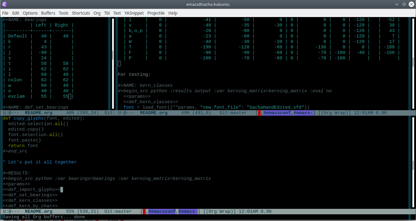
I wanted to be able to easily compare different versions of my font: my original glyphs versus my tweaked glyphs, simple spacing versus kerned. This was a hassle with FontForge, since I had to open different font files in different Metrics windows. If I execute a little bit of source code in my Org Mode, though, I can use my test web page to view all the different versions. By arranging my Emacs windows a certain way and adding :eval no to the Org Babel blocks I'm not currently using, I can easily change the relevant table entries and evaluate the whole buffer to regenerate the font versions, including exports to OTF and WOFF. Here's the code for that:
<<params>><<def_import_glyphs>><<def_set_bearings>><<def_kern_classes>><<def_kern_by_char>>font = fontforge.font()font = import_glyphs(font, params)font = set_bearings(font, bearings)save_font(font, {**params, "new_otf": "sachacHandRaw.otf"})font = kern_classes(font, kerning_matrix)font = kern_by_char(font, kerning_matrix)save_font(font, {**params, "new_otf": "sachacHandRawKerned.otf"})font = load_font('SachaHandEdited.sfd')font = set_bearings(font, bearings)font.removeLookup('kern')save_font(font, {**params, "new_otf": "sachacHandEdited.otf"})font = kern_classes(font, kerning_matrix)font = kern_by_char(font, kerning_matrix)save_font(font, {**params, "new_otf": "sachacHand.otf"})
I also like the way it's pretty easy to update multiple kerning values without clicking around. I sometimes use FontForge to get the number to set it to and then copy that into my table, but I also sometimes just tweak the number in Org Mode directly.
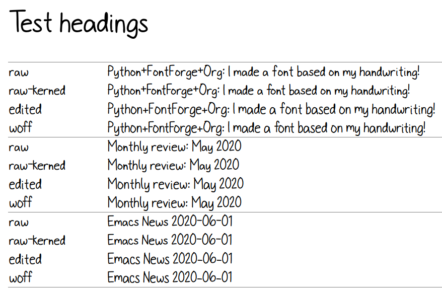
To see the results, I can generate a test HTML that shows me text with different versions of my font. I can also look at lots of kerning pairs at the same time. Here are the components of that test page:
def test_css(fonts):doc, tag, text, line = Doc().ttl()with tag('style'):for f in fonts:text("@font-face { font-family: '%s'; src: url('%s'); }" % (f[0], f[1]))text(".%s { font-family: '%s'; }" % (f[0], f[0]))text("table { font-size: inherit; font-weight: inherit }")text("td { text-align: left }")text(".blog-heading { font-weight: bold; font-size: 32px }")text(".default { color: gray }")text("body { font-family: woff, Arial, sans-serif; font-size: 32px; padding: 10px }")return doc.getvalue()def test_html(strings):doc, tag, text, line = Doc().ttl()with doc.tag('table', style='border-bottom: 1px solid gray; width: 100%; border-collapse: collapse'):for s in strings:for i, f in enumerate(fonts):style = 'border-top: 1px solid gray' if (i == 0) else ""with tag('tr', klass=f[0], style=style):line('td', f[0])line('td', s)return doc.getvalue()def test_kerning_matrix(kerning_matrix):doc, tag, text, line = Doc().ttl()with tag('table'):for r, row in enumerate(classes_left):if row is None: continuefor first_letter in row:with tag('tr'):line('td', first_letter)for c, column in enumerate(classes_right):if column is None: continuefor second_letter in column:klass = "kerned" if kerning_matrix[r + 1][c + 1] else "default"line('td', aglfn.to_glyph(first_letter) + aglfn.to_glyph(second_letter), klass=klass)return doc.getvalue()
This code actually generates the test file:
from yattag import Docimport numpy as npimport aglfn<<def_test_html>>doc, tag, text, line = Doc().ttl()fonts = [['raw', 'sachacHandRaw.otf'],['raw-kerned', 'sachacHandRawKerned.otf'],['edited', 'sachacHandEdited.otf'],['woff', 'sachacHand.woff']]strings = ["Python+FontForge+Org: I made a font based on my handwriting!","Monthly review: May 2020","Emacs News 2020-06-01"]offsets = np.asarray(kerning_matrix)classes_left = [None if (x == "" or x == "None") else x.split(',') for x in offsets[1:,0]]classes_right = [None if (x == "" or x == "None") else x.split(",") for x in offsets[0,1:]]with tag('html'):with tag('head'):doc.asis(test_css(fonts))with tag('body'):line('h1', 'Test headings')with tag('div', klass="blog-heading"):doc.asis(test_html(strings))line('h1', 'Kerning matrix')doc.asis(test_kerning_matrix(kerning_matrix))return doc.getvalue()
And here's what that test.html looks like:

Not bad… Now Emacs is my font editor! The code is at https://github.com/sachac/sachac-hand .