Giving a presentation using Autodesk Sketchbook Pro and a web conference
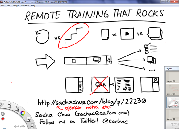
| kaizen, presentation, sketches, speakingI gave a presentation using Autodesk Sketchbook Pro and desktop-sharing in Lotus Live, and it worked out really well. I think I’ll do this for as many presentations as I can get away with. =) I’ll post a link to the recording when it’s up. It was much more fun and much more flexible than annotating in Microsoft Powerpoint. Here’s how I did it.
I pre-drew my one-slide talking points on a single layer so that I wouldn’t have to count on thinking, talking, and drawing all at the same time. I used an idea from children’s activity books: instead of drawing, you can use the eraser to make content appear, like the way you would scratch off black paint to reveal colours. I created a layer on top of my "slide", and I flood-filled this layer with white. I set the opacity of this layer to 90% so that I could see the traces of the images on the layer underneath. That way, I could use an eraser to reveal the sketches below. I selected a large eraser to make it even easier.
I also wanted to be able to draw new sketches or highlight items, so I selected a red ballpoint pen as my primary brush. Red goes well with black and white. Because my Lenovo X61 tablet pen has a pen tip and an eraser tip, I could easily flip between revealing pre-drawn sketches and adding new sketches. I drew on the the white layer that I gradually erased to reveal the underlying sketches. This meant that I could quickly remove accents or new sketches without disturbing my pre-drawn sketches.
Just in case I needed to go into more detail, I added another layer on top, filled it with white, and hid the layer. That way, I could always unhide it (thus blanking out everything else I’d drawn), add a new transparent layer on top, and sketch away.
I hid all the tools I didn’t need, and kept the layers window open on the side so that I could easily switch to another layer. Then it was time to share my screen, turn on the webcam, and give my presentation!
Here’s how you should set up your layers, from top to bottom:
- White layer, so that you can easily add layers on top of this for new drawings
- Translucent white layer with parts erased
- Pre-drawn sketches
- White background
The technique should work just as well with any drawing program that supports layers, a web conference that supports screen-sharing, and a tablet or tablet PC that lets you draw or erase easily.
Try it out and share your tips!


2 comments
David Ing
2011-05-14T18:55:22Z@sachac Wow, Autodesk Sketchbook for real-time presentation feels like it would work for the diligent. It's a long way from builds of bullet points in Powerpoint, though.
Will Robertson
2011-05-16T17:37:45ZVery cool way to use SketchBook Pro. It is always interesting to use tools in ways they were not designed for.