Trying out MindManager 2012 – Almost but not quite the right fit for me
Posted: - Modified: | review(Click on the image for larger version.)
I love the way that mindmaps let me get lots of information down quickly without worrying about organization. It’s easy to organize things after as the structure emerges. I often make mindmaps on paper, but I prefer to do my mindmaps on the computer. Working on the computer lets me reorganize items, expand and collapse branches, and read everything instead of rotating the map so that I can read text written at odd angles. (Besides, my scrawls tend to be hard to read the day after.)
I’ve been a big fan of mindmapping software ever since I came across FreeMind, a fast and free mindmapping tool. XMind became my new favourite when I found out about it. I wanted to give the premium mindmapping programs a try, though, so I gave iMindMap and MindManager a spin.
iMindMap was colourful, but didn’t quite fit the way I wanted to work. It’s definitely skewed towards maps with just one word on the branches, and I tend to write whatever I want to.
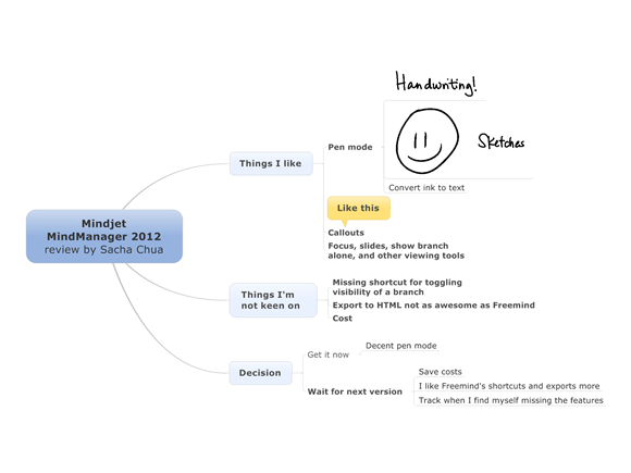
MindManager fit me better. I was delighted to find that MindManager had a good pen mode, allowing me to create, edit, and organize my map with my computer in tablet mode (look, Ma, no keyboard!). I could scribble things down, then convert ink to text and have fully-searchable and more legible notes afterwards.
I tried using MindManager in pen mode to capture a panel discussion. This was a bit of a challenge as I was actually on the panel in question, but I wanted to take notes anyway. I probably wouldn’t have tried this with other (non-tablet) mindmapping programs because the keyboard clicking sounds would have been distracting even if I had my screen tilted down (removing a barrier between me and others). The smooth gliding of a pen across a tablet screen is unobtrusive, and not all that different from writing on (somewhat glowy) paper.
As it turned out, the necessity of writing in the input box caused a bit more mental friction than drawing on a blank canvas in Autodesk Sketchbook Pro. (The input box size is configurable, but there are tradeoffs as you have to make your gestures outside the box.) I also ended up redoing the whole summary in Sketchbook because I wanted it to have more personality and a more compact layout. So no time savings for real-time visual notetaking, at least for me, although it was good to be able to reorganize points as needed.
I’ve also been using MindManager for keyboard-based brainstorming. It has a number of nifty features for project management and map navigation, but I haven’t made them part of the way I work.
MindManager’s handwriting recognition and pen controls are high on coolness factor and they’re pleasant to use, but considering that I can get the other features I care about for free with XMind, I’m not particularly keen on the $399 price for MindManager. Might be a good fit for other people, but I’ll hold off getting it for now.
Still, good to know what’s out there!
Related links:


4 comments
jay
2012-03-30T18:31:53ZNice review.
MindManager *is* expensive. It was my first mind mapping application back in 2002 and I still use version X5 in a windows VM (because it is so expensive). My next favorite is Xmind, which works in a very similar fashion.
Where MindManager really shines is for project planning for people that have to use MS Project. You can brainstorm the tasks, enter a lot of info in the "Task Info" tab for each step, move stuff around, and when you are happy-- export the whole thing into MS Project.
MindJet also has a free app for the iPad called MindJet that is very nice and very fast.
robert f
2012-03-31T15:47:21Zyou should look at Axon Research's programme - I used to use it a lot befreo moving to mac (i.e. not windows), it has a real strong following and user group, I think you will like it, see http://web.singnet.com.sg/~...
Markus
2012-04-03T00:40:25ZSacha, have you already tried Mindmeister http://goo.gl/N9XDz , seems to be quite good on mobile devices.
Sacha Chua
2012-04-03T01:37:32ZMarkus: Yup, I tried MindMeister when I was at IBM. It was a little slow and buggy for me, but that was some time ago. I hesitate to commit my mind maps to something with a subscription model - I wouldn't want to lose access to the maps! =) Besides, FreeMind and XMind are pretty darn good. I'll revisit MindMeister when I need to share maps with other people.