Experience report: Designing my logo
Posted: - Modified: | business, marketingUpdate 2012-12-31: Made the swoosh swooshier!
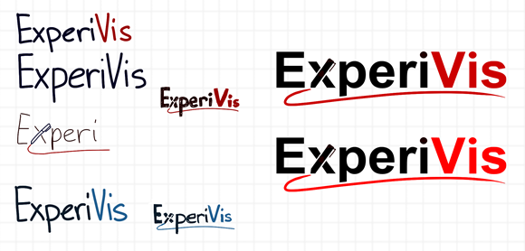
Having come up with a name for my business (I turn experiences into visuals, so ExperiVis!), I decided to spend some time figuring out what a logo might look like. I need this in order to start creating sketchnote templates and choosing colour schemes for marketing materials. Here’s what I sketched:
I tried a plain lettering style versus typing it in, and I preferred the formality of typing things in. Replacing the X with a stylus made me smile, so I kept it. I liked red more than blue – I think it’s more exciting, even though red might also make people think of grade school teachers, incorrect answers, and negative results.
W- thought bright red was more vivid and energetic than the dark red I’ve been using for my website, so I used bright red. He also suggested adding the little eraser cap like the way the Lenovo stylus is designed:
Here’s the image after I cleaned it up in Inkscape:
Update 2012-12-31: Now with a swooshier swoosh!
I think it’s a good starting point. =) Next steps: Sketch my services!


2 comments
Reader
2012-12-28T22:15:45ZThe logo looks great, and what if you take the cleaner underline of the smaller draft versions above?
Sacha Chua
2012-12-28T22:33:12ZThat smaller underline does look more swooshy, doesn't it? That one was hand-drawn instead of done as a vector. I'll see if I can trace it in Inkscape. =) Thanks for the feedback!