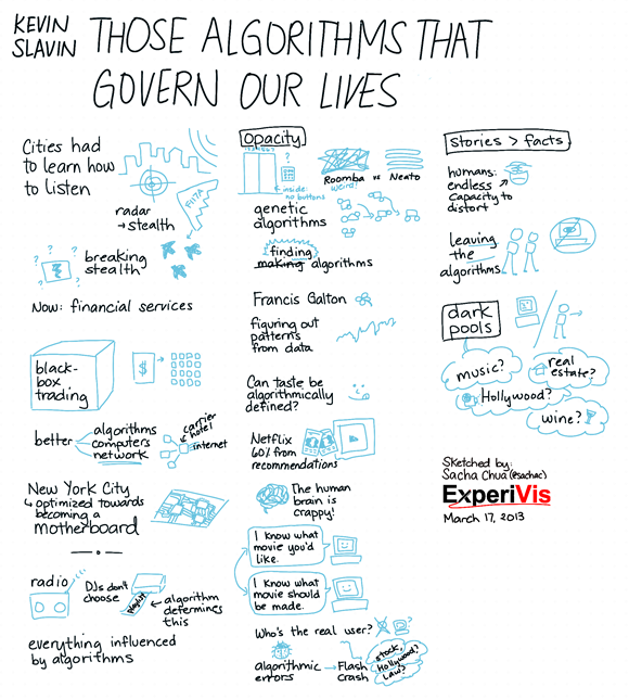
The Sketchnote Challenge: Those Algorithms That Govern Our Lives (Kevin Slavin)
| kaizen, sketchnotesEva-Lotta Lamm and a great panel of sketchnote artists are running a challenge to sketch a particular talk. I managed to squeeze in a sketchnote just before today’s deadline.
What do I like about this sketchnote?
I captured enough to help me remember, and I had time for little doodles too. The light blue images and dark blue text look calmer than the red-black combination I used in some of my other sketchnotes. The brush size worked out fine in terms of the proportion.
I didn’t switch pen sizes or vary the size much because I wasn’t sure what was going to be important. Instead, I used simple borders to emphasize key points.
I’ve been experimenting with using a light shade to add more depth to my images. It usually takes me five minutes to go through an image. I didn’t do it here because the size and detail of the images felt right already.
Drawing with plenty of whitespace around each element allowed me to easily reposition things when I needed to rebalance the columns and reorganize the information. I’m sometimes tempted to go for more creative, overlapping layouts, but I do like the flexibility of being able to change my mind. I usually publish things shortly after drawing, so I didn’t spend a lot of time tweaking this image.
What would I like to improve?
I’ve been experimenting with different colour schemes. The first colour I drew the images in was too light, so I used GIMP to change the curve to something darker. Depending on what I want people to focus on, I’ve been trying out light text / dark images vs dark text / light images. It would be great to find a quick way of experimenting with the same image. Experimenting would be easier if I drew text and images on separate layers, but the presentation was information-dense, so I didn’t feel comfortable switching back and forth. I’ve tweaked my standard colour palette to include a darker blue like the one I used for the images here. That way, I can keep the light blue for shading, and I don’t have to adjust the colours after drawing. Next: Tweak my colour palette, and find a way to experiment more easily.
The presentation was only 30 minutes long. It turns out that the usual size I draw things at results in a one-page-per-hour sort of density, so I used only half the page. (Hooray for consistency!) It might be good to develop a dot grid that’s calibrated for half-hour talks so that I’m encouraged to draw at a larger size while preserving my usual landscape aspect ratio. Still, these columns worked out fine. Next: Try a different-sized dot grid for short talks, or get used to drawing larger.
It was pretty fast-paced, too. I don’t feel like I’ve fully captured the overall logic of the presentation. It would be nice to make this understandable for someone who hasn’t seen the presentation yet, which I think I can do with a little post-work (adding headings, explaining things in sentences instead of keywords). It feels a little disjointed at the moment, and I think I missed potentially interesting points like the one about the monoculture. The individual components are enough to remind me of what I want to remember about the talk, though. Next: Add more time for post-processing so that I can draw anything I missed the first time around.
—
Check out the other submissions! First set, second set: Kevin Mears (second set) has a good printout image. I like Andy Fisher’s (second set) puppeteer image, the cute robot, and the whitespace balance of the page.

