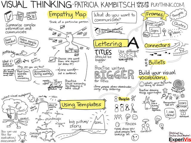
Sketchnote: Visual Thinking (Patricia Kambitsch)
| drawing, sketchnotesIt’s always a pleasure working with Patricia, and yesterday’s workshop on graphic facilitation was a lot of fun. I took digital notes during the 3-hour workshop, and we printed them and distributed them right at the end. =)
Click on the image for a larger version, which should also print nicely on 8.5×11” in landscape mode.
Feel free to share this! =)
What worked well:
- Printing the notes right at the workshop itself – great impact, and it took only a few minutes and the organizer’s help.
- I really like this black ink / yellow highlighter combination. It’s super-simple, lets me add emphasis after the fact, doesn’t require me to switch colours, and prints out better in black-and-white than using coloured text does.
- I played around with a not-quite-columnar layout, using highlights and connectors to link everything together. Someone remarked that the light gray connectors helped lead the eye, so that worked out nicely.
- Shading with light gray worked well, too. I might do that with more of the images to add some depth, and perhaps add a warm gray to my colour palette.
Things to play with next time:
More shading! More depth! =) Maybe fancier titles, too? Using elaborate frames might let me keep the text simple so that Evernote can still search it… Maybe I can start a collection of frames.
I used Autodesk Sketchbook Pro on a Lenovo X220i Tablet PC. =)


3 comments
Lisa Nelson
2013-06-03T10:47:55ZThis is cool! I like the grey shading and the yellow. I enjoyed following the story :D
sachac
2013-06-03T13:09:46ZGlad you like it! I might play around with using this sort of radial layout more often, as the connectors are much easier to draw than when I use a column-based layout.
Yvan
2014-07-29T11:04:27ZYes this great. welle designed columns and lines clear want to explore. Bravo ! Big kiss form Paris (France)