Quantified Awesome: Adding calendar heatmaps to categories
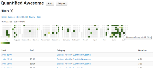
Posted: - Modified: | quantifiedIt’s amazing how little tweaks give you a whole new sense of the data. I’ve been using Cal-HeatMap to look at my blogging history. I figured I’d build it into Quantified Awesome to make it even easier to analyze how I spend my time. 1.9 hours later, here’s what I have. All totals are reported for the past 12-month period by default (as of this writing, July 19 2012 to July 19 2013, including the day’s activities), but it adjusts depending on the filter settings.
Here’s me working on the Quantified Awesome system:
Instead of just a table of log entries or a summary of numbers, I can see the gaps and sprints in my activity.
Here’s the one for Discretionary – Productive:
Pretty consistent, actually.
and Discretionary – Play:
February must’ve been when I had a new video game to tinker around with. Plenty of opportunities to relax.
Here’s my Business – Earn graph:
and Business – Build:
I’ve been biking pretty regularly, mostly on Tuesdays and Thursdays…
In contrast, I take the subway only if it’s winter or really rainy, if I’m going somewhere far or steeply uphill, or if my bike is flat (as it was yesterday).
Neato. I should definitely do this for groceries too, now that I’ve loaded my grocery receipts into Quantified Awesome! (No public link yet for that data, sorry. =) ) I also want to figure out how to speed things up enough so that I can do quartile analysis and then use that to colour the scale…
Calendar heatmaps for the win!


3 comments
Toronto Women's Expo
2013-07-25T15:25:39ZThat's pretty cool! Does this help your productivity at all, to get visual feedback like this?
sachac
2013-07-25T23:38:53ZI'm happy with how productive I am. =) I get a lot of things done, and I have space to explore. Visualizations help me be curious about and reflect on my decisions, so that's handy. Building the visualizations into my tracking tools means that I can ask these types of questions more frequently, since I don't have to crunch numbers as much. I like it! =)
Toronto Women's Expo
2013-07-30T14:54:38ZI think visualizations are handy for getting an overall impression quickly, and that helps if you're looking at the big picture and asking reflective questions. Thanks for posting this!