Considering my time balance this schoolyear, and getting ready for summer
| time, quantified, parenting, lifeIt's A+'s last week of virtual Grade 4 before summer vacation. This time of the year, when the teachers turn to filler activities like games and movies, she tends to find the pace excruciatingly slow and of little interest to her. There was a substitute teacher on Monday. She's not keen on having a substitute teacher since they tend to run into technical issues or go at a much slower pace. She already finds the regular class pace agonizingly slow. Her classmates goof off a bit more around a sub, too. But I needed some time for paperwork, so she begrudgingly signed into class. She reported that, as predicted, they got absolutely nothing done. The students played games and watched a movie. On Tuesday, there was another substitute. I'd done my paperwork for now, so I called the school to let them know she'd be absent. We were about to head out for some ice cream after breakfast, but she got upset about something and decided to stay in her room for a bit. I finished putting together Emacs News and played a bit of Stardew Valley with the Tileman Reworked mod to destress after the last few days of paperwork, and then I started on this reflection.
(Wednesday update: Back to the regular teacher, but now there's a Zoom update that's making it hard for the students to connect to class, so the teacher is switching back to Google Meet for a bit. It sounds like A+ managed to make it back on. This afternoon, they're going to play some more games and watch a movie, so I think I'll take A+ out if she wants to do some math or go shop for earbuds to replace the one she lost.)
The change of routines to summer is a bit challenging for us. Well, the schoolyear is challenging for us too. I suppose summer is challenging in a different way. The playgrounds are busier and louder. The sun is brighter and hotter. The usual rhythms of playdates with her friends changes as they go to sumgmer camps or other activities. I move from having medium-sized chunks of fairly predictable focus time to playing everything by ear.
Time analysis
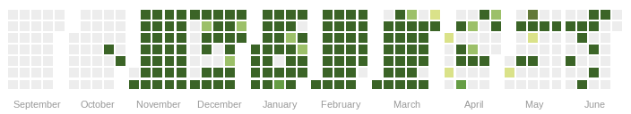
Before we officially head into summer, I want to think about how I used my time this schoolyear, and how I can prepare for summer and next schoolyear. How to read this graph: gray is sleep, pink is childcare, blue is more focused time, orange is consulting. If you click on the image, it opens an SVG with tooltips.


The biggest difference was that A+ wanted to exert more independence and autonomy when it came to school. In Grade 3, she wanted me to stay in her room so that she could ask me for help or hang out with me when she was bored. In grade 4, she preferred to have her room all to herself. W- helped me set up a little desk in the corner of another room on the same floor, so I could still be close by, but A+ mostly did things independently. Or didn't do things, as the case may be; I learned not to push her on schoolwork, since the only thing that accomplished was grumpiness all around. I've been practising stepping back. It's her experiment, after all, and the teachers can give her feedback on school things. I can keep myself busy with my own focused-time stuff so that I don't fret at her. After I got through my initial anxieties, I settled into doing more of my stuff during the schoolday.
| Category | 2024-2025 % | 2025-2026 % | Diff % | h/wk | Diff h/wk |
|---|---|---|---|---|---|
| Personal | 9.2 | 13.8 | 4.6 | 23.2 | 7.7 |
| Discretionary - Productive | 13.9 | 18.4 | 4.6 | 30.9 | 7.6 |
| Unpaid work | 4.1 | 4.6 | 0.5 | 7.7 | 0.8 |
| Discretionary - Family | 0.3 | 0.7 | 0.4 | 1.1 | 0.6 |
| Discretionary - Play | 1.9 | 1.1 | -0.8 | 1.9 | -1.3 |
| Business | 2.1 | 1.1 | -1.0 | 1.8 | -1.7 |
| Sleep | 33.4 | 32.2 | -1.1 | 54.2 | -1.9 |
| A+ | 35.1 | 28.1 | -7.1 | 47.1 | -11.9 |
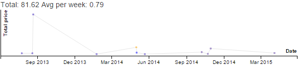
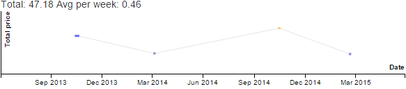
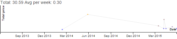
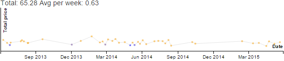
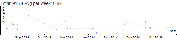
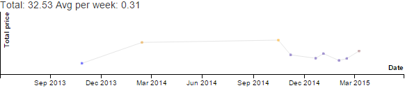
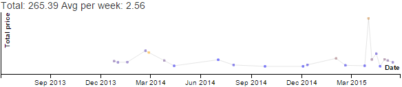
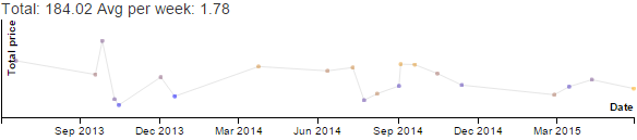
In grade 4, A+ started learning French. I started learning French too so that I could help her. I practised pronounciation with a virtual tutor once or twice a week, and I wrote journal entries in French too. (These images are just screenshots.) There were other discretionary activities, of course.
| Category | 2024-2025 % | 2025-2026 % | Diff % | h/wk | Diff h/wk |
|---|---|---|---|---|---|
| Discretionary - Productive - French | 0.0 | 5.2 | 5.2 | 8.8 | 8.8 |
| Discretionary - Productive - Emacs | 4.5 | 7.3 | 2.8 | 12.2 | 4.8 |
| Discretionary - Play - Stardew Valley | 1.2 | 0.7 | -0.5 | 1.2 | -0.8 |
| Business - Earn - Consulting | 2.0 | 0.8 | -1.1 | 1.4 | -1.9 |
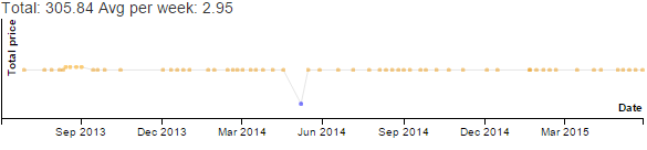
| Discretionary - Productive - Writing | 2.9 | 1.3 | -1.6 | 2.2 | -2.6 |
I tended to turn to Stardew Valley for de-stressing or revenge bedtime procrastination. Interestingly, my nascent fixation on French pretty much replaced Stardew Valley until it got slowed down by other things happening in my life starting April, which also coincided with my time on Stardew Valley picking up again in April in order to unwind.
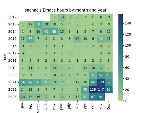
Emacs continued to be another good way to unwind. I gave myself permission to spend more time just having fun with Emacs. Following up on my reflection for Emacs Carnival March 2026: Mistakes and learning to reach out, I started scheduling conversations during A+'s schoolday. I did some Yay Emacs livestreams and Emacs Chat interviews as an experiment. I think it was a good way to get lots of tips out of people's heads and into videos/transcripts/screenshots, and I also improved my workflow for editing transcripts and extracting images. Not counting Emacs News, I wrote 47 Emacs-related posts during the previous schoolyear and 65 posts during the current schoolyear.
Other changes this schoolyear:
- Pre-adolescence: A+'s been having a harder time with her feelings. I think this might be related to pre-adolescence. Totally normal. One of my goals is to keep myself calm and regulated, and another one is to help her connect with more people she likes so that she can feel supported even when she's grumpy with me. She can chat with her aunts and cousins via Stars Messenger without needing to go through me, so that's good.
- Gymnastics: We figured out how to get one-on-one gymnastics classes going, and A+ has been enjoying them.
- Pokemon: A+ and I started playing Pokemon Go. We play it pretty casually, and we've joined a couple of the meetups. It's been a good excuse to go for the occasional walk, and it's also a good way to take advantage of a bike ride. She's also gone deep into the lore (so many books!) and has watched more than a dozen seasons of the Pokemon TV series. She occasionally plays Pokemon on W-'s old Game Boy Advance.
- Dungeons & Dragons: We've also been playing D&D. We started playing in virtual sessions with my sisters and nieces. A+'s really taken to it, including experimenting with DMing. We've gone through much of the Keep on the Borderlands Starter Set (thanks to my sister) as a duet adventure, except for a number of the Caves of Chaos which were too scary for A+ even though I tried to balance things differently. She's more into roleplaying than combat, so we mostly improvise our own adventures. I keep a d20 and a d6 in my vest, and my phone has virtual dice too for when we're walking around.
- W-: W- retired, yay! He's been enjoying biking and working on personal projects. A+ still hangs out with me more than with him, but that's fine.
Thoughts for next year:
- Neurodivergence: A+ and I find it a little challenging to adapt to changes in routine and also to handle boredom. I think I'll talk to our doctor about considering a neuropsych assessment in case knowing more about our brains can help make things a little bit easier for us. I think she'll still have a bit of leeway at school for the next few years, so it's a good time to experiment and figure out things that work better for us. We've been talking about neurodivergent strategies, too.
- Pre-adolescence: It's probably going to be a little tougher next year (pre-adolescence, extended family challenges, etc.), but this is fine. We signed up for all of this, and this is where we get to see how our preparations work out. It's also good equanimity practice. The turbulence is natural. I want to stay loving, patient, and supportive.
- Emacs: For now, Emacs Chats (and the transcription thereof) might actually be more useful to the wider Emacs community than my hacking around with idiosyncratic Emacs Lisp code, especially since I still have a hard time getting my brain to cooperate with the extra bit of polish needed to finish an idea and/or properly contribute things upstream. Livestreaming while I'm tweaking Emacs is an interesting trade-off which I think ends up being mostly positive: I'm slightly distracted because I have to talk out loud, but on the plus side, people's suggestions and questions (and the feeling that other people are watching) also help me focus on the current task instead of going down a different rabbit-hole. Or at least it encourages me to either capture the TODO for the next idea or leave myself some breadcrumbs if I really do want to go down that other rabbit-hole on stream. I'll pause these for summer. I'm looking forward to experimenting with them more next schoolyear, especially if I can balance it with the work I put into organizing EmacsConf.
- Virtual school: Virtual school continues to feel like the right choice for us both in terms of health and the ability to manage stimulation levels. When she finds her classmates too noisy, she can lower the volume. When she needs a break, she can sign out and we can work independently. We hope next year will be a good fit too. This year, the Toronto District School Board consolidated all its virtual students into one virtual elementary school, which was nice because they didn't feel left out of hybrid activities. We still had the usual transition pains this schoolyear, but maybe next year will be smoother.
Getting ready for summer
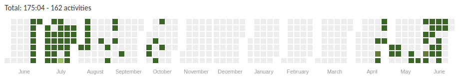
Here's what my time looked like last summer:

Unsurprisingly, it's mostly childcare. A+ had a series of private swimming lessons (too short to do much during) and one afternoon summer camp (during which I did a lot of consulting). Aside from that, we basically hung out with each other unless she was grumpy with me or one of us was in the bathroom. She tended to wake up early, so I didn't usually get focus time during the morning. Or any time during the day, really. But now I can practise French in my head, so that's good. A+ is thinking of getting her own Bluetooth earbuds since they're helpful for managing overstimulation at the playground, so I'll be able to get mine back and maybe even listen to comprehensible input podcasts when she's not directly interacting with me.
Comparing summer 2025 with schoolyear 2025-2026:
| Category | Summer 2025 % | SY 2025-2026 % | Diff % | h/wk | Diff h/wk |
|---|---|---|---|---|---|
| Discretionary - Productive | 10.5 | 18.4 | 7.9 | 30.9 | 13.2 |
| Personal | 9.8 | 13.8 | 4.0 | 23.2 | 6.7 |
| Sleep | 30.7 | 32.2 | 1.6 | 54.2 | 2.6 |
| Discretionary - Family | 0.1 | 0.7 | 0.6 | 1.1 | 1.0 |
| Unpaid work | 4.3 | 4.6 | 0.2 | 7.7 | 0.4 |
| Business | 1.5 | 1.1 | -0.4 | 1.8 | -0.7 |
| Discretionary - Play | 6.2 | 1.1 | -5.1 | 1.9 | -8.5 |
| A+ | 36.8 | 28.1 | -8.8 | 47.1 | -14.8 |
As expected, the schoolyear means less time with A+ compared to summer (-14h / week), which mostly gets shifted to productive time (+13h/week). I actually get a little more time to sleep during the schoolyear, too. So, preparing for this upcoming summer, I can anticipate less sleep and more time with a possibly tetchy kiddo, but if I can take advantage of little moments here and there (like when she's in the bathroom for an unpredictable length of time, or when she needs space for me), then I can take care of whatever I need to stay sane.
I'd like to continue with my sessions with French tutors, although I might have to experiment with the timing to see what works. Shortly after lunch might still be nice, since it's probably going to be too bright and hot to enjoy being at the playground. If I keep improving, then I can use little snippets of idle time (like when she's playing with her friends) to rehearse sentences, listen to comprehensible input, or write my journal entries.
Let's compare summer 2024 with summer 2025:
| Category | Summer 2024 % | Summer 2025 % | Diff % | h/wk | Diff h/wk |
|---|---|---|---|---|---|
| Discretionary - Productive | 2.5 | 10.5 | 8.0 | 17.7 | 13.5 |
| Discretionary - Play | 1.6 | 6.2 | 4.6 | 10.4 | 7.7 |
| Personal | 7.5 | 9.8 | 2.3 | 16.5 | 3.9 |
| Unpaid work | 4.1 | 4.3 | 0.2 | 7.3 | 0.4 |
| Discretionary - Family | 0.6 | 0.1 | -0.5 | 0.1 | -0.9 |
| Business | 4.5 | 1.5 | -3.0 | 2.5 | -5.1 |
| A+ | 42.5 | 36.8 | -5.6 | 61.9 | -9.5 |
| Sleep | 36.6 | 30.7 | -6.0 | 51.5 | -10.0 |
Some thoughts for this upcoming summer:
- Sleep: I probably want to get back to about 8 hours of sleep a day (33%), which is totally doable if I resist the temptation to squeeze in gaming or coding. This probably means I need to take better care of myself during the day so that I don't feel the urge to indulge in revenge bedtime procrastination, which probably means (1) finding ways to spend time with A+ that I enjoy more, like D&D, biking, or swimming, and (2) using French or other portable pick-up-and-put-down activities to take advantage of little snippets of free time.
- Childcare: A+ might want to spend lots of time with me, but less than the previous year as she becomes more independent, and the sharp drop in the time kids want to spend with their parents is coming inexorably. I can probably keep the discretionary stuff to just whatever keeps me sane, and focus on enjoying time with A+. Maybe more D&D, especially since we're figuring out ways to improvise on the go. Swimming is nice, too.
FAQ:
- How much time does it take to track and analyze your time?
- Hardly any time to track it, maybe a couple of seconds between activities. I made a home-made web-based system for tracking my time, and I can easily update it by tapping buttons on my smartphone or specifying a less common category. It doesn't have to be super precise. Most of the analysis reuses code from previous years, including the web-based graphs. I generate the tables with Emacs Lisp in an Org Mode Babel block. Thinking about how I've been using the time takes time and reflection, but it's good for me.
- Can you share your tracking system?
- I used to let other people use it, but bots kept hammering it, so now it's just for me. Here's the source code just in case you want to try self-hosting.