Where am I in terms of design?
Posted: - Modified: | designI'm working on learning more about design. I don't think about it all the time, but sometimes I check out design blogs like Little Big Details and CSS Tricks. I'm getting the hang of sketching several variants instead of jumping straight into the first idea I have, and sometimes I even show those wireframes to other people before coding it up.
Someone asked me where I'd rate myself on a scale of 1 to 10. It's hard to do that without thinking about what 1 and 10 are and what's in the middle. Besides, I know that the scale will keep shifting anyway. I'll never ever get to 10, and this is good. There's always more to learn.
Anyway, here's what I came up with. Which, on reflection, might be overstating it. Sometimes I feel like I'm still throwing everything in including the kitchen sink. But at least this gives me a map, a You Are Here, and more usefully, a sense of what the next step on the path might be.
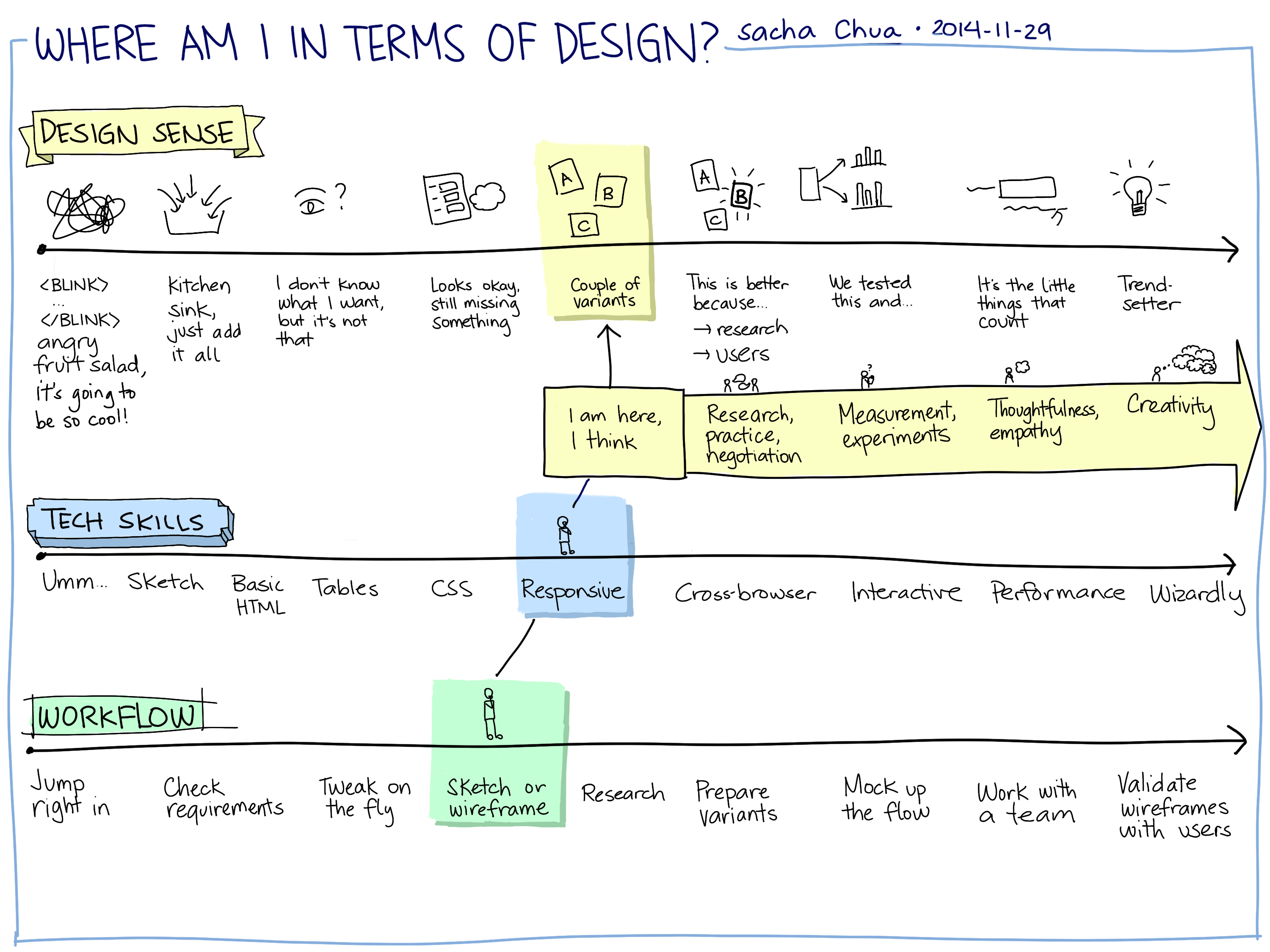
There are at least three components to this, I think. TECHNICAL SKILLS–the CSS and Javascript, the code and the fiddly bits–that's actually the smallest part, and probably the easiest. I'm not too worried about that. I can learn it when I need to, following the tutorials that other people have written. For the few things that aren't covered by Javascript polyfills and StackOverflow answers, I can use trial-and-error to bodge my way through (at least until I understand things better).
DESIGN SENSE–now that's tough. I can read all the usability books I want. I can study the key principles of visual hierarchy or grouping. I can take a master's degree in human-computer interaction. (Wait, I did!) I know I'm supposed to keep the end users in mind, either by talking to people directly or by keeping personas in front of me. I know I'm supposed to keep things simple and discoverable, with affordances that encourage you to use things in the right way.
I can mostly find my way down well-worn roads. (Want a real-time status update visualization? A mosaic of news items on the front page? A multiple choice survey? Gotcha.) I am often asked to come up with something new, though. Sometimes it's just new to the group, so we figure out what people want after a little back-and-forth. Sometimes it's new to me, and I have to do some research. Sometimes, I suspect, I'm trying to come up with something a little new to everyone. Or at least it requires a lot more translation to find something familiar to draw on.
But there's still so much more to learn before I can confidently sift through conflicting feedback, before I can guide people from vague ideas to that flash of recognition: “Ah, yes, this is what I wanted.”
I don't know if it's just a matter of experience. I've worked with designers on web projects and I've disagreed with them. (Gradients? Really? And you want that to do what?) I've also worked with designers I got along really well with, especially the ones who weren't coming from a print background and who knew the difference between what looked flashy and what was easier to do on the Web.
So. Design sense. This is the part that intrigues me the most. I'm working on developing opinions. It's not just about memorizing a bunch of principles or applying the latest fads (from skeumorphic to flat, from static to parallax, etc.). I think it involves being able to see, understand, and recommend. Browsing through design blogs doesn't really help me with this. I have to slow down and think about why something works, why it doesn't, what other variants I might try, why I like something or another. And then, beyond opinion, there's also measurement: revealed preferences often go against what we think we want.
This is where WORKFLOW comes in. I've been working on resisting the temptation to jump in and start coding things right away. Instead, wireframing possible designs means I can play around with how something looks and behaves, changing it with less friction. (It also means I can turn ideas over to team members in case they want to use that for development practice.) Getting the hang of wireframing will also help me try different variations while being less invested in them.
Research can help me quickly find different types of the same idea, so I can broaden my horizons. For example, looking at a few support communities (Adobe, Apple, and Skype) gave me a better sense of what I liked about each of them and why.
My main challenges for design and workflow are:
- How can I apply what I'm learning within the constraints that I have? For example, it's one thing to know that testing is good. It's another to think about how I might do A/B testing without proper analytics and without hundreds of thousands of views.
- In the absence of stronger metrics, how can I work with conflicting feedback? Can I get better at generating different variants to help people find something they agree on? Can I get faster at working with low-fidelity prototypes or in-browser code?
- How can I recognize familiar aspects in new ideas, and get better at cobbling together well-tested ideas from different places? Hmm. Come to think of it, it's a little like those Master Builders in the LEGO Movie, isn't it? There's something about that ability to look at something and say, “Oh, that looks unfamiliar, but it's really like A and B and C.” I do this kind of connecting-the-dots outside design. I can learn how to do it here too. (Analogies are another way to practise this. =) )
I'll probably be able to get the hang of the tech along the way, so I'm not worried about it.
I think this will help me learn the kind of design I want. I'm not really interested in the kind of design that involves following fairly well-sorted out paths making snazzy websites for other people, like WordPress theme customization or development or things like that. I can pick that up if I need to, probably.
I'm more curious about getting better at designing new(ish) things, the kind where I can't just pick a few sites for design inspiration, the kind where I'm making something I haven't seen before and I have to decide what to show and how it behaves.
Oh! Here is another version of that sketch, in case you want to fill it in yourself. =)
5 comments
NoonianAtall
2014-12-12T07:47:11ZSacha, what do you think of the new Google Material UI? I am quite frustrated by it, to be honest. They keep making screen elements larger and larger, meaning that I can see less and less data on the screen.
I saw a screenshot of the new music player, and when it was showing an album's track list, there were only 5-7 tracks visible, because the top half of the screen was just album art, and the track list had so much padding for each track that it was just nuts! A simple 12-track album and you can't even see all the tracks in one screenful on a 1920x1080 screen that barely fits in one's hand.
And that's just the music player--the problem is that they apply this to everything. It even applies to every single Material app's top nav bar, which is now about 20% taller. I start up the Play Store app one day, and oh look, it updated on its own, and now I can see less information on my screen. Great! >:(
So as every app maker follows the piper, every app will suffer the same fate. I even use CyanogenMod on my phone, but eventually I'll have to go with Lollipop or be stuck with a bunch of known security holes.
And like you said, it's just one fad after another. Apple goes skeuomorphic (well, Microsoft did way back there with Bob), and so does everyone else. Apple goes shiny, so does everyone else. Microsoft goes flat and sharp-cornered, so does everyone else. I'm so tired of the churn!
I want a phone that is a tool, a tool that becomes "sharper" as I grow more accustomed to it. A phone that adapts to me, not one I have to constantly re-learn how to use. A phone that keeps working well, not one where I install an update to an app and suddenly the hardware menu button doesn't do anything useful anymore!
If you ever come out of your semi-retirement, maybe you could try to join Google's Android team and lead them in a sane direction, because what they're doing is just nuts. Candy-themed naming schemes are one thing, but with Lollipop and Material, it looks like they came from Willy Wonka's chocolate factory. And that is not a good thing.
Oh well, rant over. At least I can use Emacs and Org...but not (practically) on my phone. :(
sachac
2014-12-13T18:24:06ZI don't have an opinion yet, since I haven't run into enough friction for that to get on my nerves. But yeah, I can see how sometimes you want more information on the screen, and sometimes it's nice to have space and pretty things.
I was reading Pushing Social's "7 Insights to Consider When Redesigning Your Blog" and point #5 (Jordache Jeans and Theme Selection) about the faddishness of designs resonated with me. A site feels current if it looks like what's popular, but it also feels derivative. And then you get stuck in this redesign cycle if you don't want to look dated. It's good for keeping endless armies of web designers and developers employed, I guess.
I think this is one of the reasons why I like Emacs and Org Mode so much. It feels timeless, and yet it grows to accommodate my expanding imagination. Thanks for sharing!
Archimedes Trajano
2014-12-15T17:58:25ZI sort of went with a lazy approach and switched to using the stock themes that came with WordPress. The advantage of using the stock themes is they keep up to date with whatever WordPress would have to offer.
I've gone through my trials in creating my own WordPress theme with bootstrap already once with bootswatch swap capability, but in the end it's a matter of why bother trying to keep up with WordPress features.
I just add a WP extension called SImple Custom CSS that allows me to override some of their CSS to match my own whims or adjustments for disqus.
Material design is great in one sense, but I never liked Google's approach in avoiding pure black or pure white. Pure Black makes a difference in AMOLED devices so it saves a bit on power.
DevSprout
2015-11-27T19:19:04ZSacha, I am so glad I looked through your blog. I am on a similar journey myself as a UI developer I sometimes find myself in an designer/UX advisory position. I tend to use pinterest as a source of inspiration to expose myself to new design ideas. Wireframe sounds like a good idea, I will definitely look into that. Do you have any light-weight wireframe tools you can recommend?
sachac
2015-11-30T19:09:10ZHaven't really picked one, sorry. I tend to just sketch quick wireframes on paper or in a drawing program, but I'm sure there are much better tools out there.