Sketchnote Hangout: Playing with colour
Posted: - Modified: | drawingThe recent Sketchnote Hangout organized by Makayla Lewis was a good kick in the colour palette.
Before the hangout, I’d settled into a pattern of black-text-with-a-little-accent (although blue ink isn’t much of an accent colour). This, despite an almost embarrassing number of recent attempts to break out of the colouring rut:
Exploring sketchnote colour styles (December 2014)
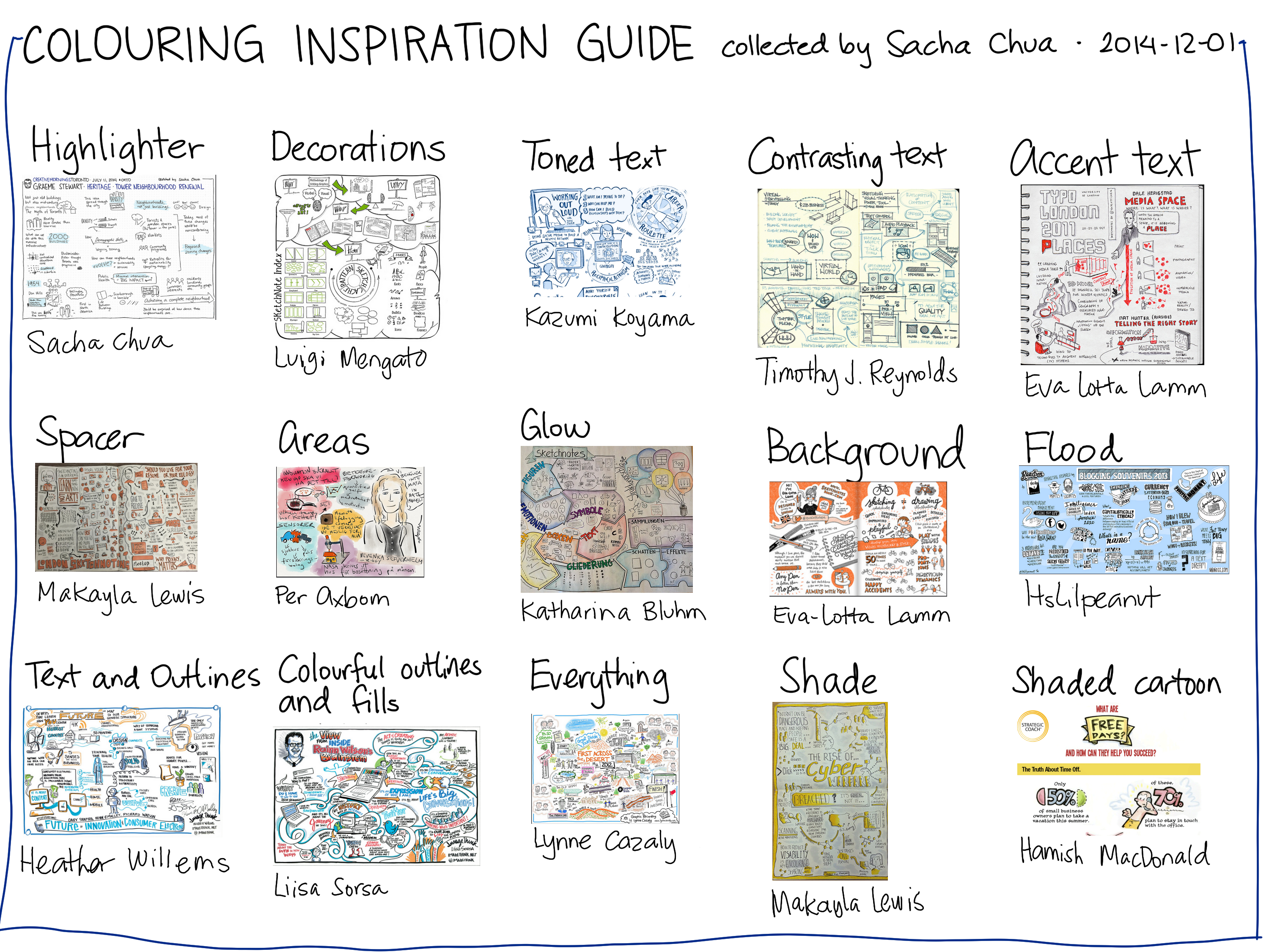
2014-12-01 Colouring inspiration guide – drawing
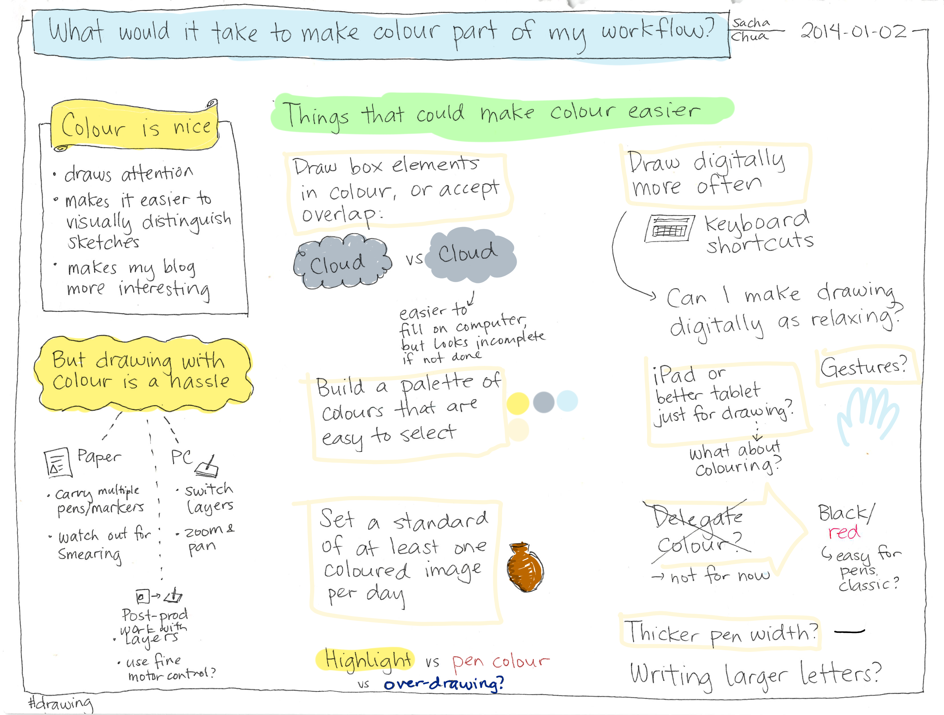
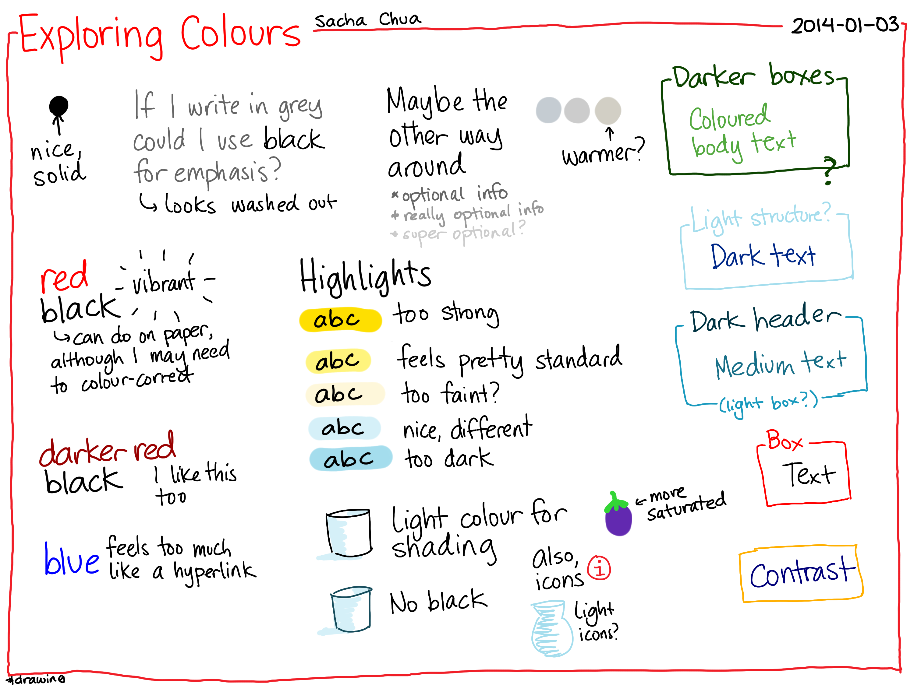
Building a habit of drawing with colours (January 2014)
Sketchnote Lesson: Adding color (September 2013)
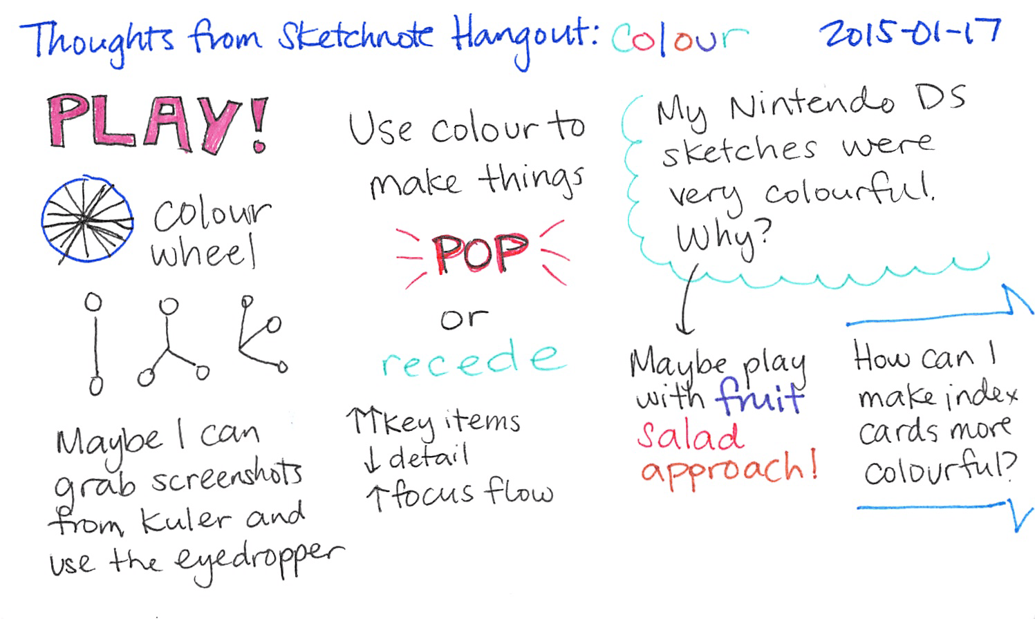
This time! Really! It helps that I’ve added a red pen and a green pen to the ones I carry around in my vest, and that I make myself use them when I use index cards. Digitally, I’m forcing myself to expand my colour vocabulary. Since Adobe Color CC (formerly Kuler) lets you pick a pleasing colour scheme (you can also trust in the gods of randomness or popularity), I’m less likely to have the angry-fruit-salad effect, and I can push myself by using arbitrary colours until I develop a sense of what feels better. Next time I sketch on my computer, if my colour scheme isn’t already set based on a book, I might grab a screenshot and use the eyedropper to pick out colours from that.
Someday I might get back to that sheer primary-colour exuberance of my Nintendo DS sketches. Someday.
In the meantime, you may want to check out other people’s colour experiments:
- Mauro Toselli (and his earlier one)
- Rob Dimeo
3 comments
Alan
2015-01-27T19:03:56ZGetting at something I don't remember, squirrelled away many years ago, about color. Only a blur, about the psychological effectiveness of color. Probably a delusion. Something like, color is less significant in the mind than shape?
A growing amount of information passes through my notice indicating that color may be more significant than I had gotten to believe. Is color fluff? Maybe not so much?
sachac
2015-01-28T18:18:38ZColour seems to be a good way of drawing my attention to something, so maybe I'll play around with it a bit more. =) It's easier to pick out than shape is, sometimes.
hmelman
2015-02-11T21:29:27ZI've long used a multicolor pen so I've been able to use color in notes. I use it sparingly and usually with purpose. As much as possible I keep the content monochromatic but I'll use the secondary color for meta things (things to lookup later, action items, questions I have at the time but can't ask, etc.). I'll also use the second color to correct mistakes in or annotate earlier notes. So I use it not to decorate but to indicate something like a different audience or different context.