Thinking about webpage margins
| blogging, designI want to write more, and I want to enjoy going through my archive. Some posts are long, especially those that come from transcripts. If I sat with the ideas for longer, I might be able to make them more concise or break them up into more atomic notes; but I also want to get things out faster in order to learn from potential conversations. So I'm thinking about text structure and margins, since I want to re-read my blog more and I sometimes glaze over when there's lots of text.
More headings are a good start. Org Mode makes it
easy enough to add them: M-RET calls
org-insert-heading.
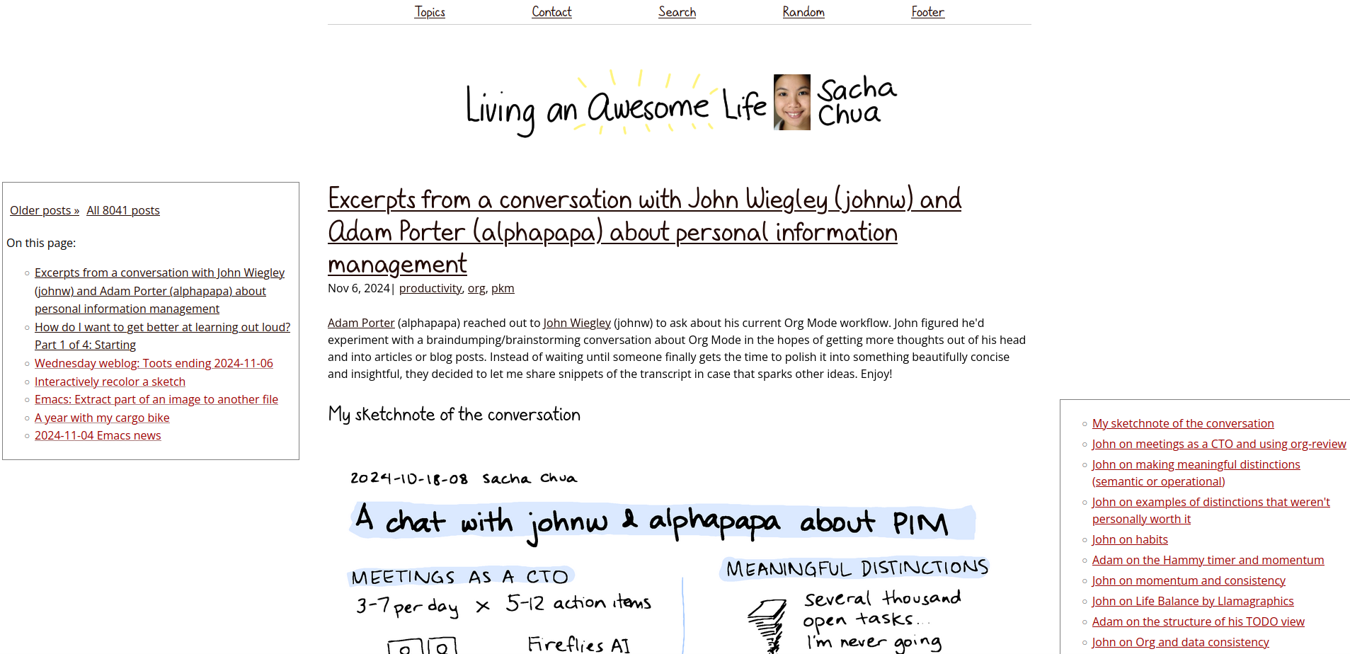
I'm experimenting with sticky tables of contents on large screens: one for "on this page" on the left, and one for long posts on the right.

On the individual post page, it'll just be the table of contents for the post, like this one.

It feels a little busy. If I write some Javascript, I might be able to use IntersectionObservers to highlight where we are. Maybe I can even squeeze the article's TOC into the "on this page" TOC if there is one, which means it can stay on one side.
I want to do other things with the margins. Doodles for fun? My cargo bike post started with the doodles pulled all the way into the margins, and then I moved them back into the text so that I don't have to worry about bumping into the table of contents.

Sometimes I use a sketchnote to help me think through or summarize a topic. It might be fun to use the sketchnote as a table of contents or overview, maybe even highlighting different sections of it as I scroll. handwritten.blog uses mix-blend-mode for hyperlinks. If the SVG isn't too big, maybe I can use the same kind of technique I used in animating SVG topic maps with Inkscape. Alternatively, I could put extracted regions from the sketchnote in the margins for context and visual variety.
Sidenotes? I like how A Scripter's Notes has both an active, expanding TOC on the right as well as side notes on the left.

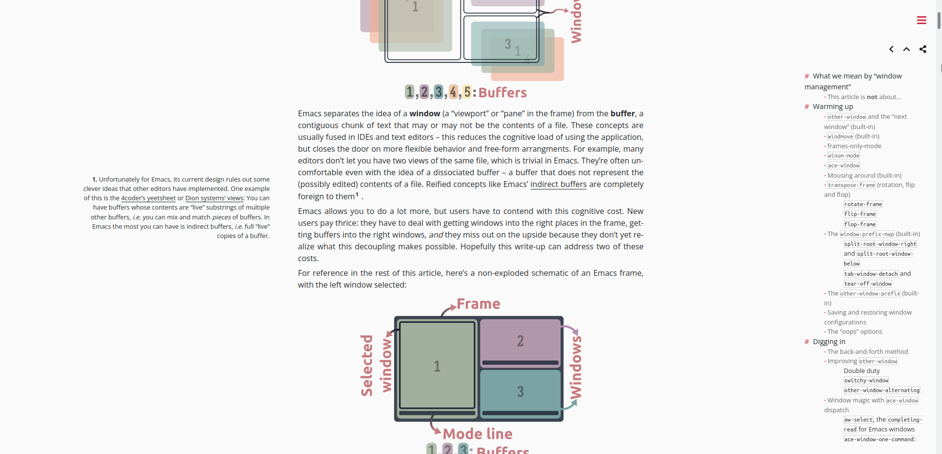
Karthinks uses a sticky TOC and sidenotes:

A Blog With Relevant Information uses just sidenotes, so the rest of the page feels pretty clear:

Maybe keywords, like the Cornell method of note-taking? Kind of like sidenotes, but more structural, for skimming. I'm having a hard time finding a blog example, though. If I figure out side nodes, I could probably just use a different style to indicate those Cornell-style cues.
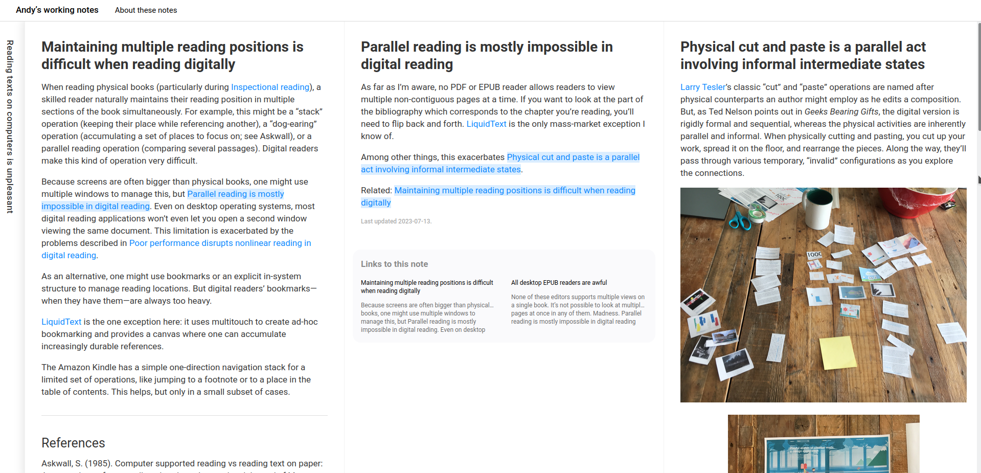
But there's so much more I want to do with the space. I like the stacking of https://notes.andymatuschak.org , and I like that you can link to a particular stacked state.

Then every so often, I come across a blog that is just clean and refreshing and then I want to get rid of everything in the margins.
There are plenty of CSS and JS resources out there. Figuring out what I want is the tough part.
