Adding subheadings and sketches to my blog page navigation

Posted: - Modified: | 11ty, blogging

[2025-04-04 Fri]: Fixed link to onThisPage.cjs. Thanks to John Rakestraw for pointing it out!

Assumed audience:

  • My future self, when I'm trying to figure out where to change things if I want to implement something similar
  • People who like tweaking their blog's CSS, especially if they also use Org Mode or 11ty

Headings help us make sense of longer blog posts. Heading links are like signposts letting you know what's ahead and where you can take a shortcut to get to what you're interested in.

Headings are useful for me too. Sometimes I browse my blog and come across things I've completely forgotten writing about, so the headings can help me remember without having to reread long posts. If I use headings more often, I might be able to work with bigger chunks of thoughts. If I can work with bigger chunks of thoughts, then maybe I can think about more things that are hard to fit within the limits of my working memory. Making headings more navigable also means I might not have to worry about the tangents I go on and the number of different thoughts I try to smoosh together, if people can jump straight to the parts that sound relevant to them.

I particularly like the way Karthik uses a sticky table of contents for long blog posts like The Emacs Window Management Almanac | Karthinks. I also like the way the Read the Docs Sphinx Theme displays a nested table of contents on the left side on wide screens. I use org-html-themes to export Org Mode files with that theme when I want to be fancy, like my Emacs configuration (usually works, although sometimes my config is broken).

The last time I tinkered with my webpage margins, I put my "On this page" list on the left side and the blog post headings (if any) on the right side, mostly because it was easy to do. I just changed the margin and float attributes of the element with the subheadings. I'd like to clear up more space for potential sidenotes or doodles, though. This time, I experimented with nesting the blog navigation inside the "On this page" navigation on the left side.
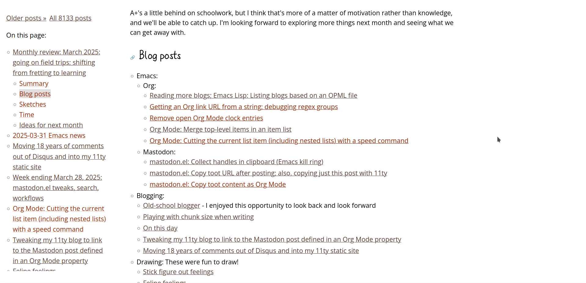
2025-04-02_14-04-30.png
Figure 1: A screenshot of my blog showing the nested links

Here's how I did it:

Org Mode: where I start writing

I use Org Mode's table of contents directive to include a table of contents in blog posts. I wrap it inside a sticky-toc block to indicate when I want it to be part of the sticky table of contents on my blog. In Org Mode, the syntax looks like this:

#+begin_sticky-toc
#+TOC: headlines 2 local
#+end_sticky-toc

I put it in a yasnippet so that I don't have to remember it. I just type tocs (for TOC, sticky) and then press TAB to complete it.

11ty static site generator: on this page

After exporting individual HTML files from Org Mode, I turn them into my blog using the 11ty static site generator. To simplify my archive pages, I have an onThisPage shortcode which lists the posts on that page. I changed it to include the sticky-toc contents from the items' templateContent attributes.

const { JSDOM } = require('jsdom');

module.exports = function (eleventyConfig) {
  function formatPostLine(item, index) {
    let subtoc = '';
    if (item.templateContent?.match(/sticky-toc/)) {
      const doc = new JSDOM(item.templateContent).window.document;
      const sub = doc.querySelector('.sticky-toc ul, .sticky-toc div, .sticky-toc-after-scrolling div');
      if (sub) {
        if (sub.querySelector('.panzoom')) {
          console.log('remove panzoom');
          sub.querySelector('.panzoom').classList.remove('panzoom');  // don't do panzoom for now
        }
        sub.classList.remove('panzoom');
        subtoc = sub.outerHTML;
      }
    }
    return `<li><a class="toc-link" data-index="index${index}" href="${item.url}">${item.data.title}</a>${subtoc}</li>`;
  }
  eleventyConfig.addShortcode('onThisPage', function (list) {
    return `<nav class="on-this-page">
On this page:
<ul>
${list.map(formatPostLine).join("\n")}
</ul>
</nav>`;
  });
};

And then there's a bunch of CSS in assets/css/style.css:

CSS
/* tables of contents */
.on-this-page > ul > li > ul, .on-this-page > ul > li > div { display: none }

@media only screen and (width >= 95em) {
    html, body { overflow-x: unset; }

    .sticky-toc, .sticky-left, .sticky-right {
        font-size: var(--fs-sm);
        width: calc((100vw - var(--body-max-width) - 5rem)/2);
        position: sticky;
        max-height: calc(100vh - 2rem);
        overflow-y: auto;
        scroll-behavior: smooth;
        background: var(--modus-bg-main);
        top: 0;
        padding: 1rem;
    }

    article .sticky-toc {
        display: none
    }

    .single-post article .sticky-toc {
        display: block;
    }

    .sticky-toc, .sticky-left, .single-post article .sticky-toc {
        margin-left: calc((-100vw + var(--body-max-width))/2);
        float: left;
    }

    .sticky-right {
        margin-right: calc((-100vw + var(--body-max-width))/2);
        float: right;
    }

    /* Hide the TOCs for non-active posts, but only if JS is enabled */
    .js .on-this-page > ul > li > ul, .js .on-this-page > ul > li > div { display: none }
    .on-this-page > ul > li.post-active > ul, .on-this-page > ul > li.post-active > div { display: block }

    .active { background-color: var(--modus-bg-tab-bar) }

    .sticky-toc svg .active rect {
        fill: var(--modus-bg-tab-bar) !important;
        fill-opacity: 1 !important;
        mix-blend-mode: darken;
        stroke-dash-array: unset !important;
        stroke-width: 4px;
    }

    .link-to-nonsticky-toc {
        display: none
    }
}


I also have some Javascript to highlight the active post and show the subheadings for it in assets/js/misc.js.

Javascript
/* Table of contents */

function stickyTocAfterScrolling() {
  const elements = document.querySelectorAll('.single-post .sticky-toc-after-scrolling');
  let lastScroll = window.scrollY;

  elements.forEach(element => {
    const clone = element.cloneNode(true);
    clone.setAttribute('class', 'sticky-toc');
    clone.querySelector('.panzoom')?.classList.remove('panzoom');
    element.parentNode.insertBefore(clone, element.nextSibling);
  });

  const observer = new IntersectionObserver(
    (entries) => {
      const currentScroll = window.scrollY;
      const scrollingDown = currentScroll > lastScroll;
      lastScroll = currentScroll;

      entries.forEach(entry => {
        const element = entry.target;
        const clone = cloneMap.get(element);

        if (!entry.isIntersecting && scrollingDown) {
          clone.setAttribute('class', 'sticky-toc');
          clone.style.display = 'block';
        } else if (entry.isIntersecting && !scrollingDown) {
          element.style.visibility = 'visible';
          clone.style.display = 'none';
        }
      });
    },
    {
      root: null,
      threshold: 0,
      rootMargin: '-10px 0px 0px 0px'
    }
  );

  elements.forEach(element => {
    observer.observe(element);
  });

  window.addEventListener('resize', () => {
    elements.forEach(element => {
      const clone = cloneMap.get(element);
      if (clone.style.display != 'none') {
        // reset didn't seem to work
        svgPanZoom(clone.querySelector('svg')).destroy();
        addPanZoomToElement(clone.querySelector('svg'));
      }
    });
  }, { passive: true });
}

stickyTocAfterScrolling();

function scrollToActiveTocLink() {
  const activeLink = document.querySelector('.sticky-toc .active');
  const tocContainer = document.querySelector('.sticky-toc');
  if (!activeLink || !tocContainer) return;
  const tocRect = tocContainer.getBoundingClientRect();
  const linkRect = activeLink.getBoundingClientRect();
  if (linkRect.top < tocRect.top || linkRect.bottom > tocRect.bottom) {
    const scrollPosition = linkRect.top + tocContainer.scrollTop -
                          (tocRect.height / 2) + (linkRect.height / 2);
    tocContainer.scrollTo({
      top: scrollPosition,
      behavior: 'smooth'
    });
  }
}
function getVisibleArticle() {
  const viewportHeight = window.innerHeight || document.documentElement.clientHeight;
  return [...document.querySelectorAll('article')].find((article) => {
    const rect = article.getBoundingClientRect();
    const visibleTop = Math.max(0, rect.top);
    const visibleBottom = Math.min(viewportHeight, rect.bottom);
    const visibleHeight = Math.max(0, visibleBottom - visibleTop);
    return visibleHeight > 0; // find the first visible one
  });
}

function handleActiveTOCLink() {
  const updateActive = function(links, active) {
    const activeFragment = active.includes('#') ?
          active.substring(active.indexOf('#')) : '';
    links.forEach(link => {
      const href = link.getAttribute('href');
      if (href.includes(window.location.origin)) {
        link.classList.toggle('active', href == active)
      } else if (href.startsWith('#')) {
        link.classList.toggle('active', href == activeFragment);
      }
    });
  };
  const posts = document.querySelectorAll('.post');
  const tocLinks = document.querySelectorAll('.on-this-page .toc-link');
  const options = {
    root: null,
    rootMargin: '-20% 0px -70% 0px',
    threshold: 0
  };
  const observer = new IntersectionObserver((entries) => {
    entries.forEach(entry => {
      if (entry.isIntersecting) {
        const id = entry.target.id;
        const link = document.querySelector(`.toc-link[data-index="${id}"]`);
        document.querySelectorAll('.sticky-toc .active').forEach((o) => o.classList.remove('active'));
        document.querySelectorAll('.post-active').forEach((o) => o.classList.remove('post-active'));
        if (link) {
          link.classList.add('active');
          const item = link.closest('li');
          item.classList.add('post-active');
        }
      }
    });
    scrollToActiveTocLink();
  }, options);
  posts.forEach((post) => { observer.observe(post); });

  const stickyTocLinks = document.querySelectorAll('article .sticky-toc a, .on-this-page a');
  const postTocObserver = new IntersectionObserver((entries) => {
    entries.forEach(entry => {
      if (entry.isIntersecting) {
        const id = entry.target.id;
        const url = window.location.origin + window.location.pathname + '#' + id.replace(/^outline-container-/, '');
        updateActive(stickyTocLinks, url);
      }
    });
    scrollToActiveTocLink();
  }, options);

  document.querySelectorAll('article .sticky-toc, article .sticky-toc-after-scrolling').forEach((toc) => {
    const post = toc.closest('article');
    if (post) {
      post.querySelectorAll('.outline-2, .outline-3').forEach((section) => { postTocObserver.observe(section) });
    }
  });
  const visible = getVisibleArticle();
  const id = visible?.id;
  if (id) {
    const activeLink = document.querySelector(`.toc-link[data-index="${id}"]`);
    if (activeLink) {
      activeLink.classList.add('active');
      activeLink.closest('li').classList.add('post-active');
      scrollToActiveTocLink();
    }
  }
}
handleActiveTOCLink();

I can use a sketch as a map, too

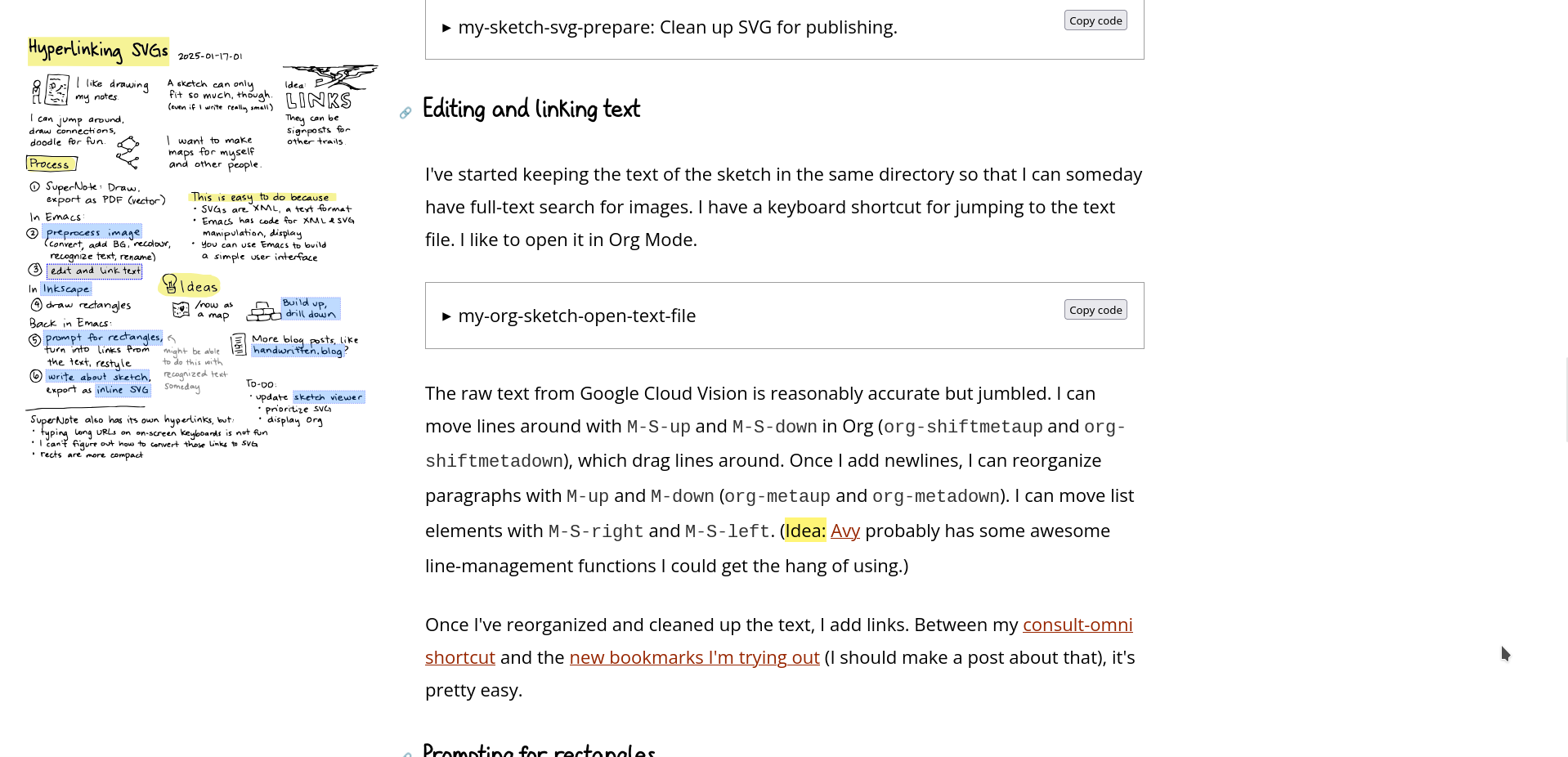
I sometimes want to use sketchnotes as overviews, especially if I've added hyperlinks to them. I used to make the images show up on the right side, but now I want them to show up in the left-side navigation instead. Also, I wanted any links to headings to automatically get recoloured as I scroll to that heading.

2025-04-02-scrolling-svg.gif
Figure 2: Animated GIF showing how the SVG highlights change as you scroll down

I added a special case to the handleActiveTOCLink function to handle anchor hyperlinks (just #anchor) in the SVG. It probably makes sense to make those absolute URLs, which means slightly changing my workflows for hyperlinking SVGs and writing about sketches.

So on both the category page (ex: the Hyperlinking SVGs entry in category - drawing, which might have moved off the first page of results if you're reading this far in the future) and the single-post page (ex: Hyperlinking SVGs), there's a full-sized version of the image in the main blog post, and then a small copy of it in the margin on the left. The sidebar copy is probably too small to read, but it might be enough to get a sense of spatial relationships, and the links also have title attributes that are displayed as tooltips when you hover.

2025-04-03_14-28-48.png
Figure 3: Screenshot of small image in sidebar on the single post page

I use Javascript to duplicate the image and make a small, sticky version because I haven't quite figured out how to properly make it sticky when off-screen with just CSS. Even my JS feels a little tangled. Maybe this would be a good excuse to learn about web components; someone's probably figured out something polished.

I'm curious about using more drawings to anchor my thinking and structure my blog posts.

Progressive enhancement

Some people read my blog using EWW (the Emacs Web Wowser, of course), so I want my blog to be reasonable even without CSS and JS.

A number of people read my blog without Javascript enabled. I installed the Firefox extension Script Switch so that I can test my blog with and without Javascript whenever I remember.

I sometimes look up my blog posts on my phone and there's no space for any of this fanciness there, so it'll only kick in on large screens. My CSS file is littered with various breakpoints I've cargo-culted over the years and I should simplify it at some point. At the moment, if it looks fine on my Lenovo P52, I'm happy.

Other ideas and next steps

Theoretically, the right margin is now available for sidenotes, so I might be able to look at ox-tufte and Eleventufte and get something going. Then I'll have a way to add small notes that are shorter than a paragraph. Longer tangents can go in a details/summary element instead, although I have it on good authority that one can write at length in footnotes. I love the footnotes in the Bartimaeus series, and apparently there are quite a few books where the footnotes are part of the storytelling.)

It might be nice to let tables extend into the right sidebar when I know I won't have a doodle nearby. Incidentally, Sidenotes In Web Design ยท Gwern.net uses breadcrumbs in the left sidebar instead of a table of contents, so there's more space for tables and sidenotes.

I thought about using CSS breakpoints so that on a medium-sized screen, we can have the left sidebar even if there's no space for something on the right. I haven't gotten around to experimenting with it yet, though. Besides, I don't know yet if I want to prioritize the stuff I want in the right sidebar (side notes, doodles) over fairly-static navigation.

As I mentioned, it might be handy to tweak my SVG linking workflow to use absolute URLs.

Sometimes I look up my notes within Emacs, but surprisingly often, I look them up on the Web. Navigation isn't just cosmetic. I want to get better at using my blog as a tool for thought, so tinkering with layout isn't just window dressing. It's (very slowly) experimenting with scaffolding for my brain. Little things can help!