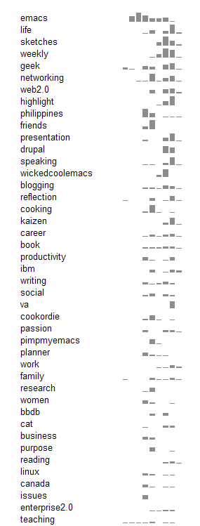
Visualization of my blog categories
Posted: - Modified: | visualization, blogging, visualThis visualizes how often I blogged something with a tag in a given year, sorted by all-time popularity. There are more categories, but I skipped them. The height of each block represents how many blog posts I wrote in that category, while the different blocks represent the years, ending with 2010 at the far right. The graph reflects changing interests and recurring themes.
This visualizes some of the things I’ve been writing about in 2010. We’re only a month in, so the last line is pretty small, and in some cases (n < 4) not even visible.
Sparkline bar graphs created with Sparklines for Excel. Initial categories table created with the following SQL incantation:
select p.post_date, p.post_title, terms.name from wp_posts p inner join wp_term_relationships tr on p.id=tr.object_id inner join wp_term_taxonomy tt on tr.term_taxonomy_id=tt.term_taxonomy_id inner join wp_terms terms on tt.term_id=terms.term_id into outfile '/tmp/categories.csv';
then imported and tweaked in Microsoft Excel.


5 comments
Jo Jordan
2010-02-13T23:24:35ZSo clever. What was the data file?
Sacha Chua
2010-02-15T22:14:39ZThe data file was a CSV created using the SQL statement above. It had the post date, title, and category name. I then used the YEAR function in Microsoft Excel to extract just the year, and I used a pivot table to sum it all up. I could've done that in SQL too (the summary, and probably the year calculation too), but pulling in the raw post data meant that I could slice and dice it in other ways.
Jo Jordan
2010-02-15T22:44:39ZThanks Sacha. I think I would have to export a CSV file from Wordpress.com Then I can find my way though Excel from there.
Great idea!
Sacha Chua
2010-02-16T18:52:27ZOh, that's what you meant. =) Yes, you'll probably have to export your posts and then figure out what to do with them. One of the perks of hosting my own Wordpress installation is that I can play around with the database myself.
Jo Jordan
2010-02-17T22:49:09ZGood point. I am in the process of migrating my blog. Maybe I should do that first.