In February, I started adding emojis to my monthly summaries. I added emojis to the lines for the text versions of my monthly sketches, then used a little bit of Emacs Lisp to convert that into HTML code with the text as a tooltip. I wondered what it might be like to represent a lot of days very densely. Would the constrained vocabulary of emojis be enough to give me a sense of the time, combined with the ability to hover over the emojis to see the keywords I wrote for that day?
Not bad. I can see the campfire and s'mores days (🔥), the time we were sick (🌡️), the shift from skating and sledding to biking and swimming, the days when I focused on sewing. In contrast, here are the monthly calendar sketches:
Hmm. I'm primarily interested in episodic memory retrieval and pattern recognition. The emoji summaries might be better at showing repetition because of the constrained vocabulary and the density is neat, but they're not quite expressive enough to resonate with me. I don't like hovering to see the tooltip, but by itself, the emoji doesn't usually have enough information to trigger my memory (either on its own or as part of the episodic context). Emojis and text also open up the possibility of an "on this day" slice, but I can get that with the plain text or by adding an on-this-day.rss to my web-based journal viewer with maybe some kind of private feed in our local network.
The sketches are more fun to flip through, especially now that I'm adding more colour to them. I can show repetition through background colour or icons in my monthly sketches. If I click on these images in my blog post or in my public sketchbook (ex: monthly sketches) using either my laptop or my tablet, I can page through them quickly, like the idea of rapid serial visual presentation 1. (This is great! Now I'm tempted to figure out how to disable all animations for BiggerPicture for just that bit of extra speed, which I think is a matter of tinkering with mediaTransition…) I wonder what it would take to have an automatic "on this day" slice for my monthly calendar sketches. Maybe if I was stricter about using a template so that I can automatically extract boxes from it, or maybe if I can use recognized numbers to figure out the layout… Definitely a someday thing, but could be an interesting challenge.
Do I want to do these emoji summaries long-term? Someone summarized 5 years of diary entries as emojis, and of course there's an app to do this too. Even on a larger scale, though, I think I might just get a few "huh, how about that" moments out of it rather than "wow, that's amazing." I think that if I continue with my daily sketches, that's probably more fun for me to make and review, and it still contains enough information to allow me to map the days to emojis later on if I want to. I can probably discontinue this emoji experiment. I'm glad I explored it, though.
In case you're curious about the Emacs Lisp code for extracting the emoji summaries, here's the function. It looks for the top-level blog post, scans for lines matching "dayNum. (emoji) text summary of day", and then turns that into the appropriate span, including links if there are any.
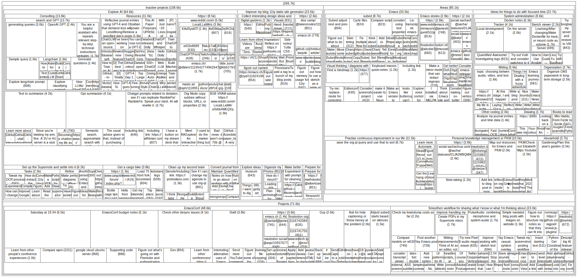
[2025-01-12 Sun]: u/dr-timeous posted a treemap_org.py · GitHub that makes a coloured treemap that displays the body on hover. (Reddit) Also, I think librsvg doesn't support wrapped text, so that might mean manually wrapping if I want to figure out the kind of text density that webtreemap has.
One of the challenges with digital notes is that
it's hard to get a sense of volume, of mass, of
accumulation. Especially with Org Mode, everything
gets folded away so neatly and I can jump around
so readily with C-c j (org-goto) or C-u C-c
C-w (org-refile) that I often don't stumble
across the sorts of things I might encounter in a
physical notebook.
Treemaps are a quick way to visualize hierarchical
data using nested rectangles or squares, giving a
sense of relative sizes. I was curious about what
my main organizer.org file would look like as a
treemap, so I wrote some code to transform it into
the kind of data that
https://github.com/danvk/webtreemap wants as
input. webtreemap creates an HTML file that uses
Javascript to let me click on nodes to navigate
within them.
For this treemap prototype, I used
org-map-entries to go over all the headings and
make a report with the outline path and the size
of the heading. To keep the tree visualization
manageable, I excluded done/cancelled tasks and
archived headings. I also wanted to exclude some
headings from the visualization, like the way my
Parenting subheading has lots of personal
information underneath it. I added a :notree:
tag to indicate that a tree should not be
included.
Screencast of exploring a treemap
Reflections
Figure 1: Screenshot of the treemap for my organizer.org
The video and the screenshot above show the
treemap for my main Org Mode file,
organizer.org. I feel like the treemap makes it
easier to see projects and clusters where I'd
accumulated notes, both in terms of length and
quantity. (I've omitted some trees like
"Parenting" which take up a fairly large chunk of
space.)
To no one's surprise, Emacs takes up a large part
of my notes and ideas. =)
When I look at this treemap, I notice a bunch of
nodes I need to mark as DONE or CANCELLED
because I forgot to update my organizer.org. That
usually happens when I come up with an idea, don't
remember that I'd come up with it before, put it
in my inbox.org file, and do it from there or from
the organizer.org location I've refiled it to
without bumping into the first idea. Once in a
blue moon, I go through my whole organizer.org
file and clean out the cruft. Maybe a treemap like
this will make it easier to quickly scan things.
Interestingly, "Explore AI" takes up a
disproportionately large chunk of my "Inactive
Projects" visualization, even though I spend more
time and attention on other things. Large language
models make it easy to generate a lot of text, but
I haven't really done the work to process those.
I've also collected a lot of links that I haven't
done much with.
It might be neat to filter the headings by
timestamp so that I can see things I've touched in
the last 6 months.
Hmm, looking at this treemap reminds me that I've
got "organizer.org/Areas/Ideas for things to do
with focused time/Writing/", which probably should
get moved to the posts.org file that I tend to
use for drafts. Let's take look at the treemap for
that file. (Updated: cleared it out!)
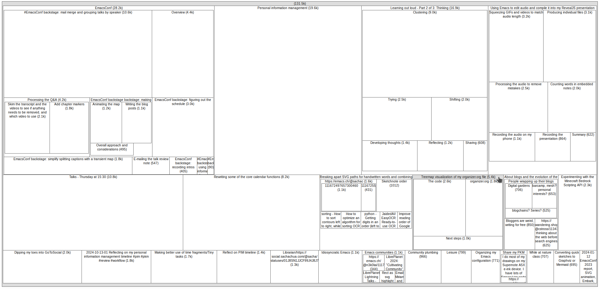
Figure 2: Drafts in my posts.org
Unlike my organizer.org file, my posts.org
file tends to be fairly flat in terms of
hierarchy. It's just a staging ground for ideas
before I put them on my blog. I usually try to
keep posts short, but a few of my posts have
sub-headings. Since the treemap makes it easy to
see nodes that are larger or more complex, that
could be a good nudge to focus on getting those
out the door. Looking at this treemap reminds me
that I've got a bunch of EmacsConf posts that I
want to finish so that I can document more of our
processes and tools.
Figure 3: Treemap of my inbox
My inbox.org is pretty flat too, since it's
really just captured top-level notes that I'll
either mark as done or move somewhere else
(usually organizer.org). Because the treemap
visualization tool uses / as a path separator,
the treemap groups headings that are plain URLs
together, grouped by domain and path.
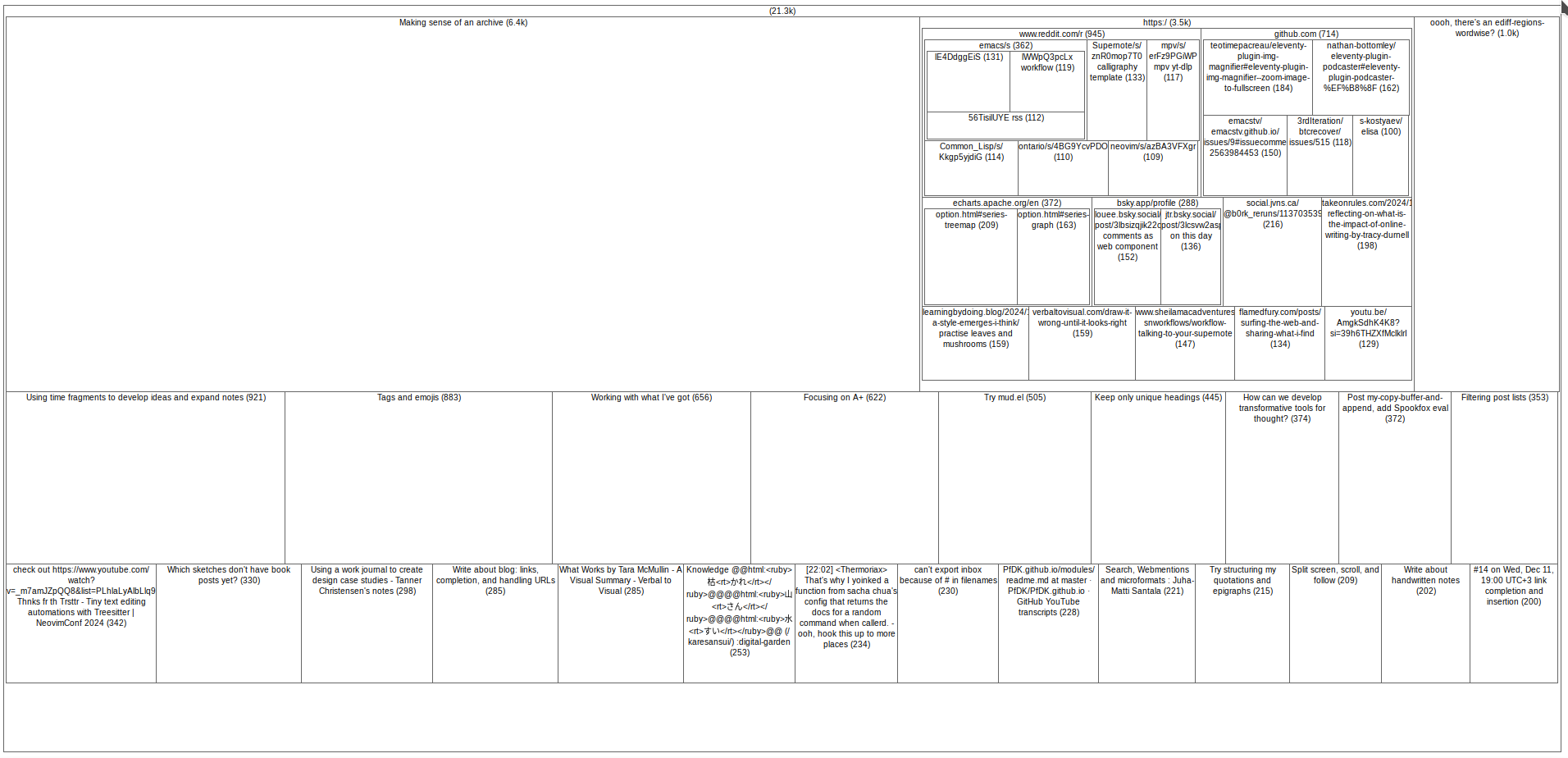
Figure 4: Treemap of my Emacs configuration
My Emacs configuration is organized as a
hierarchy. I usually embed the explanatory blog
posts in it, which explains the larger nodes. I
like how the treemap makes it easy to see the
major components of my configuration and where I
might have a lot of notes/custom code. For
example, my config has a surprising amount to do
with multimedia considering Emacs is a text
editor, and that's mostly because I like to tinker
with my workflow for sketchnotes and subtitles.
This treemap would be interesting to colour based
on whether something has been described in a blog
post, and it would be great to link the nodes in a
published SVG to the blog post URLs. That way, I
can more easily spot things that might be fun to
write about.
There's another treemap visualization tool that
can produce squarified treemaps as coloured SVGs,
so that style might be interesting to explore too.
Next steps
I think there's some value in being able to look
at and think about my outline headings with a
sense of scale. I can imagine a command that shows
the treemap for the current subtree and allows
people to click on a node to jump to it (or maybe
shift-click to mark something for bulk action), or
one that shows subtrees summing up :EFFORT:
estimates or maybe clock times from the logbook,
or one limited by a timestamp range, or one that
highlights matching entries as you type in a
query, or one that visualizes s-exps or JSON or
project files or test coverage.
It would probably be more helpful if the treemap
were in Emacs itself, so I could quickly jump to
the Org nodes and read more or mark something as
done when I notice it. boxy-headings uses text to
show the spatial relationships of nested headings,
which is neat but probably not up to handling this
kind of information density. Emacs can also
display SVG images in a buffer, animate them, and
handle mouse-clicks, so it could be interesting to
implement a general treemap visualization which
could then be used for all sorts of things like
disk space usage, files in project modules, etc.
SVGs would probably be a better fit for this
because that allows increased text density and
more layout flexibility.
It would be useful to browse the treemap within
Emacs, export it as an SVG so that I can include
it in a webpage or blog post, and add some
Javascript for web-based navigation.
The Emacs community being what it is (which is
awesome!), I wouldn't be surprised if someone's
already figured it out. Since a quick search
for treemap in the package archives and various
places doesn't seem to turn anything up, I thought
I'd share these quick experiments in case they
resonate with other people. I guess I (or someone)
could figure out the squarified treemapping
algorithm or the ordered treemap algorithm in
Emacs Lisp, and then we can see what we can do
with it.
I've also thought about other visualizations that
can help me see my Org files a different way.
Network graphs are pretty popular among the
org-roam crew because org-roam-ui makes them.
Aside from a few process checklists that link to
headings that go into step-by-step detail and
things that are meant to graph connections between
concepts, most of my Org Mode notes don't
intentionally link to other Org Mode notes. (There
are also a bunch of random org-capture context
annotations I haven't bothered removing.) I tend
to link to my public blog posts, sketches, and
source code rather than to other headings, so
that's a layer of indirection that I'd have to
custom-code. Treemaps might be a good start,
though, as they take advantage of the built-in
hierarchy. Hmm…
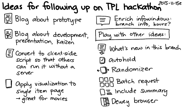
UPDATE 2015-11-27: Here's the video of my hackathon pitch:
UPDATE 2015-11-18: I figured out how to make this entirely client-side, so you don't have to run a separate server. First, install either Tampermonkey (Chrome) or Greasemonkey (Firefox). Then install the user script insert-visualize-link.user.js , and the Visualize link should appear next to the library branch options on Toronto Public Library search result pages. See the Github repository for more details.
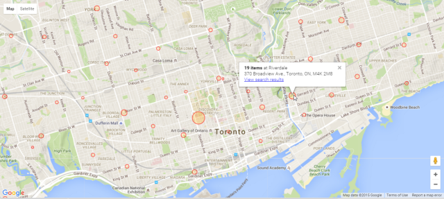
Yay! My neighbourhood library visualization won at the Toronto Public Library hackathon. It added a Visualize link to the search results page which mapped the number of search results by branch. For example, here's a visualization of a search that shows items matching "Avengers comics".
It's a handy way to see which branches you might want to go to so that you can browse through what's there in person.
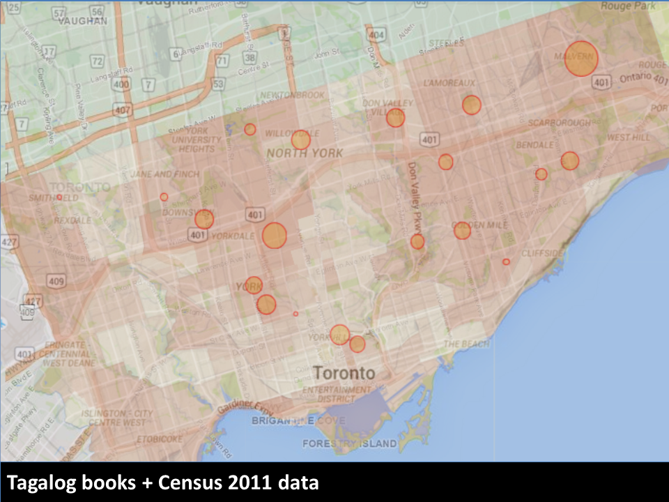
Librarians could also use it to help them plan their selections, since it's easy to see the distribution across branches. For example, here's the visualization for books in Tagalog.
The collections roughly match up with Wellbeing Toronto's data on Tagalog as the home language, although there are some areas that could probably use collections of their own.
Incidentally, I was delighted to learn that Von Totanes had done a detailed analysis of the library's Filipino collections in the chapter he wrote in Filipinos in Canada: Disturbing Invisibility (Coloma, McElhinny, and Tungohan, 1992). Von sent me the chapter after I mentioned the hackathon on Facebook; yay people bumping into other people online!
Personally, I'm looking forward to using this visualization to see things like which branches have new videos. Videos released in the past year can only be borrowed in person – you can't request them online – so it's good to check branches regularly to see if they're there. It would be even better if the library search engine had a filter for "On the shelf right now", but in the meantime, this visualization tool gives me a good idea of our chances of picking up something new to watch while we're folding laundry. =)
The code works by extracting the branch names and totals on the left side of search pages and combining those with the locations of the branches (KML). I don't really need the server component, so I'm thinking of rewriting the script so that it runs entirely client-side – maybe as a Chrome extension or as a user script. That way, other people can play with the idea without running their own server (and without my having to keep a server around), and we can try it out without waiting for the library to integrate it into their website. That said, it would be totally awesome to get it into the interface of the Toronto Public Library! We'll just have to see if it can happen. =) Happy to chat with library geeks to get this sorted out.
It was fun working on this. W- decided to join me at the last minute, so it turned into a fun weekend of hanging out with my husband at the library. I wanted to keep my weekend flexible and low-key, so I decided not to go through the team matchmaking thing. W- found some comfy chairs in the corner of the area, I plugged in the long extension cord I brought, and we settled in.
I learned a lot from the hackathon mentors. In particular, I picked up some excellent search and RSS tips from Alan Harnum. You can't search with a blank query, but he showed me how you can start with a text string, narrow the results using the facets on the left side, and then remove the text string from the query in order to end up with a search that uses only the facets. He also showed me that the RSS feed had extra information that wasn't in the HTML source and that it could be paginated with URL parameters. Most of the RSS feeds I'd explored in the past were nonpaginated subsets of the information presented on the websites, so it was great to learn about the possibilities I had overlooked.
The faceted search was exactly what I needed to list recent videos even if I didn't know what they were called, so I started thinking of fun tools that would make hunting for popular new videos easier. (There have been quite a few times when I've gone to a library at opening time so that I could snag a video that was marked as available the night before!) In addition to checking the specific item's branch details to see where it was on the shelf and which copies were out on loan, I was also curious about whether we were checking the right library, or if other libraries were getting more new videos than our neighbourhood library was.
W- was curious about the Z39.50 protocol that lets you query a library catalogue. I showed him the little bits I'd figured out last week using yaz-client from the yaz package, and he started digging into the protocol reference. He figured out how to get it to output XML (format xml) and how to search by different attributes. I'm looking forward to reading his notes on that.
Me, I figured that there might be something interesting in the visualization of new videos and other items. I hadn't played around a lot with geographic visualization, so it was a good excuse to pick up some skills. First, I needed to get the data into the right shape.
Step 1: Extract the data and test that I was reading it correctly
I usually find it easier to start with the data rather than visualizations. I like writing small data transformation functions and tests, since they don't involve complex external libraries. (If you miss something important when coding a visualization, often nothing happens!)
I wrote a function to extract information from the branch CSV on the hackathon data page, using fast-csv to read it as an array of objects. I tested that with jasmine-node. Tiny, quick accomplishment.
Then I worked on extracting the branch result count from the search results page. This was just a matter of finding the right section, extracting the text, and converting the numbers. I saved a sample results page to my project and used cheerio to parse it. I decided not to hook it up to live search results until I figured out the visualization aspect. No sense in hitting the library website repeatedly or dealing with network delays.
Step 2: Make a simple map that shows library branches
I started with the Google Maps earthquake tutorial. The data I'd extracted had addresses but not coordinates. I tried using the Google geocoder, but with my rapid tests, I ran into rate limits pretty early. Then it occurred to me that with their interest in open data, the library was the sort of place that would probably have a file with branch coordinates in terms of latitude and longitude. The hackathon data page didn't list any obvious matches, but a search for Toronto Public Library KML (an extension I remembered from W-'s explorations with GPS and OpenStreetMap) turned up the file I wanted. I wrote a test to make sure this worked as I expected.
Step 3: Combine the data
At first I tried to combine the data on the client side, making one request for the branch information and another request for the results information. It got a bit confusing, though – I need to get the hang of using require in a from-scratch webpage. I decided the easiest way to try my idea out was to just make the server combine the data and return the GeoJSON that the tutorial showed how to visualize. That way, my client-side HTML and JS could stay simple.
Step 4: Fiddle with the visualization options
Decisions, decisions… Red was too negative. Blue and green were hard to see. W- suggested orange, and that worked out well with Google Maps' colours. Logarithmic scale or linear scale? Based on a maximum? After experimenting with a bunch of options, I decided to go with a linear scale (calculated on the server), since it made sense for the marker for a branch with a thousand items to be significantly bigger than a branch with five hundred items. I played with this a bit until I came up with maximum and minimum sizes that made sense to me.
Step 5: Hook it up to live search data
I needed to pass the URL of the search results, and I knew I wanted to be able to call the visualization from the search results page itself. I used TamperMonkey to inject some Javascript into the Toronto Public Library webpage. The library website didn't use JQuery, so I looked up the plain-vanilla Javascript way of selecting and modifying elements.
I wanted to display information on hover and filter search results on click. Most of the tutorials I saw focused on how to add event listeners to individual markers, but I eventually found an example that showed how to add a listener to map.data and get the information from the event object. I also found out that you could add a title attribute and get a simple tooltip to display, which was great for confirming that I had the data all lined up properly.
Step 7: Cache the results
Testing with live data was a bit inconvenient because of occasional timeouts from the library website, so I decided to cache search results to the filesystem. I didn't bother writing code for checking last modification time, since I knew it was just for demos and testing.
Step 8: Prettify the hover
The tooltip provided by title was a little bare, so I decided to spend some time figuring out how to make better information displays before taking screenshots for the presentation. I found an example that showed how to create and move an InfoWindow based on the event's location instead of relying on marker information, so I used that to show the information with better formatting.
Step 9: Make the presentation
Here's how I usually plan short presentations:
Figure out the key message and the flow.
Pick a target words-per-minute rate and come up with a word budget.
Draft the script, checking it against my word budget.
Read the script out loud a few times, checking for time, tone, and hard-to-say phrases.
Annotate the script with notes on visual aids.
Make visuals, take screenshots, etc.
Record and edit short videos, splitting them up in Camtasia Studio by using markers so that I can control the pace of the video.
Copy the script (or keywords) into the presenter's notes.
Test the script for time and flow, and revise as needed.
I considered two options for the flow. I could start with the personal use case (looking for new videos) and then expand from there, tying it into the library's wider goals. That would be close to how I developed it. Or I could start with one of the hackathon challenges, establish that connection with the library's goals, and then toss in my personal use case as a possibly amusing conclusion. After chatting about it with W- on the subway ride home from the library, I decided to start with the second approach. I figured that would make it easier for people to connect the dots in terms of relevance.
I used ~140wpm as my target, minus a bit of a buffer for demos and other things that could come up, so roughly 350 words for 3 minutes. I ran through the presentation a few times at home, clocking in at about 2:30. I tend to speak more quickly when I'm nervous, so I rehearsed with a slightly slower pace. That way, I could get a sense of what the pace should sound like. During the actual presentation, though, I was a teensy bit over time – there was a bit of unexpected applause. Also, even though I remembered to slow down, I didn't breathe as well as I probalby should've; I still tend to breathe a little shallowly when I'm on stage. Maybe I should pick a lower WPM for presentations and add explicit breathing reminders. =)
I normally try to start with less material and then add details to fit the time. That way, I can easily adjust if I need to compress my talk, since I've added details in terms of priority. I initially had a hard time concisely expressing the problem statement and tying together the three examples I wanted to use, though. It took me a few tries to get things to fit into my word budget and flow in a way that made me happy.
Anyway, once I sorted out the script, I came up with some ideas for the visuals. I didn't want a lot of words on the screen, since it's hard to read and listen at the same time. Doodles work well for me. I sketched a few images and created a simple sequence. I took screenshots for the key parts I wanted to demonstrate, just in case I didn't get around to doing a live demo or recording video. That way, I didn't have to worry about scrambling to finish my presentation. I could start with something simple but presentable, and then I could add more frills if I had time.
Once the static slides were in place, I recorded and edited videos demonstrating the capabilities. Video is a nice way to give people a more real sense of how something works without risking as many technical issues as a live demo would.
I had started with just my regular resolution (1366×768 on my laptop) and a regular browser window, but the resulting video was not as sharp as it could have been. Since the presentation template had 4:3 aspect ratio, I redid the video with 1024×768 resolution and a full-screen browser in order to minimize the need for resizing.
I sped up boring parts of the video and added markers where I wanted to split it into slides. Camtasia Studio rendered the video into separate files based on my markers. I added the videos to individual slides, setting them to play automatically. I like the approach of splitting up videos onto separate slides because it allows me to narrate at my own pace instead of speeding up or slowing down to match the animation.
I copied the segments of my script to the presenter notes for each slide, and I used Presenter View to run through it a few more times so that I could check whether the pace worked and whether the visuals made sense. Seemed all right, yay!
Just in time, too. I had a quick lunch and headed off to the library for the conclusion of the hackathon.
There wsa a bit of time before the presentations started. I talked to Alan again to show him what I'd made, hear about what he had been working on, and pick his brain to figure out which terms might resonate with the internal jargon of the library – little things, like what they call the people who decide what kinds of books should be in which libraries, or what they call the things that libraries lend. (Items? Resources? Items.) Based on his feedback, I edited my script to change "library administrators" to "selection committees". I don't know if it made a difference, but it was a good excuse to learn more about the language people used.
I tested that the presentation displayed fine on the big screen, too. It turned out that the display was capable of widescreen input at a higher resolution than what I'd set, but 1024×768 was pretty safe and didn't look too fuzzy, so I left it as it was. I used my presentation remote to flip through the slides while confirming that things looked okay from the back of the room (colours, size, important information not getting cut off by people's heads, etc.). The hover text was a bit small, but it gave the general idea.
And then it was presentation time. I was third, which was great because once I finished, I could focus on other people's presentations and learn from their ideas. Based on W-'s cellphone video, it looks like I remembered to use the microphone so that the library could record, and I remembered to look up from my presenter notes and gesture from time to time (hard when you're hidden behind the podium, but we do what we can!). I stayed pretty close to my script, but I hope I kept the script conversational enough that it sounded more like me instead of a book. I didn't have the mental bandwidth to keep an eye on the timer in the center of the presenter view, but fortunately the time worked out reasonably well. I concluded just as the organizer was getting up to nudge me along, and I'd managed to get to all the points I wanted to along the way. Whew!
Anyway, that's a quick braindump of the project and what it was like to hack it together. I'll probably write some more about following up on ideas and about other people's presentations, but I wanted to get this post out there while the experience was fresh in my head. It was fun. I hope the Toronto Public Library will take the hackathon ideas forward, and I hope they'll get enough out of the hackathon that they'll organize another one! =)
I learned the basics of SQL in high school, I think. In university, I got most of my kicks from the extracurricular projects I worked on because doing so let me hang out with interesting people. As those people graduated, I moved to handling those systems on my own. Blogging have me another reason to explore data analysis, since I was curious about my stats. Eventually, with Quantified Self, I started collecting and scraping my own data.
I do a lot of data analysis and report creation as part of my social business consulting. It has deepened my appreciation of database indexes, subqueries, common table expressions, recursive queries, caching tables, arrays, partitioned queries, string manipulation with regular expressions, and visualization tools. I’d love to get together with other social business data geeks so that we could swap analysis questions and techniques, but we’d need to get approval for sharing data or set up a sanitization protocol that my clients would be comfortable with. We’re doing some pretty cool stuff.
What is it like when my clients ask me data questions, or when I think of a question I’d like to explore?
I start by thinking of whether we have the data to answer that question, or how I can collect the data we need. I think about whether there are similar questions that are easier to answer. Then I start thinking about how to bring everything together: which tables, which joins, which conditions. Sometimes I have to use subqueries to combine the data. I’m getting into the habit of using common table expressions to make those easier to read. I feel satisfied when I can connect everything in a way that makes sense to me. I also like seeing the common threads among different questions, and turning those insights into parameterized reports.
Sometimes the first report I make fits the situation perfectly. Other times, we go back and forth a little to figure out what the real question is. I really appreciate it when other people help me sanity-check the numbers, because I occasionally overlook things. I’d like to get better at catching those errors.
Once the report settles down, I can think about the performance. Sometimes it’s as simple as adding an index or creating a table that caches complex calculations. Other times, I might need to modify the presentation or the question a little.
In addition to making my reports more reliable, I’d like to get better at visualizing the data so that people can get an intuitive feel for what’s going on.
I also want to get better at making inferences based on the data, especially when it comes to teasing out time-delayed or multivariate factors. I think my data sets are usually too small for things like that, though.
Anyway, that’s what it’s like to enjoy crunching the numbers. I love being able to do it, and I like exploring the kinds of questions that people imagine. =)
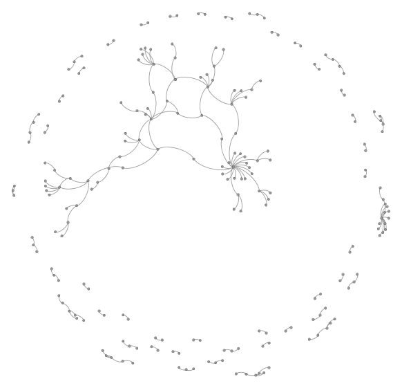
I’m curious about the internal citation of my blog. Which thoughts have been developed over a long chain of posts? Which posts do I often link to? Where are there big jumps in time? Where have I combined threads?
I’ll probably need to build my own data extractor so that it can:
ignore weekly and monthly reviews, since I link to everything in those,
reconcile short and long permalinks, redirection, and sneak previews,
and maybe even index my sketches and look at follow-ups
and I’ll probably want to create something that I could eventually plot as an SVG or imagemap using Graphviz, or maybe analyze using Gephi.
It would be super-interesting to create some kind of output that I could fold into my blog outline or into individual posts. I would need a static dump for that one, I think.
How would I build something like this? One time, I used Ruby to analyze the text of my blog. That might work. I might be able to pull out all the link hrefs, do lookups…
As of Dec 3, 2014, there are 87 posts in 2014 that link to previous posts, out of 259 non-review posts (so roughly 34%). I used this SQL query to get that:
SELECT post_title FROM wp_posts WHERE post_content LIKE ‘%<a href=”https://sachachua.com/blog/20%’ AND post_date >= ‘2014-01-01’ AND post_title NOT LIKE ‘%review:%’ AND post_state=’publish’;
Hmm. I might even be able to do some preliminary explorations with Emacs and text processing instead of writing a script to analyze this, if I focus on 2014 and ignore the special cases (short permalinks, redirection, and sneak previews), just to see what the data looks like. Rough technical notes:
Ooooh. Pretty. Gephi visualization of the edge list formed by links, using the Yifan Hu layout. That big thread in the middle, that’s the one about taskmasters and choice and productivity, which is indeed the core theme running through this year of the experiment. The cluster on the right is a year in review. We see lots of little links too.
Internal links for entries posted in 2014
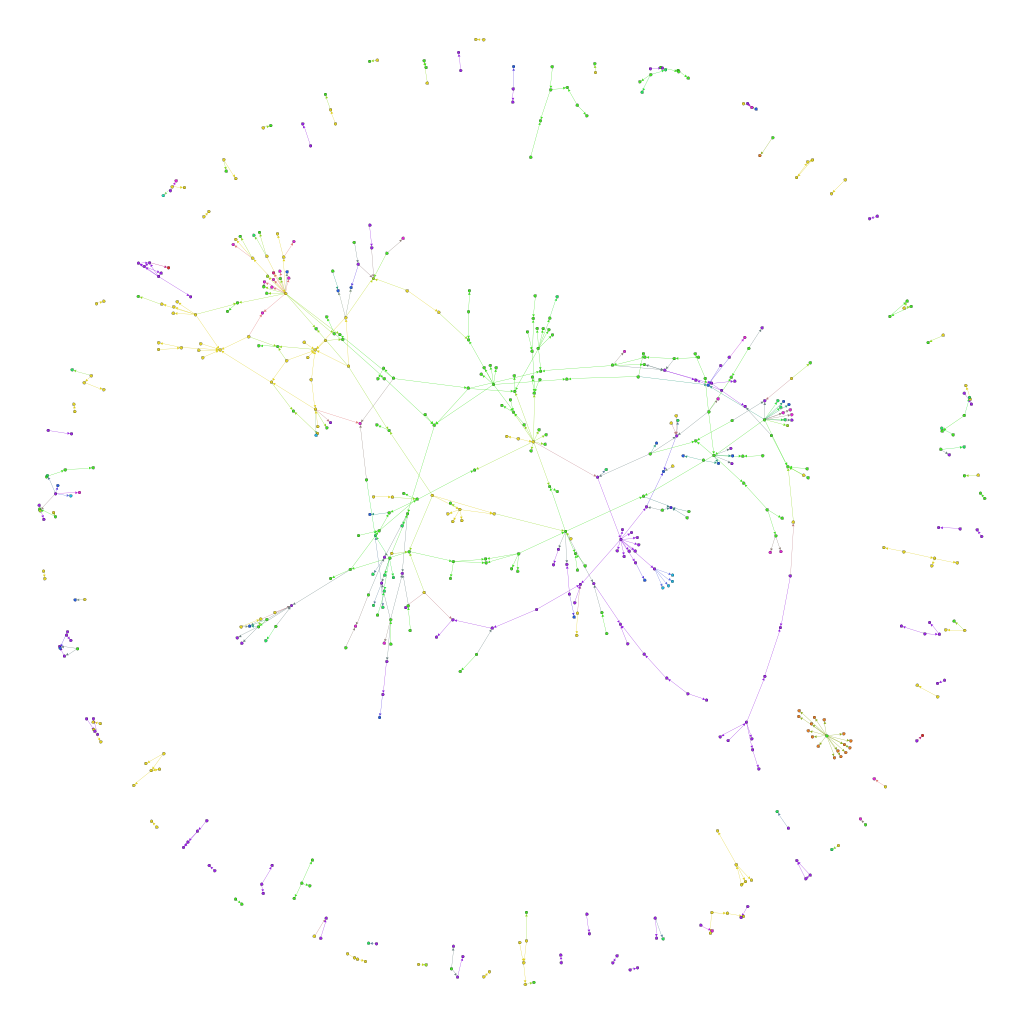
Now I’m curious about what happens when we add the posts and links from 2013 and 2012, too. I’ve colour-coded this by year, with It ties together posts on sketchnoting, blogging, choice, learning, writing, plans… Neat.
What does this say? It says that even though I write about lots of different things, there are connections between the different topics, and the biggest tangle in the middle has more than 320 nodes. I have lots of blog posts that build on an idea for three or four posts, sometimes spanning several years, even if I don’t think about it in advance. There are 90 such clumps, and it might be good to revisit some of these 2- and 3-post chains to see if I can link them up even further.
Also, it could be interesting to do this analysis with tags, not just year. Hmm… Also, I should dust off my data structures and algorithms, and make my own connected-component analyzer so that I can get a list of the clumps of topics. Good ideas to save for another day!
Today is my penultimate day at IBM! Having successfully turned my projects over to another developer (hooray for the habit of organizing project-related files in Lotus Connections Activities), I’ve been focusing on getting things ready for the traditional goodbye e-mail, which I plan to send tomorrow.
I dug around in the Lotus Connections Profiles API to see if I could get a list of my contacts’ e-mail addresses. I fixed a small bug in the feed exporter of the Community Toolkit (w4.ibm.com/community for people in the IBM intranet) and exported my contacts, giving me a list of 530 IBMers who had accepted or sent me an invitation to connect.
Not everyone participates in that Web 2.0 network, though, so I wanted to analyze my sent mail to identify other people to whom I should send a note. I couldn’t find a neat LotusScript to do the job, and I couldn’t get the NSF to EML or mbox converter to work. Because I didn’t need all the information, just the recipients, subjects, and times, I wrote my own script (included at the end of this blog post).
I used the script to summarize the messages in my sent mail folder, and crunched the numbers using PivotTables in Microsoft Excel. I worked with monthly batches so that it was easier to find and fix errors. I decided to analyze all the mail going back to the beginning of last year in order to identify the people I mailed the most frequently, and to come up with some easy statistics as well.
Spiky around project starts/ends, I’d guess.
I wanted to see which roles I tended to e-mail often, so I categorized each recipient with their role. I distinguished between people I’d worked with directly on projects (coworkers) and people who worked with IBM but with whom I didn’t work on a project (colleagues). The numbers below count individual recipients.
Role
Number of people
Number of individual e-mails sent
Average e-mails sent per person
colleague
407
827
2.0
coworker
50
562
11.2
client
21
387
18.4
manager
4
109
27.3
partner
9
51
5.7
system
9
21
2.3
other
8
11
1.4
self
1
5
5.0
Grand Total
509
1973
3.9
As it turns out, I sent a lot of mail to a lot of people throughout IBM, mostly in response to questions about Lotus Connections, Idea Labs, or collaboration tools.
Now I can sort my summarized data to see whom I e-mailed the most often, and add more names to my don’t-forget-to-say-goodbye list. If all goes well, I might even be able to use that mail merge script. =)
The following agent processes selected messages and creates a table with one row per recipient, e-mailing the results to the specified mail address. It seems to choke on calendar entries and other weird documents, but if you go through your sent mail box in batches (Search This View by date is handy), then you should be able to find and delete the offending entries.
Option Public
Dim TempNitem As NotesItem
Dim TempNm As NotesName
Dim session As  NotesSession
Dim db As NotesDatabase
Sub Initialize
	mailAddress = "YOUR_ADDRESS@HERE"

	Dim ws As New NotesUIWorkspace
	Dim uidoc As NotesUIDocument
	Dim partno As String
	Dim db As NotesDatabase
	Dim view As NotesView
	Dim doc As NotesDocument
	Dim collection As NotesDocumentCollection
	Dim memo As NotesDocument
	Dim body As NotesRichTextItem
	Dim range As NotesRichTextRange
	Dim count As Integer

	Set session = New NotesSession
	Set db = session.CurrentDatabase
	Set collection = db.UnprocessedDocuments

	Dim FldTitles(3) As String
	FldTitles(0) = "E-mail"
	FldTitles(1) = "Subject"
	FldTitles(2) = "Date sent"

	Set maildoc = db.CreateDocument
	maildoc.Form = "Memo"
	maildoc.Subject = "Summary"
	maildoc.SendTo = mailAddress
	Dim ritem As NotesRichTextItem
	Set ritem=New NotesRichTextItem(maildoc,"body")
' passing the rich text item & other relevant details
	Set ritem = CreateTable(FldTitles, collection, ritem, "Sent items", "Summary created on " + Format(Now, "YYYY-MM-DD"))
	maildoc.send(False)
End Sub
Function CreateTable(FldTitles As Variant, doccoll  As NotesDocumentCollection, rtitem As NotesRichTextItem,msgTitle As String,msgBody As String ) As NotesRichTextItem
	'http://searchdomino.techtarget.com/tip/0,289483,sid4_gci1254682_mem1,00.html
	'Takes  Documentcollection & creates tabular information on to the passed   rtitem (rich text item)

	Set ritem=rtitem
	Set rtnav = ritem.CreateNavigator
	Set rstyle=session.CreateRichTextStyle

	'===================================================
	'heading in the body section of the mail
	rstyle.Bold=True
	rstyle.NotesColor=COLOR_RED
	rstyle.Underline=True
	rstyle.NotesFont=FONT_COURIER
	rstyle.FontSize=12
	Call  ritem.AppendStyle(rstyle)
	ritem.AppendText(msgTitle)

	rstyle.Underline=False
	rstyle.NotesColor=COLOR_BLACK
	ritem.AddNewline(2)

	rstyle.FontSize=10
	rstyle.Bold=False
	rstyle.NotesColor=COLOR_BLACK
	Call  ritem.AppendStyle(rstyle)
	ritem.AppendText(msgBody)
	ritem.AddNewline(1)

	'===================================================
	rows=doccoll.Count +1
	cols=CInt(UBound(FldTitles))

	Call ritem.AppendTable(1, cols)
	Dim rtt As NotesRichTextTable
	Call rtnav.FindFirstElement(RTELEM_TYPE_TABLE)
	Set rtt = rtNav.GetElement
	'=================================================
	'heading of the table
	rstyle.Bold=True
	rstyle.NotesColor=COLOR_BLUE
	rstyle.FontSize=10
	Call  ritem.AppendStyle(rstyle)

	For i=0 To UBound(FldTitles) - 1
		Call rtnav.FindNextElement(RTELEM_TYPE_TABLECELL)
		Call ritem.BeginInsert(rtnav)
		Call ritem.AppendText(FldTitles(i))
		Call ritem.EndInsert
	Next

	'=================================================
	rstyle.FontSize=10
	rstyle.Bold=False
	rstyle.NotesColor=COLOR_BLACK
	Call  ritem.AppendStyle(rstyle)
	Dim count As Integer
	count = 0
	Set  doc=doccoll.GetFirstDocument
	While Not (doc Is Nothing)
		subject = doc.GetFirstItem("Subject").values(0)
		posted = doc.GetFirstItem("PostedDate").values(0)
		Set sendTo = doc.getFirstItem("SendTo")
		For i = 0 To UBound(sendTo.values)
			Call rtt.AddRow(1)
			Call rtnav.FindNextElement(RTELEM_TYPE_TABLECELL)
			Call ritem.BeginInsert(rtnav)
			ritem.appendText(sendTo.values(i))
			Call ritem.EndInsert
			Call rtnav.FindNextElement(RTELEM_TYPE_TABLECELL)
			Call ritem.BeginInsert(rtnav)
			ritem.appendText(subject)
			Call ritem.EndInsert
			Call rtnav.FindNextElement(RTELEM_TYPE_TABLECELL)
			Call ritem.BeginInsert(rtnav)
			ritem.appendText(posted)
			Call ritem.EndInsert
		Next
		count = count + 1
		Set doc=doccoll.GetNextDocument(doc)
	Wend
	Set CreateTable=ritem
	MsgBox "E-mails summarized: " & count
End Function
I find it helpful to save it as the "Summarize Recipients" agent and assign it to a toolbar button that runs @Command([RunAgent]; "Summarize Recipients").
This visualizes how often I blogged something with a tag in a given year, sorted by all-time popularity. There are more categories, but I skipped them. The height of each block represents how many blog posts I wrote in that category, while the different blocks represent the years, ending with 2010 at the far right. The graph reflects changing interests and recurring themes.
This visualizes some of the things I’ve been writing about in 2010. We’re only a month in, so the last line is pretty small, and in some cases (n < 4) not even visible.
Sparkline bar graphs created with Sparklines for Excel. Initial categories table created with the following SQL incantation:
select p.post_date, p.post_title, terms.name from wp_posts p inner join wp_term_relationships tr on p.id=tr.object_id inner join wp_term_taxonomy tt on tr.term_taxonomy_id=tt.term_taxonomy_id inner join wp_terms terms on tt.term_id=terms.term_id into outfile '/tmp/categories.csv';