Quantified Awesome: Added sparklines and percentages
Posted: - Modified: | quantified, timeAs I was answering the standard question of “Who are you and what do you do?”, I thought it might be interesting to come up with the percentages for what I actually do based on my time records. After all, I have the data. In the past, I used to export my records to a spreadsheet and do some easy number-crunching. Why bother, though, if I can program the system to do this for me?`
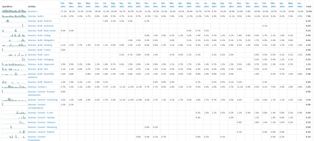
I ended up spending 3.5 hours adding percentages and sparklines to Quantified Awesome, updating my RSpec tests along the way. (100% coverage, yay!) Here's what the result looks like:
The sparklines let me easily see trends and exceptions, while percentages can be easily multiplied by 168 hours to get weekly estimates or 24 hours to get daily ones. For example, sleep took up 35.8% of my time from 2012-02-17 to 2014-06-11, or an average of 8.6 hours a day. Activities directly related to earning money took up 10.9% of my time, or roughly 18.3 hours a week. The sprints and spikes are easier to see with sparklines than with tabular data, and they were easy to implement with JQuery Sparklines.
So now I can be more accurate when answering the question: “What do you do?” It doesn't make sense to include all the minutiae. People don't really answer that question with “Sleep,” even though that takes up much of people's time. However, I can pick a threshold (1%?) and look at the activities above that. That is, for the ~28 months of this 5-year experiment so far, I:
- consult (10.3%)
- connect with people (5.0%)
- write (3.0%)
- draw (2.5%)
- cook (2.3%)
- bike (2.0%)
- work on Emacs (1.2%) and
- work on Quantified Awesome and other tracking tools (1%)
Data! Mwahahaha…


1 comment
mam_moneim
2014-06-28T07:56:18Zvery nice Sacha