Designing Help and Support: Skype
Posted: - Modified: | designI've looked at Adobe and Apple, both of whom run their support communities on Jive. Here's a look at Skype.
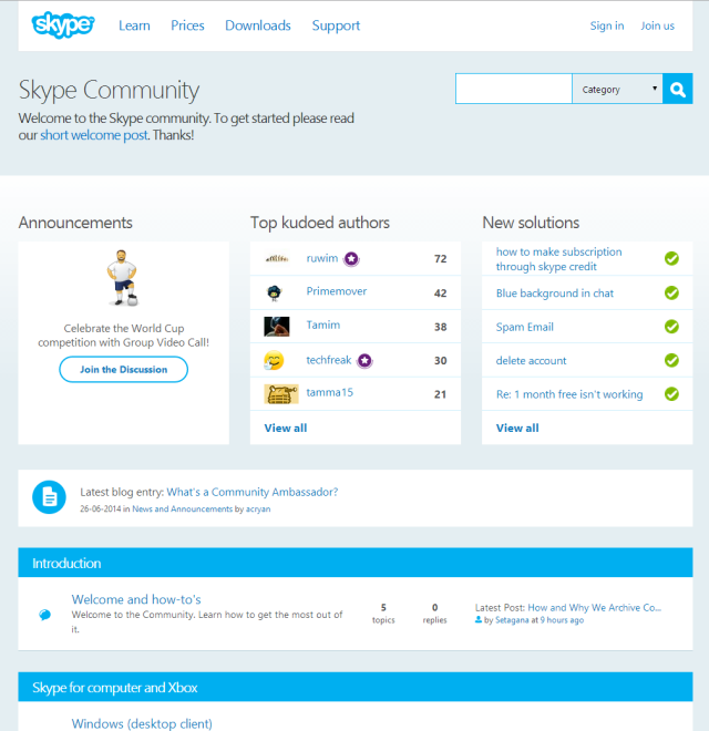
Skype uses a typical forum layout (categories, forums, # of topics, # of replies, latest post) with extra widgets to highlight announcements, contributors, solutions, and blog posts.
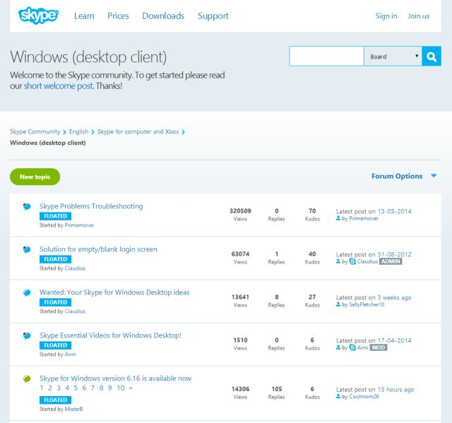
Forum pages list threads, number of views, replies, and kudos. Sticky threads are labeled as “floated”. As with Apple, I'd probably link to relevant knowledgebase categories from here, to save people the navigation and to encourage them to explore.
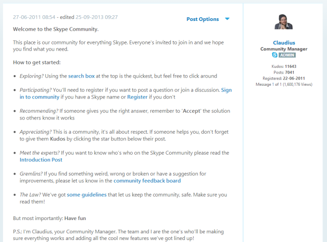
The forums include a link to this welcome post. It includes brief instructions and quick links.
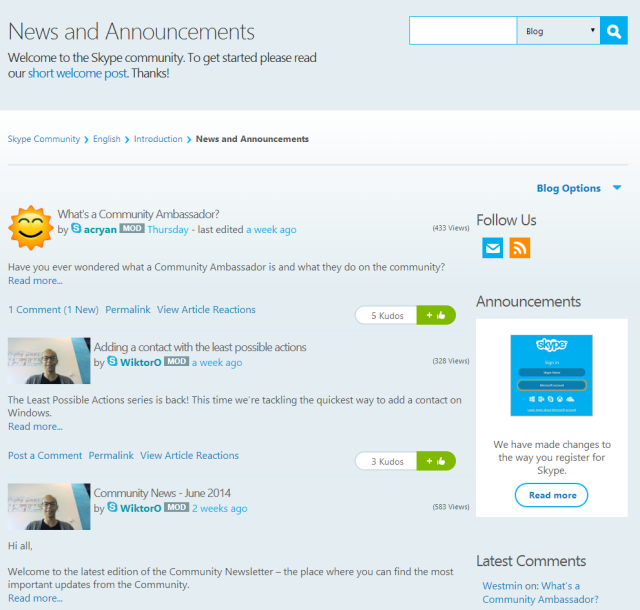
The News and Announcements section is a list of blog posts with excerpts. The light blue line that separates each post practically disappears into the page background. I would probably make the author photos consistent-width, post titles more prominent (probably darker, larger, and flush left with the margin) so that they're easier to scan, include a slightly longer excerpt, and maybe make the kudos icon less prominent. The bright green makes the kudos icon the most salient thing on the page.
By golly, I'm actually starting to develop opinions! =)


