Exploring sketchnote colour styles
Posted: - Modified: | drawing, sketches, visualI'm working on expanding my sketchnote colour vocabulary. I want to go beyond tweaking colour schemes and the occasional coloured sketch (both from Jan 2014). Since comparing different examples is a great way to develop opinions (July 2014), I figured I'd review the Evernote clippings I'd tagged with technique:colour in order to roughly classify them by type of technique.
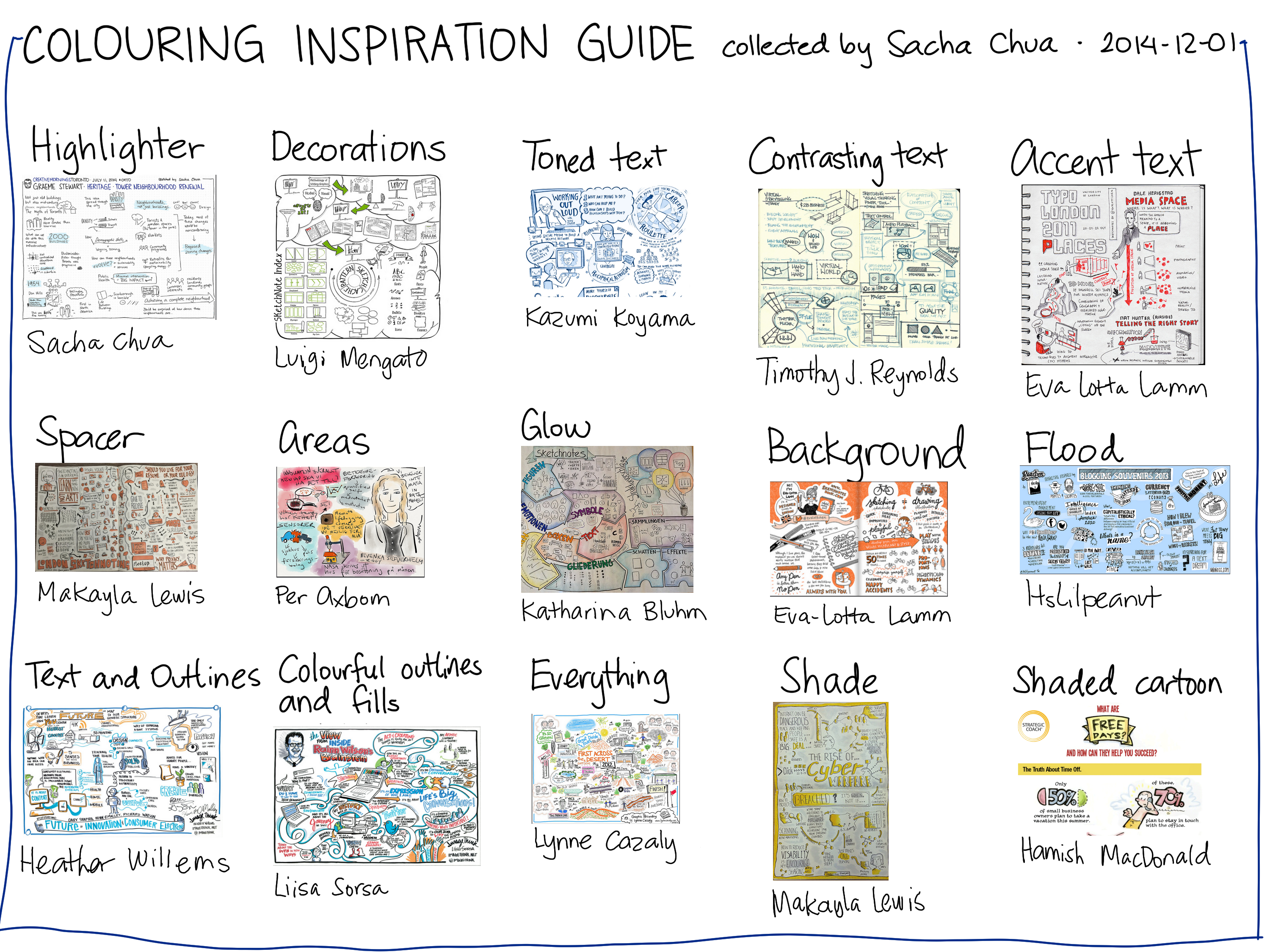
2014-12-01 Colouring inspiration guide – drawing
Here's the list of links to the sketches themselves:
- Highlighter: Sacha Chua
- Decorations: Luigi Mengato
- Toned text: Kazumi Koyama
- Contrasting text: Timothy J. Reynolds
- Accent text: Eva-Lotta Lamm
- Spacer: Makayla Lewis
- Areas: Per Axbom
- Glow: Katharina Bluhm
- Background: Eva-Lotta Lamm
- Flood: ItsLilpeanut
- Text and outlines: Heather Willems
- Colourful outlines and fills: Liisa Sorsa
- Everything: Lynne Cazaly
- Shade: Makayla Lewis
- Shaded cartoon: Hamish Macdonald
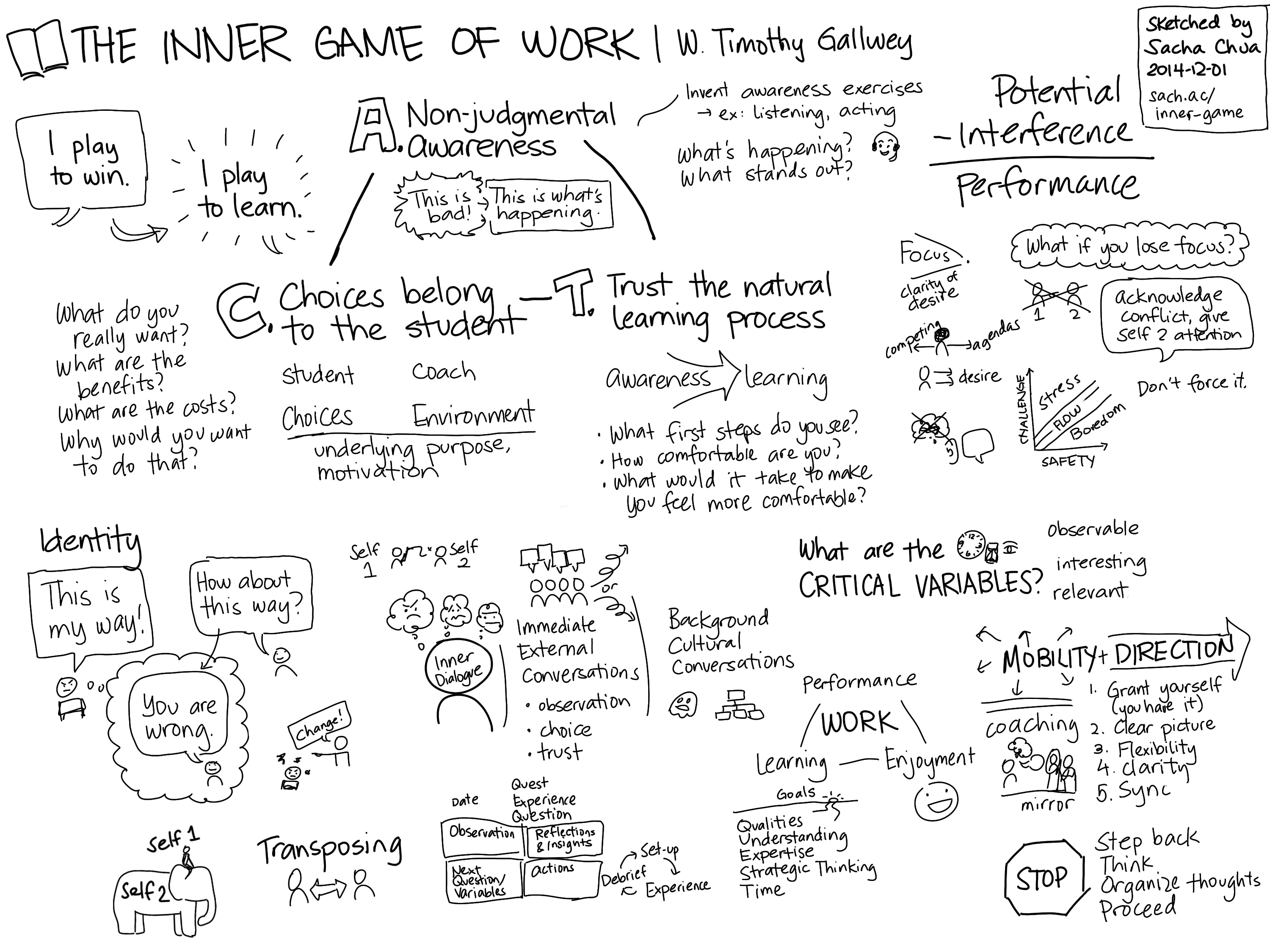
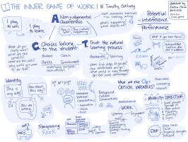
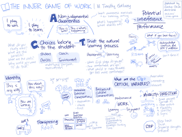
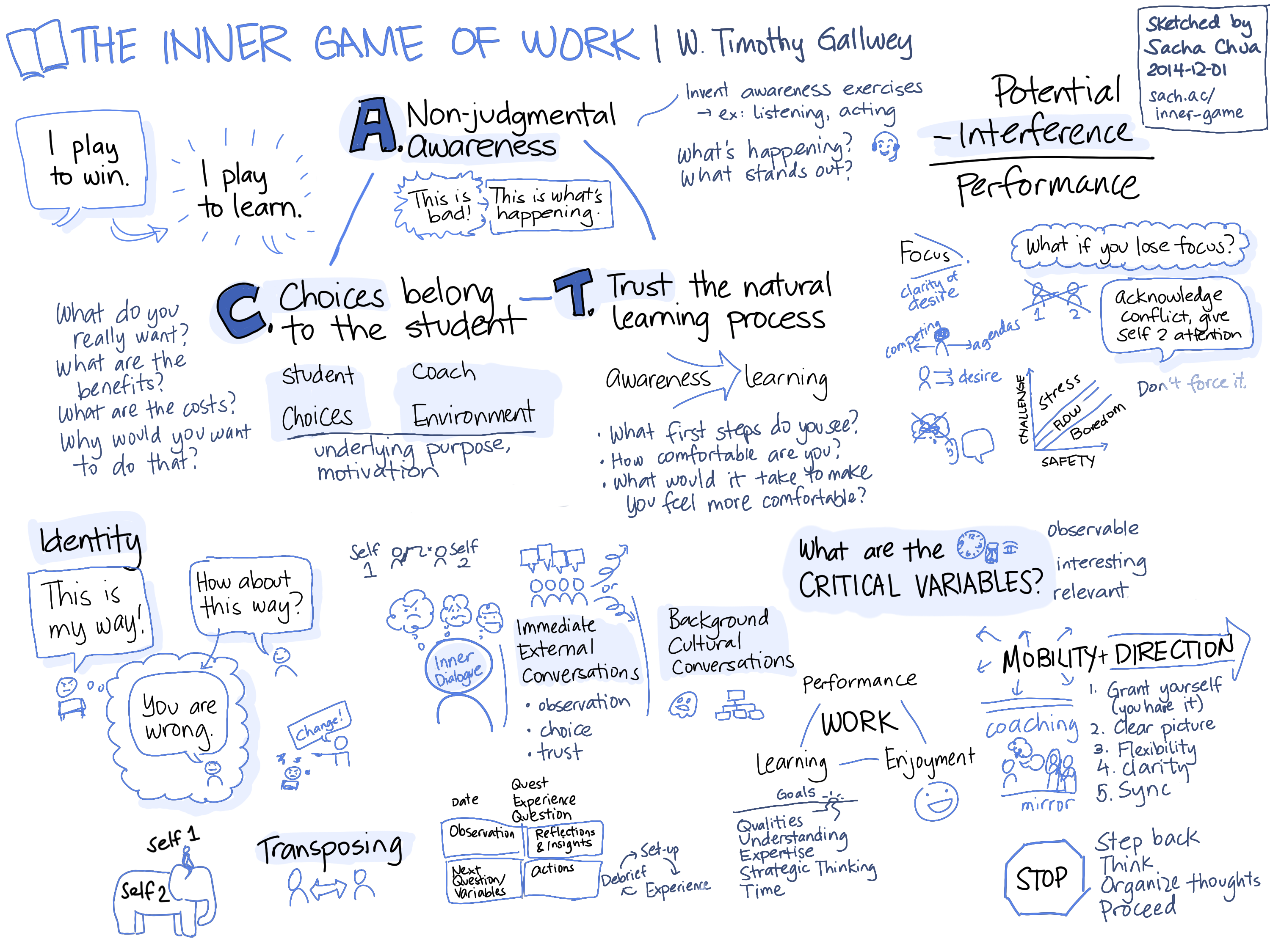
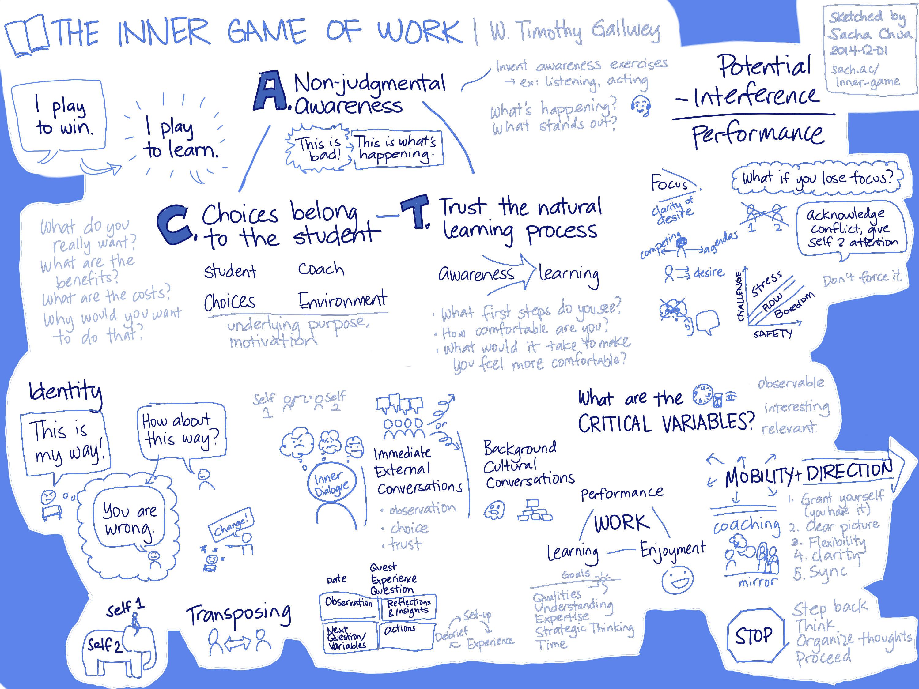
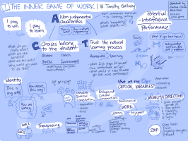
I thought about the different styles, and I picked five to practise with: decorations, accent text, toned text, background, and flood. I took this black-and-white sketchnote draft I made of The Inner Game of Work (W. Timothy Gallwey, 2000; Amazon affiliate link).
and I coloured it in Autodesk Sketchbook Pro with liberal use of layers. Here are the results:
-
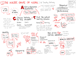
- Decorations

-

- Accent text

-
- Toned text – areas
-
- Toned text
-

- Accent and tones
-

- Background
-
- Flood

Of the styles I tried, I think I like the toned text one the most. It feels the most put-together while still being different from my usual highlighting style. I should play around with this a bit more to see whether blue/red makes a difference here, though.
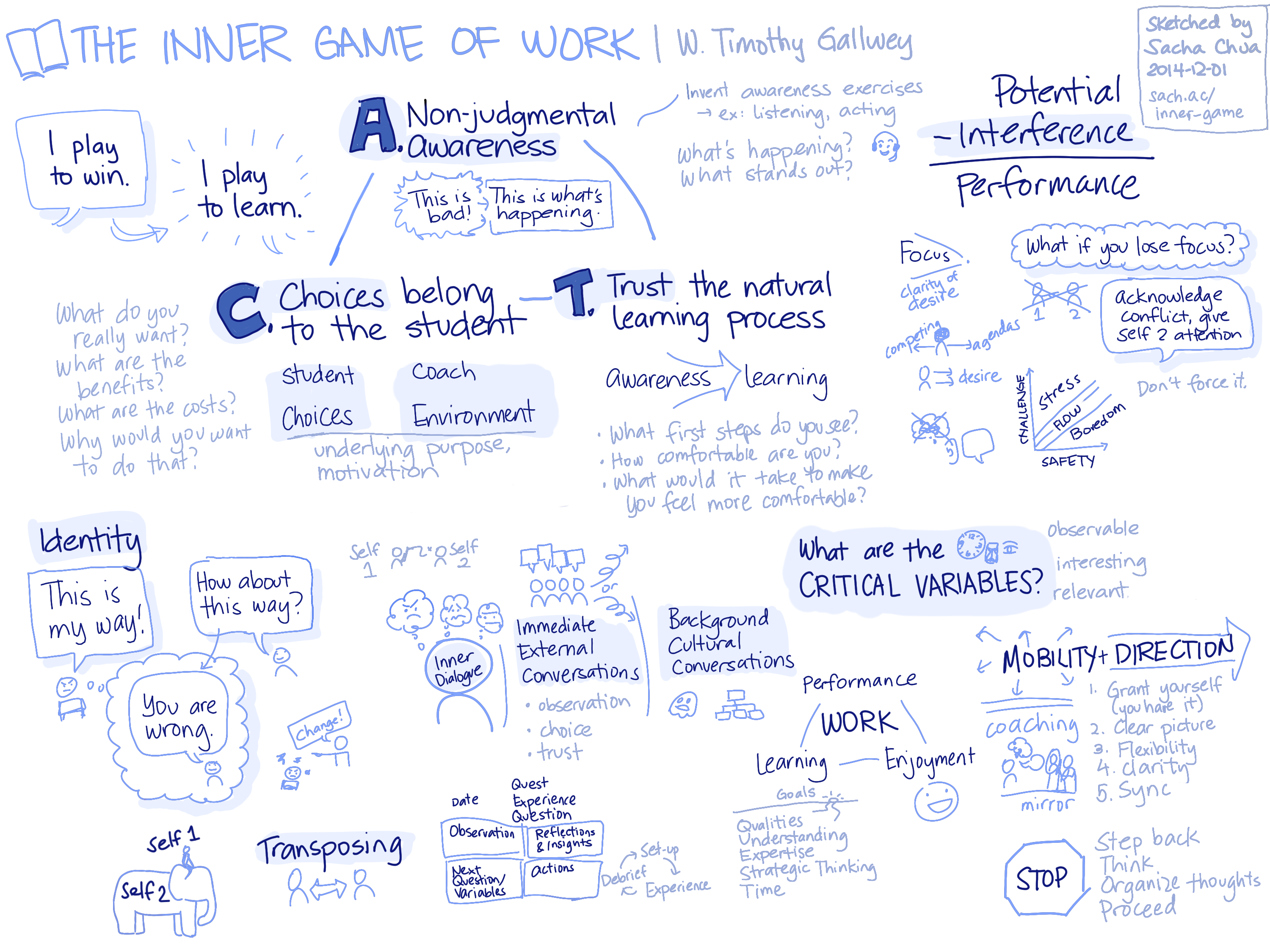
2014-12-01 The Inner Game of Work – W. Timothy Gallwey
This is also a handy way to practise nonjudgmental awareness, as suggested by the book. =) If I pay attention to how other people do things and how I do things, I can't help but learn more along the way.
I hope other people find this useful!