Exploring colours
Posted: - Modified: | drawingBecause it's good to experiment and play.
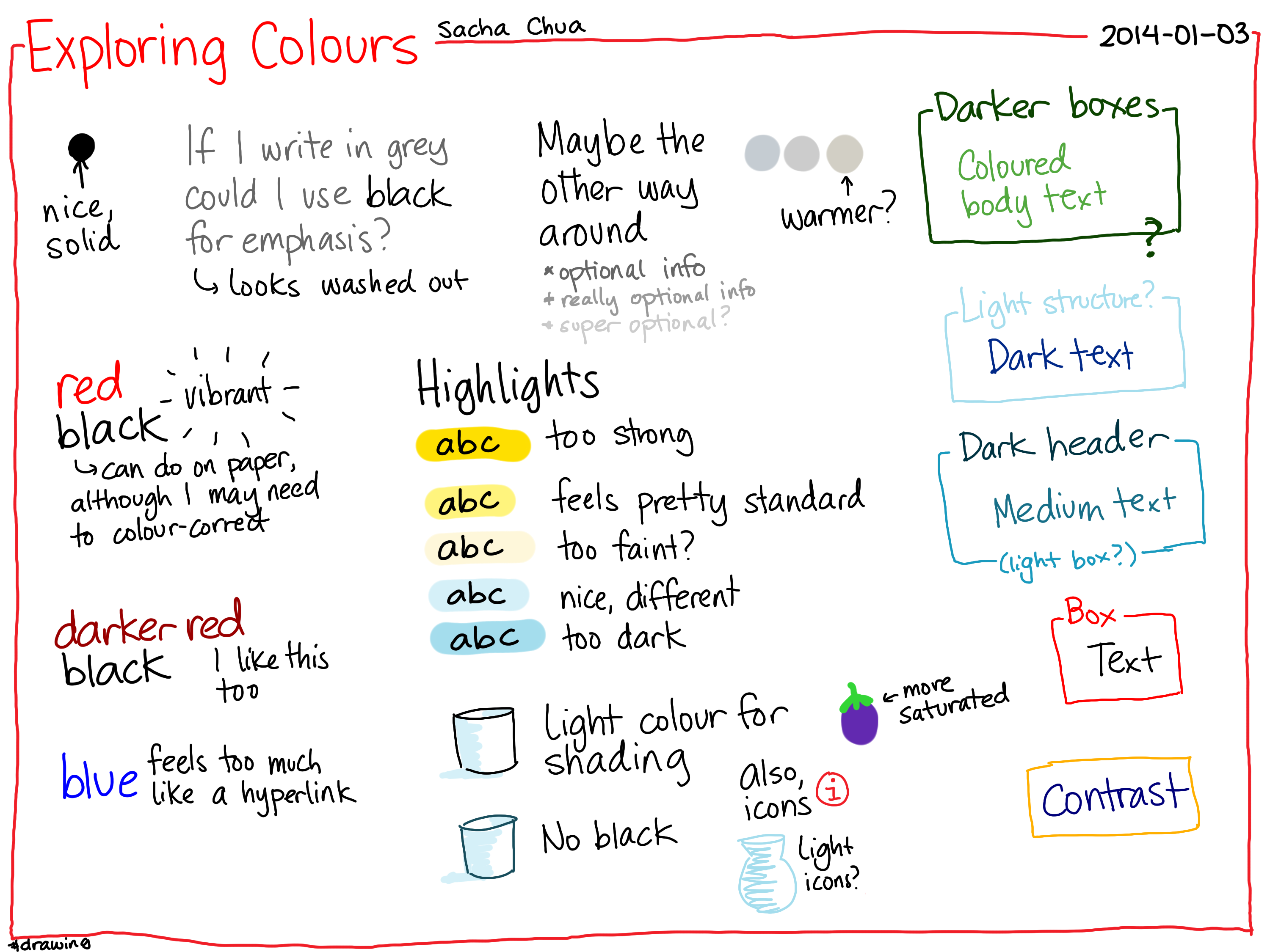
I think I'll focus on black text with colour for emphasis when I'm drawing on paper, with some light yellow or light blue highlighting added on the computer if the sketch needs it, and maybe some shading too. I don't like highlighting on paper, as the colour is uneven and I'm worried about the ink smearing. On the computer, I'll use brand-based colours if I'm matching a logo and the colours make sense. If not, I might play around with non-black text, just because I can do that on the computer easily. =)
If I use colour for structure and black for text, the balance feels right (and it would be wrong the other way around). Maybe that means darker boxes (more prominent) and lighter text, when I'm working with non-black text? It makes the visual hierarchy jump out more than it would with a light structure.
Hmm… Drawing on paper with red and black is annoying because red scans as pinkish (maybe the scanner's trying to correct for off-white paper?). Blue survives the scanner better. Comparison:
| Blue | Blog | |
| Red | Blog |

Okay, let's see what it's like with this as my default workflow!