Exploring neighbourhood libraries and other notes from the Toronto Public Library Hackathon
Posted: - Modified: | visualization, development, geek, kaizenUPDATE 2015-11-30: Here's the Toronto Public Library's recap, along with other videos.
UPDATE 2015-11-27: Here's the video of my hackathon pitch:
UPDATE 2015-11-18: I figured out how to make this entirely client-side, so you don't have to run a separate server. First, install either Tampermonkey (Chrome) or Greasemonkey (Firefox). Then install the user script insert-visualize-link.user.js , and the Visualize link should appear next to the library branch options on Toronto Public Library search result pages. See the Github repository for more details.
Yay! My neighbourhood library visualization won at the Toronto Public Library hackathon. It added a Visualize link to the search results page which mapped the number of search results by branch. For example, here's a visualization of a search that shows items matching "Avengers comics".
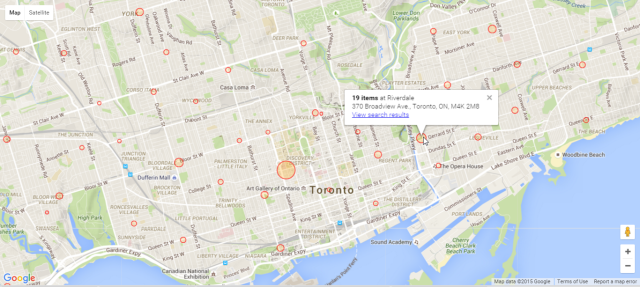
It's a handy way to see which branches you might want to go to so that you can browse through what's there in person.
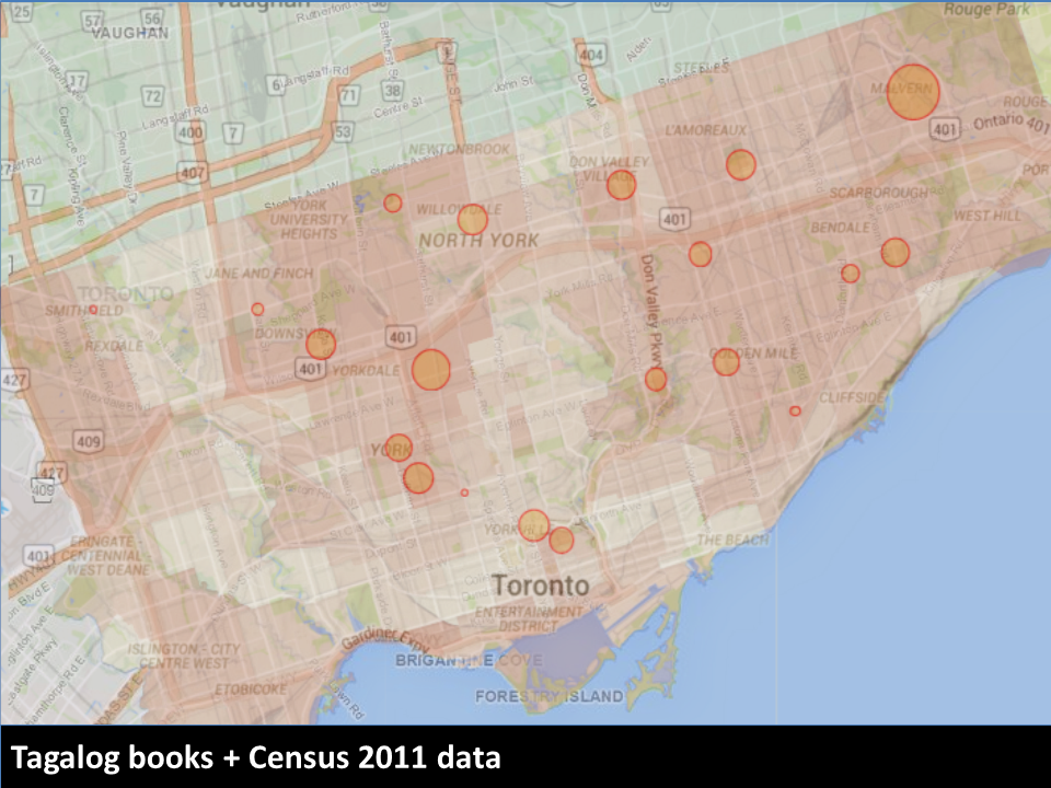
Librarians could also use it to help them plan their selections, since it's easy to see the distribution across branches. For example, here's the visualization for books in Tagalog.

The collections roughly match up with Wellbeing Toronto's data on Tagalog as the home language, although there are some areas that could probably use collections of their own.
Incidentally, I was delighted to learn that Von Totanes had done a detailed analysis of the library's Filipino collections in the chapter he wrote in Filipinos in Canada: Disturbing Invisibility (Coloma, McElhinny, and Tungohan, 1992). Von sent me the chapter after I mentioned the hackathon on Facebook; yay people bumping into other people online!
Personally, I'm looking forward to using this visualization to see things like which branches have new videos. Videos released in the past year can only be borrowed in person – you can't request them online – so it's good to check branches regularly to see if they're there. It would be even better if the library search engine had a filter for "On the shelf right now", but in the meantime, this visualization tool gives me a good idea of our chances of picking up something new to watch while we're folding laundry. =)
Notes
https://github.com/sachac/explore-neighbourhood-libraries
More notes will probably follow, but here are a few quick drawings:
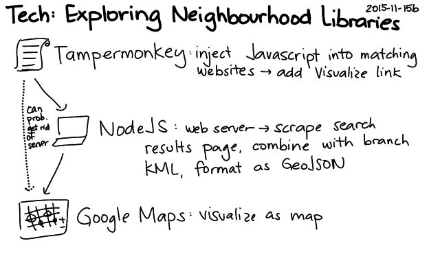


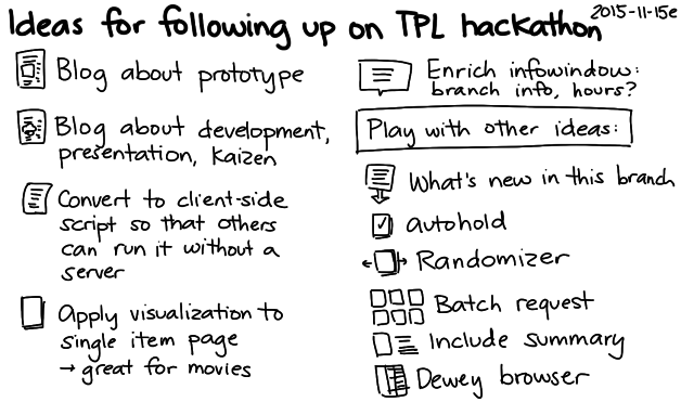

The code works by extracting the branch names and totals on the left side of search pages and combining those with the locations of the branches (KML). I don't really need the server component, so I'm thinking of rewriting the script so that it runs entirely client-side – maybe as a Chrome extension or as a user script. That way, other people can play with the idea without running their own server (and without my having to keep a server around), and we can try it out without waiting for the library to integrate it into their website. That said, it would be totally awesome to get it into the interface of the Toronto Public Library! We'll just have to see if it can happen. =) Happy to chat with library geeks to get this sorted out.
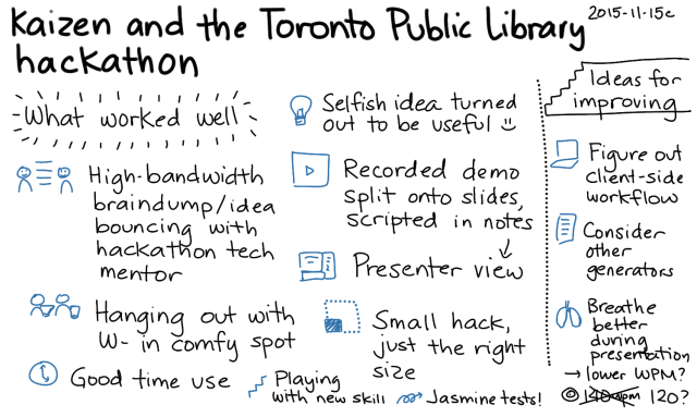
It was fun working on this. W- decided to join me at the last minute, so it turned into a fun weekend of hanging out with my husband at the library. I wanted to keep my weekend flexible and low-key, so I decided not to go through the team matchmaking thing. W- found some comfy chairs in the corner of the area, I plugged in the long extension cord I brought, and we settled in.
I learned a lot from the hackathon mentors. In particular, I picked up some excellent search and RSS tips from Alan Harnum. You can't search with a blank query, but he showed me how you can start with a text string, narrow the results using the facets on the left side, and then remove the text string from the query in order to end up with a search that uses only the facets. He also showed me that the RSS feed had extra information that wasn't in the HTML source and that it could be paginated with URL parameters. Most of the RSS feeds I'd explored in the past were nonpaginated subsets of the information presented on the websites, so it was great to learn about the possibilities I had overlooked.
The faceted search was exactly what I needed to list recent videos even if I didn't know what they were called, so I started thinking of fun tools that would make hunting for popular new videos easier. (There have been quite a few times when I've gone to a library at opening time so that I could snag a video that was marked as available the night before!) In addition to checking the specific item's branch details to see where it was on the shelf and which copies were out on loan, I was also curious about whether we were checking the right library, or if other libraries were getting more new videos than our neighbourhood library was.
W- was curious about the Z39.50 protocol that lets you query a library catalogue. I showed him the little bits I'd figured out last week using yaz-client from the yaz package, and he started digging into the protocol reference. He figured out how to get it to output XML (format xml) and how to search by different attributes. I'm looking forward to reading his notes on that.
Me, I figured that there might be something interesting in the visualization of new videos and other items. I hadn't played around a lot with geographic visualization, so it was a good excuse to pick up some skills. First, I needed to get the data into the right shape.
Step 1: Extract the data and test that I was reading it correctly
I usually find it easier to start with the data rather than visualizations. I like writing small data transformation functions and tests, since they don't involve complex external libraries. (If you miss something important when coding a visualization, often nothing happens!)
I wrote a function to extract information from the branch CSV on the hackathon data page, using fast-csv to read it as an array of objects. I tested that with jasmine-node. Tiny, quick accomplishment.
Then I worked on extracting the branch result count from the search results page. This was just a matter of finding the right section, extracting the text, and converting the numbers. I saved a sample results page to my project and used cheerio to parse it. I decided not to hook it up to live search results until I figured out the visualization aspect. No sense in hitting the library website repeatedly or dealing with network delays.
Step 2: Make a simple map that shows library branches
I started with the Google Maps earthquake tutorial. The data I'd extracted had addresses but not coordinates. I tried using the Google geocoder, but with my rapid tests, I ran into rate limits pretty early. Then it occurred to me that with their interest in open data, the library was the sort of place that would probably have a file with branch coordinates in terms of latitude and longitude. The hackathon data page didn't list any obvious matches, but a search for Toronto Public Library KML (an extension I remembered from W-'s explorations with GPS and OpenStreetMap) turned up the file I wanted. I wrote a test to make sure this worked as I expected.
Step 3: Combine the data
At first I tried to combine the data on the client side, making one request for the branch information and another request for the results information. It got a bit confusing, though – I need to get the hang of using require in a from-scratch webpage. I decided the easiest way to try my idea out was to just make the server combine the data and return the GeoJSON that the tutorial showed how to visualize. That way, my client-side HTML and JS could stay simple.
Step 4: Fiddle with the visualization options
Decisions, decisions… Red was too negative. Blue and green were hard to see. W- suggested orange, and that worked out well with Google Maps' colours. Logarithmic scale or linear scale? Based on a maximum? After experimenting with a bunch of options, I decided to go with a linear scale (calculated on the server), since it made sense for the marker for a branch with a thousand items to be significantly bigger than a branch with five hundred items. I played with this a bit until I came up with maximum and minimum sizes that made sense to me.
Step 5: Hook it up to live search data
I needed to pass the URL of the search results, and I knew I wanted to be able to call the visualization from the search results page itself. I used TamperMonkey to inject some Javascript into the Toronto Public Library webpage. The library website didn't use JQuery, so I looked up the plain-vanilla Javascript way of selecting and modifying elements.
document.querySelector('#refinements-library_branch')
  .parentNode.querySelector('h3').innerHTML =
  'Library Branch <a target="_blank" style="color: white; ' +
  'text-decoration: underline" ' +
  'href="http://localhost:9000/viz.html?url=' +
  encodeURIComponent(location.href) + '">(Visualize)</a>';
Step 6: Tweak the interface
I wanted to display information on hover and filter search results on click. Most of the tutorials I saw focused on how to add event listeners to individual markers, but I eventually found an example that showed how to add a listener to map.data and get the information from the event object. I also found out that you could add a title attribute and get a simple tooltip to display, which was great for confirming that I had the data all lined up properly.
Step 7: Cache the results
Testing with live data was a bit inconvenient because of occasional timeouts from the library website, so I decided to cache search results to the filesystem. I didn't bother writing code for checking last modification time, since I knew it was just for demos and testing.
Step 8: Prettify the hover
The tooltip provided by title was a little bare, so I decided to spend some time figuring out how to make better information displays before taking screenshots for the presentation. I found an example that showed how to create and move an InfoWindow based on the event's location instead of relying on marker information, so I used that to show the information with better formatting.
Step 9: Make the presentation
Here's how I usually plan short presentations:
- Figure out the key message and the flow.
- Pick a target words-per-minute rate and come up with a word budget.
- Draft the script, checking it against my word budget.
- Read the script out loud a few times, checking for time, tone, and hard-to-say phrases.
- Annotate the script with notes on visual aids.
- Make visuals, take screenshots, etc.
- Record and edit short videos, splitting them up in Camtasia Studio by using markers so that I can control the pace of the video.
- Copy the script (or keywords) into the presenter's notes.
- Test the script for time and flow, and revise as needed.
I considered two options for the flow. I could start with the personal use case (looking for new videos) and then expand from there, tying it into the library's wider goals. That would be close to how I developed it. Or I could start with one of the hackathon challenges, establish that connection with the library's goals, and then toss in my personal use case as a possibly amusing conclusion. After chatting about it with W- on the subway ride home from the library, I decided to start with the second approach. I figured that would make it easier for people to connect the dots in terms of relevance.
I used ~140wpm as my target, minus a bit of a buffer for demos and other things that could come up, so roughly 350 words for 3 minutes. I ran through the presentation a few times at home, clocking in at about 2:30. I tend to speak more quickly when I'm nervous, so I rehearsed with a slightly slower pace. That way, I could get a sense of what the pace should sound like. During the actual presentation, though, I was a teensy bit over time – there was a bit of unexpected applause. Also, even though I remembered to slow down, I didn't breathe as well as I probalby should've; I still tend to breathe a little shallowly when I'm on stage. Maybe I should pick a lower WPM for presentations and add explicit breathing reminders. =)
I normally try to start with less material and then add details to fit the time. That way, I can easily adjust if I need to compress my talk, since I've added details in terms of priority. I initially had a hard time concisely expressing the problem statement and tying together the three examples I wanted to use, though. It took me a few tries to get things to fit into my word budget and flow in a way that made me happy.
Anyway, once I sorted out the script, I came up with some ideas for the visuals. I didn't want a lot of words on the screen, since it's hard to read and listen at the same time. Doodles work well for me. I sketched a few images and created a simple sequence. I took screenshots for the key parts I wanted to demonstrate, just in case I didn't get around to doing a live demo or recording video. That way, I didn't have to worry about scrambling to finish my presentation. I could start with something simple but presentable, and then I could add more frills if I had time.
Once the static slides were in place, I recorded and edited videos demonstrating the capabilities. Video is a nice way to give people a more real sense of how something works without risking as many technical issues as a live demo would.
I had started with just my regular resolution (1366×768 on my laptop) and a regular browser window, but the resulting video was not as sharp as it could have been. Since the presentation template had 4:3 aspect ratio, I redid the video with 1024×768 resolution and a full-screen browser in order to minimize the need for resizing.
I sped up boring parts of the video and added markers where I wanted to split it into slides. Camtasia Studio rendered the video into separate files based on my markers. I added the videos to individual slides, setting them to play automatically. I like the approach of splitting up videos onto separate slides because it allows me to narrate at my own pace instead of speeding up or slowing down to match the animation.
I copied the segments of my script to the presenter notes for each slide, and I used Presenter View to run through it a few more times so that I could check whether the pace worked and whether the visuals made sense. Seemed all right, yay!
Just in time, too. I had a quick lunch and headed off to the library for the conclusion of the hackathon.
There wsa a bit of time before the presentations started. I talked to Alan again to show him what I'd made, hear about what he had been working on, and pick his brain to figure out which terms might resonate with the internal jargon of the library – little things, like what they call the people who decide what kinds of books should be in which libraries, or what they call the things that libraries lend. (Items? Resources? Items.) Based on his feedback, I edited my script to change "library administrators" to "selection committees". I don't know if it made a difference, but it was a good excuse to learn more about the language people used.
I tested that the presentation displayed fine on the big screen, too. It turned out that the display was capable of widescreen input at a higher resolution than what I'd set, but 1024×768 was pretty safe and didn't look too fuzzy, so I left it as it was. I used my presentation remote to flip through the slides while confirming that things looked okay from the back of the room (colours, size, important information not getting cut off by people's heads, etc.). The hover text was a bit small, but it gave the general idea.
And then it was presentation time. I was third, which was great because once I finished, I could focus on other people's presentations and learn from their ideas. Based on W-'s cellphone video, it looks like I remembered to use the microphone so that the library could record, and I remembered to look up from my presenter notes and gesture from time to time (hard when you're hidden behind the podium, but we do what we can!). I stayed pretty close to my script, but I hope I kept the script conversational enough that it sounded more like me instead of a book. I didn't have the mental bandwidth to keep an eye on the timer in the center of the presenter view, but fortunately the time worked out reasonably well. I concluded just as the organizer was getting up to nudge me along, and I'd managed to get to all the points I wanted to along the way. Whew!
Anyway, that's a quick braindump of the project and what it was like to hack it together. I'll probably write some more about following up on ideas and about other people's presentations, but I wanted to get this post out there while the experience was fresh in my head. It was fun. I hope the Toronto Public Library will take the hackathon ideas forward, and I hope they'll get enough out of the hackathon that they'll organize another one! =)


