I like using the orderless completion package for Emacs because it allows me to specify different parts of a completion candidate than any order I want. Because I'm learning French, I want commands like consult-line (which uses minibuffer completion) and completion-at-point (which uses in-buffer completion) to also match candidates where the words might have accented characters. For example, instead of having to type "utilisé" with the accented é, I want to type "utilise" and have it match both "utilise" and "utilisé".
Figure 1: Screenshot of consult-line showing matching against accented charactersFigure 2: Screenshot of completion-at-point matching "fev" with "février"
: Made the code even neater with :key, included the old code as well
At this week's Emacs Berlin meetup, someone wanted to know how to change the order of completion candidates. Specifically, they wanted to list the top level Org Mode headings before the second level headings and so on. They were using org-ql to navigate Org headings, but since org-ql sorts its candidates by the number of matches according to the code in the org-ql-completing-read function, I wasn't quite sure how to get it to do what they wanted. (And I realized my org-ql setup was broken, so I couldn't fiddle with it live. Edit: Turns out I needed to update the peg package) Instead, I showed folks consult-org-heading which is part of the Consult package, which I like to use to jump around the headings in a single Org file. It's a short function that's easy to use as a starting point for something custom.
Here's some code that allows you to use consult-org-heading to jump to an Org heading in the current file with completions sorted by level.
Figure 1: Screenshot showing where the candidates transition from top-level headings to second-level headings
My previous approach defined a different function based on consult-org-heading, but using the advice feels a little cleaner because it will also make it work for any other function that uses consult-org--headings. I've included the old code in case you're curious. Here, we don't modify the function's behaviour using advice, we just make a new function (my-consult-org-heading) that calls another function that processes the results a little (my-consult-org--headings).
Old code, if you're curious
(defunmy-consult-org--headings (prefix match scope &rest skip)
(let ((candidates (consult-org--headings prefix match scope)))
(sort candidates
:lessp
(lambda (a b)
(let ((level-a (car (get-text-property 0 'consult-org--heading a)))
(level-b (car (get-text-property 0 'consult-org--heading b))))
(cond
((< level-a level-b) t)
((< level-b level-a) nil)
((string< a b) t)
((string< b a) nil)))))))
(defunmy-consult-org-heading (&optional match scope)
"Jump to an Org heading.MATCH and SCOPE are as in `org-map-entries' and determine whichentries are offered. By default, all entries of the currentbuffer are offered."
(interactive (unless (derived-mode-p #'org-mode)
(user-error"Must be called from an Org buffer")))
(let ((prefix (not (memq scope '(nil tree region region-start-level file)))))
(consult--read
(consult--slow-operation"Collecting headings..."
(or (my-consult-org--headings prefix match scope)
(user-error"No headings")))
:prompt"Go to heading: ":category'org-heading:sort nil
:require-match t
:history'(:input consult-org--history)
:narrow (consult-org--narrow)
:state (consult--jump-state)
:annotate#'consult-org--annotate:group (and prefix #'consult-org--group)
:lookup (apply-partially #'consult--lookup-prop'org-marker))))
I also wanted to get this to work for C-u org-refile, which uses org-refile-get-location.
This is a little trickier because the table of completion candidates is a list of cons cells that don't store the level, and it doesn't pass the metadata to completing-read to tell it not to re-sort the results. We'll just fake it by counting the number of "/", which is the path separator used if org-outline-path-complete-in-steps is set to nil.
In general, if you would like completion candidates to be in a certain order, you can specify display-sort-function either by calling completing-read with a collection that's a lambda function instead of a table of completion candidates, or by overriding it with completion-category-overrides if there's a category you can use or completion-extra-properties if not.
Here's a short example of passing a lambda to a completion function (thanks to Manuel Uberti):
(defunmu-date-at-point (date)
"Insert current DATE at point via `completing-read'."
(interactive
(let* ((formats '("%Y%m%d""%F""%Y%m%d%H%M""%Y-%m-%dT%T"))
(vals (mapcar #'format-time-string formats))
(opts
(lambda (string pred action)
(if (eq action 'metadata)
'(metadata (display-sort-function . identity))
(complete-with-action action vals string pred)))))
(list (completing-read "Insert date: " opts nil t))))
(insert date))
If you use consult--read from the Consult completion framework, there is a :sort property that you can set to either nil or your own function.
: Added m-x.app examples, moved el-init to AI category, added retrospective link.
Org Mode is a big part of why I enjoy Emacs, so I'm delighted that there's a new release out (Org 9.8). Thanks to all who contributed! If you would like to help out, Ihor is looking for several volunteers who can try to reproduce bugs and do initial feedback on the new patches.
Lots of cool stuff this week! I'm looking forward to checking out the new futur library for async programming, and the developments around embedding graphics in a canvas in Emacs look interesting too (see the Multimedia section). Also, the discussion about making beginner configuration easier could be neat once the wrinkles are ironed out. Enjoy!
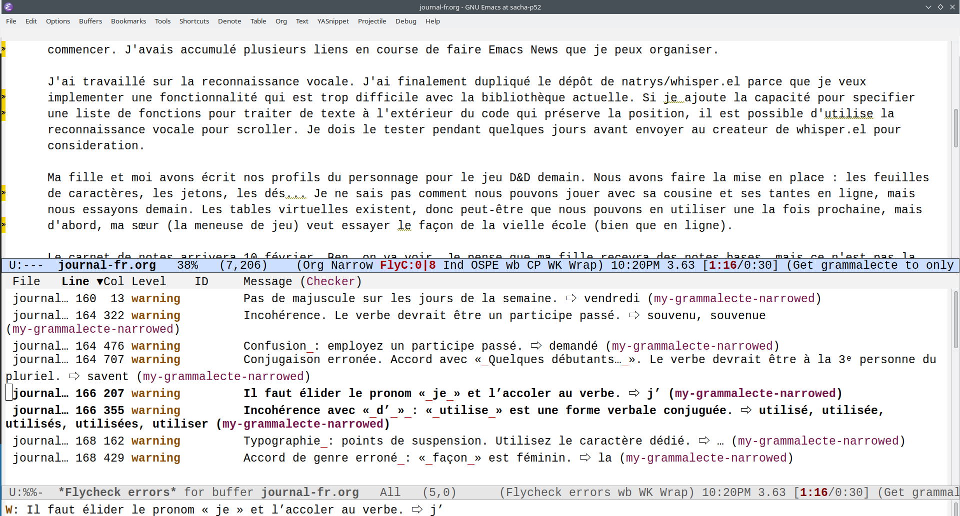
After learning about French spellcheck and grammar checking from Emacs expliqué à mes enfants, I added flycheck-grammalecte to my config. Nudged by @lann@mastodon.zaclys.com, I finally got around to figuring out why my setup sometimes worked and sometimes didn't. When I checked flycheck-verify-setup, I noticed that grammalecte kept getting disabled. A little digging around showed me that it was getting disabled because of too many errors. That was because it was trying to work on my whole file instead of just the portion that I narrowed to with org-narrow-to-subtree (ooh, just noticed an org-toggle-narrow-to-subtree command). I like having all of my French journal entries in one file because I can use consult-line (which I've bound to M-g l) to quickly look up examples of where else I've used a word. So I needed to define a checker that runs only on the narrowed part of the buffer.
After I use my-flycheck-grammalecte-setup, I can use flycheck-select-checker to select my-grammalecte-narrowed and then use flycheck-buffer to run it. Then it will underline all the number/gender agreement issues I usually have. It's nice that I can practise editing my text with this script before I run the text through an LLM (also via flycheck) for feedback on wording.
Figure 1: Screenshot of grammalecte providing grammar feedback