Sketchnote Lesson: Adding color
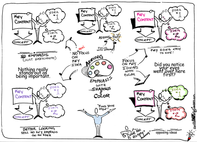
Posted: - Modified: | drawing, podcastColor is a great way to add visual interest and guide people’s eyes to what you want them to focus on. Here’s Kevin Dulle’s sketchnote lesson on adding emphasis with shadows and color:
Reposted with permission – check out his blog for more tips!
If you’re starting out with sketchnotes, you don’t have to use color right away. Go ahead and draw with whatever you feel comfortable with, whether that’s a black technical pen, a 4-color ballpen, or a digital stylus.
You can always add color afterwards. On paper, you can use crayons, colored pencils, highlighters, markers, and so on. Make sure you test it in an inconspicuous area (maybe on a separate piece of paper) because your coloring method may interact badly with your drawing.
You can also add color on the computer. I prefer this way because then I can easily change my mind about what colors to use. Erasing is easier. Learn how to use the software tools that are out there. Here is a quick video I put together on how to use the free GIMP tool to add color by either replacing the ink that’s there (as if you changed pens) or adding color on top (as if you used a highlighter).
Okay, so that takes care of the mechanics. What about the styles?
Develop your personal style by looking for inspiration and experimenting with ideas. In addition to checking out people’s sketchnotes, look elsewhere for interesting color combinations: nature, art, product designs, and so on. Try different techniques and colors.
Here’s a sampler of different coloring styles I’ve played with in my sketchnotes:
| Highlighter I like this because it’s super-easy to add quickly if you’re drawing digitally – just add a new layer below your text. Visual Book Review: The First 20 Hours: How to Learn Anything… Fast |
|
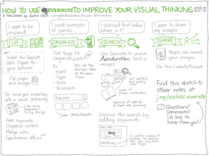
| Color as accent for images You can add this while drawing by switching between pens (on paper) or between colors (if digital), or you can use the Color layer trick in the video to add it afterwards. How to use Evernote to improve your visual thinking |
|
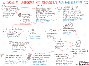
| Colors with meanings Here I used red to indicate the path of my mistakes and blue to indicate what I could improve. An embarrassing failure is the result of a series of unfortunate decisions, and that’s a good thing. |
|
| Emphasis Red is a great color for drawing attention. Coloring your headlines helps set them apart. Visual Book Review: Running Lean – Ash Maurya |
|
| Extra information You can also use gray or lighter colours to include extra information that people don’t need to focus on. Visual Book Review: The Start-Up of You – Reid Hoffman, Ben Casnocha |
|
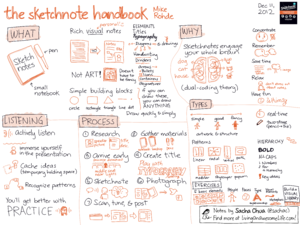
| Depth You can use a lighter colour for shading or depth. Visual Book Review: The Sketchnote Handbook |
|
| Branding Pick up colors from company logos or event materials to make your sketchnotes look more like part of the event. Sketchnotes: #INNOTalkTO Innovatively Speaking |
|
| Lots of colors This is fun to do when you have more time. In this case, I colored in my sketchnote while waiting in line for an “autograph.” Sketchnotes: How to Live an Amazing Life – C.C.Chapman |
Sketchnote Army has a wide variety of sketchnoting styles. Flip through it, see what you like, and try playing around with those ideas. Have fun!
Like this? Check out the other sketchnote lessons and learn more. Feel free to suggest topics, ask questions, or share your own tips!


2 comments
Kevin
2014-01-16T00:52:48ZGreat piece Sacha. I am enjoying seeing your progress over teh short time I have known you. You have created a very identifiable style. Brava.
sachac
2014-01-16T04:21:24ZIt's a little boggling, but the simplicity and 5-year-old-ness of my drawings are apparently a plus. =) Okay! I will happily fill up the unintimidating end of this skill spectrum. ;)