Animating SVG topic maps with Inkscape, Emacs, FFmpeg, and Reveal.js
| emacs, drawing, org, ffmpeg, videotldr (2167 words): I can make animating presentation maps easier by writing my own functions for the Emacs text editor. In this post, I show how I can animate an SVG element by element. I can also add IDs to the path and use CSS to build up an SVG with temporary highlighting in a Reveal.js presentation.
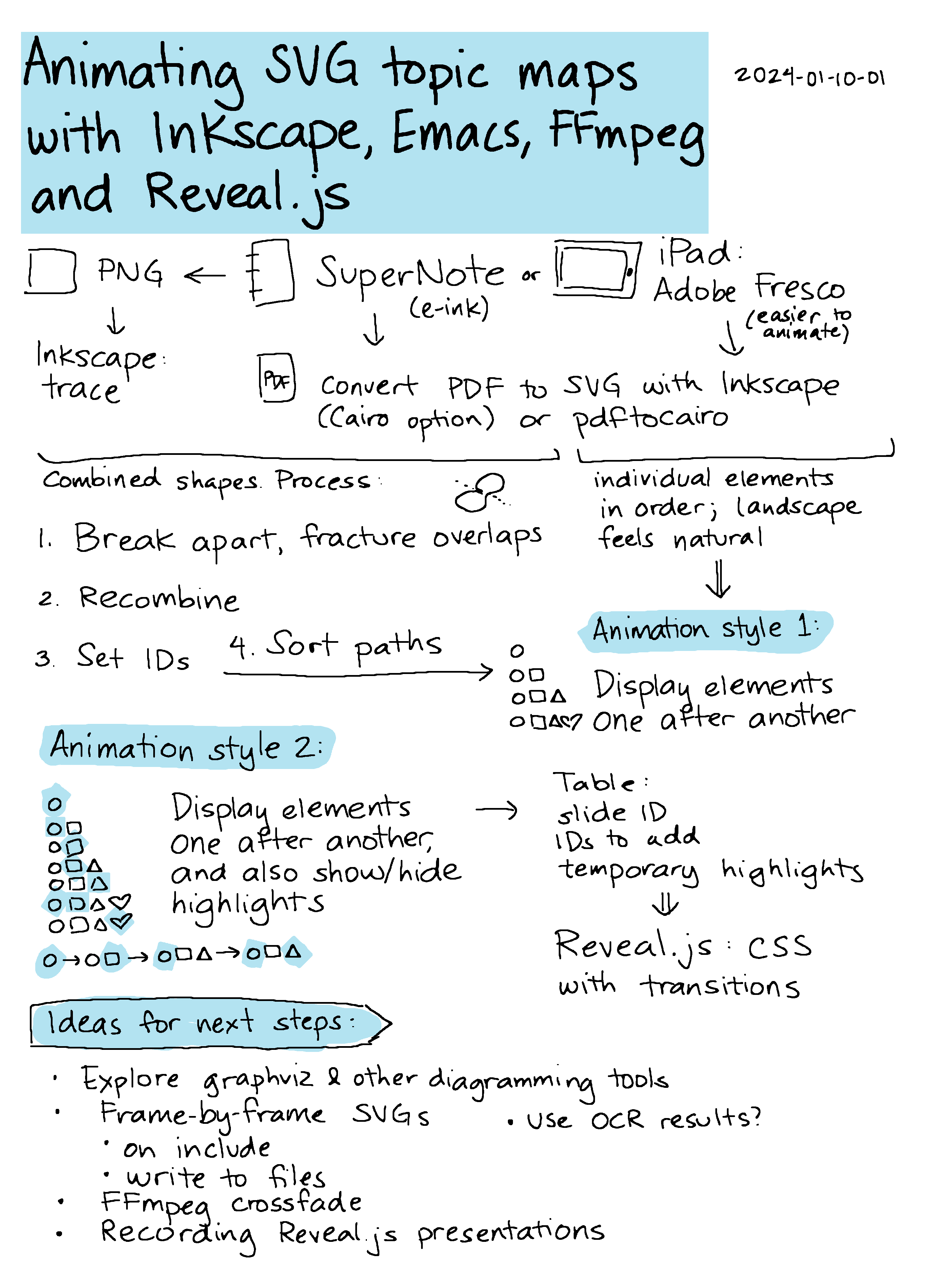
Text from the sketch
- PNG: Inkscape: trace
- Supernote (e-ink)
- iPad: Adobe Fresco
Convert PDF to SVG with Inkscape (Cairo option) or pdftocairo)
- PNG / Supernote PDF: Combined shapes. Process
- Break apart, fracture overlaps
- Recombine
- Set IDs
- Sort paths -> Animation style 1
- Adobe Fresco: individual elements in order; landscape feels natural
Animation styles
- Animation style 1: Display elements one after another
- Animation style 2: Display elements one after another, and also show/hide highlights
- Table: slide ID, IDs to add, temporary highlights -> Reveal.js: CSS with transitions
Ideas for next steps:
- Explore graphviz & other diagramming tools
- Frame-by-frame SVGs
- on include
- write to files
- FFmpeg crossfade
- Recording Reveal.js presentations
- Use OCR results?
I often have a hard time organizing my thoughts into a linear sequence. Sketches are nice because they let me jump around and still show the connections between ideas. For presentations, I'd like to walk people through these sketches by highlighting different areas. For example, I might highlight the current topic or show the previous topics that are connected to the current one. Of course, this is something Emacs can help with. Before we dive into it, here are quick previews of the kinds of animation I'm talking about:

Getting the sketches: PDFs are not all the same
Let's start with getting the sketches. I usually export my sketches as PNGs from my Supernote A5X. But if I know that I'm going to animate a sketch, I can export it as a PDF. I've recently been experimenting with Adobe Fresco on the iPad, which can also export to PDF. The PDF I get from Fresco is easier to animate, but I prefer to draw on the Supernote because it's an e-ink device (and because the kiddo usually uses the iPad).
If I start with a PNG, I could use Inkscape to trace the PNG and turn it into an SVG. I think Inkscape uses autotrace behind the scenes. I don't usually put my highlights on a separate layer, so autotrace will make odd shapes.
It's a lot easier if you start off with vector graphics in the first place. I can export a vector PDF from the SuperNote A5X and either import it into Inkscape using the Cairo option or use the command-line pdftocairo tool.
I've been looking into using Adobe Fresco, which is a free app available for the iPad. Fresco's PDF export can be converted to an SVG using Inkscape or PDF to Cairo. What I like about the output of this app is that it gives me individual elements as their own paths and they're listed in order of drawing. This makes it really easy to animate by just going through the paths in order.
Animation style 1: displaying paths in order
Here's a sample SVG file that pdfcairo creates from an Adobe Fresco PDF export:
pdftocairo -svg ~/Downloads/subed-audio.pdf ~/Downloads/subed-audio.svg
Sample SVG
Adobe Fresco also includes built-in time-lapse, but since I often like to move things around or tidy things up, it's easier to just work with the final image, export it as a PDF, and convert it to an SVG.
I can make a very simple animation by setting the opacity of all the paths to 0, then looping through the elements to set the opacity back to 1 and write that version of the SVG to a separate file. From how-can-i-generate-png-frames-that-step-through-the-highlights:
my-animate-svg-paths: Add one path at a time. Save the resulting SVGs to OUTPUT-DIR.
(defun my-animate-svg-paths (filename output-dir)
  "Add one path at a time. Save the resulting SVGs to OUTPUT-DIR."
  (unless (file-directory-p output-dir)
    (make-directory output-dir t))
  (let* ((dom (xml-parse-file filename))
         (paths (seq-filter (lambda (e) (dom-attr e 'style))
                            (dom-by-tag dom 'path)))
         (total (length paths))
         (frame-num (length paths))
         result)
    (dolist (elem paths)
      (dom-set-attribute elem 'style
                         (concat
                          (dom-attr elem 'style)
                          ";mix-blend-mode:darken")))
    (with-temp-file (expand-file-name (format "frame-%03d.svg" (1+ frame-num)) output-dir)
      (xml-print dom))
    (dolist (elem paths)
      (dom-set-attribute elem 'style
                         (concat
                          (dom-attr elem 'style)
                          ";fill-opacity:0")))
    (dolist (elem paths)
      (with-temp-file (expand-file-name
                       (format "frame-%03d.svg"
                               (- total frame-num))
                       output-dir)
        (message "%03d" frame-num)
        (dom-set-attribute elem 'style
                           (concat (dom-attr elem 'style)
                                   ";fill-opacity:1"))
        (push (list (format "frame-%03d.svg"
                            (1+ (- total frame-num)))
                    (dom-attr elem 'id))
              result)
        (setq frame-num (1- frame-num))
        (xml-print dom)))
    (reverse result)))
Here's how I call it:
(my-animate-svg-paths "~/Downloads/subed-audio.svg" "/tmp/subed-audio/frames" t)
Then I can use FFmpeg to combine all of those frames into a video:
ffmpeg -i frame-%03d.svg -vf palettegen -y palette.png
ffmpeg -framerate 30 -i frame-%03d.svg -i palette.png -lavfi "paletteuse" -loop 0 -y animation-loop.gif

Neither Supernote nor Adobe Fresco give me the original stroke information. These are filled shapes, so I can't animate something drawing it. But having different elements appear in sequence is fine for my purposes. If you happen to know how to get stroke information out of Supernote .note files or of an iPad app that exports nice single-line SVGs that have stroke direction, I would love to hear about it.
Identifying paths from Supernote sketches
When I export a PDF from Supernote and convert it to an SVG, each color is a combined shape with all the elements. If I want to animate parts of the image, I have to break it up and recombine selected elements (Inkscape's Ctrl-k shortcut) so that the holes in shapes are properly handled. This is a bit of a tedious process and it usually ends up with elements in a pretty random order. Since I have to reorder elements by hand, I don't really want to animate the sketch letter-by-letter. Instead, I combine them into larger chunks like topics or paragraphs.
The following code takes the PDF, converts it to an SVG, recolours highlights, and then breaks up paths into elements:
my-sketch-convert-pdf-and-break-up-paths: Convert PDF to SVG and break up paths.
(defun my-sketch-convert-pdf-and-break-up-paths (pdf-file &optional rotate)
  "Convert PDF to SVG and break up paths."
  (interactive (list (read-file-name
                      (format "PDF (%s): "
                              (my-latest-file "~/Dropbox/Supernote/EXPORT/" "pdf"))
                      "~/Dropbox/Supernote/EXPORT/"
                      (my-latest-file "~/Dropbox/Supernote/EXPORT/" "pdf")
                      t
                      nil
                      (lambda (s) (string-match "pdf" s)))))
  (unless (file-exists-p (concat (file-name-sans-extension pdf-file) ".svg"))
    (call-process "pdftocairo" nil nil nil "-svg" (expand-file-name pdf-file)
                  (expand-file-name (concat (file-name-sans-extension pdf-file) ".svg"))))
  (let ((dom (xml-parse-file (expand-file-name (concat (file-name-sans-extension pdf-file) ".svg"))))
        highlights)
    (setq highlights (dom-node 'g '((id . "highlights"))))
    (dom-append-child dom highlights)
    (dolist (path (dom-by-tag dom 'path))
      ;;  recolor and move
      (unless (string-match (regexp-quote "rgb(0%,0%,0%)") (or (dom-attr path 'style) ""))
        (dom-remove-node dom path)
        (dom-append-child highlights path)
        (dom-set-attribute
         path 'style
         (replace-regexp-in-string
          (regexp-quote "rgb(78.822327%,78.822327%,78.822327%)")
          "#f6f396"
          (or (dom-attr path 'style) ""))))
      (let ((parent (dom-parent dom path)))
        ;; break apart
        (when (dom-attr path 'd)
          (dolist (part (split-string (dom-attr path 'd) "M " t " +"))
            (dom-append-child
             parent
             (dom-node 'path `((style . ,(dom-attr path 'style))
                               (d . ,(concat "M " part))))))
          (dom-remove-node dom path))))
    ;; remove the use
    (dolist (use (dom-by-tag dom 'use))
      (dom-remove-node dom use))
    (dolist (use (dom-by-tag dom 'image))
      (dom-remove-node dom use))
    ;; move the first g down
    (let ((g (car (dom-by-id dom "surface1"))))
      (setf (cddar dom)
            (seq-remove (lambda (o)
                          (and (listp o) (string= (dom-attr o 'id) "surface1")))
                        (dom-children dom)))
      (dom-append-child dom g)
      (when rotate
        (let* ((old-width (dom-attr dom 'width))
               (old-height (dom-attr dom 'height))
               (view-box (mapcar 'string-to-number (split-string (dom-attr dom 'viewBox))))
               (rotate (format "rotate(90) translate(0 %s)" (- (elt view-box 3)))))
          (dom-set-attribute dom 'width old-height)
          (dom-set-attribute dom 'height old-width)
          (dom-set-attribute dom 'viewBox (format "0 0 %d %d" (elt view-box 3) (elt view-box 2)))
          (dom-set-attribute highlights 'transform rotate)
          (dom-set-attribute g 'transform rotate))))
    (with-temp-file (expand-file-name (concat (file-name-sans-extension pdf-file) "-split.svg"))
      (svg-print (car dom)))))
You can see how the spaces inside letters like "o" end up being black. Selecting and combining those paths fixes that.
If there were shapes that were touching, then I need to draw lines and fracture the shapes in order to break them apart.
The end result should be an SVG with the different chunks that I might want to animate, but I need to identify the paths first. You can assign object IDs in Inkscape, but this is a bit of an annoying process since I haven't figured out a keyboard-friendly way to set object IDs. I usually find it easier to just set up an Autokey shortcut (or AutoHotkey in Windows) to click on the ID text box so that I can type something in.
Autokey script for clicking
import time
x, y = mouse.get_location()
# Use the coordinates of the ID text field on your screen; xev can help
mouse.click_absolute(3152, 639, 1)
time.sleep(1)
keyboard.send_keys("<ctrl>+a")
mouse.move_cursor(x, y)
Then I can select each element, press the shortcut key, and type an ID into the textbox. I might use "t-…" to indicate the text for a map section, "h-…" to indicate a highlight, and arrows by specifying their start and end.
To simplify things, I wrote a function in Emacs that will go through the different groups that I've made, show each path in a different color and with a reasonable guess at a bounding box, and prompt me for an ID. This way, I can quickly assign IDs to all of the paths. The completion is mostly there to make sure I don't accidentally reuse an ID, although it can try to combine paths if I specify the ID. It saves the paths after each change so that I can start and stop as needed. Identifying paths in Emacs is usually much nicer than identifying them in Inkscape.
my-svg-identify-paths: Prompt for IDs for each path in FILENAME.
(defun my-svg-identify-paths (filename)
  "Prompt for IDs for each path in FILENAME."
  (interactive (list (read-file-name "SVG: " nil nil
                                     (lambda (f) (string-match "\\.svg$" f)))))
  (let* ((dom (car (xml-parse-file filename)))
         (paths (dom-by-tag dom 'path))
         (vertico-count 3)
         (ids (seq-keep (lambda (path)
                          (unless (string-match "path[0-9]+" (or (dom-attr path 'id) "path0"))
                            (dom-attr path 'id)))
                        paths))
         (edges (window-inside-pixel-edges (get-buffer-window)))
         id)
    (my-svg-display "*image*" dom nil t)
    (dolist (path paths)
      (when (string-match "path[0-9]+" (or (dom-attr path 'id) "path0"))
        ;; display the image with an outline
        (unwind-protect
            (progn
              (my-svg-display "*image*" dom (dom-attr path 'id) t)
              (setq id (completing-read
                        (format "ID (%s): " (dom-attr path 'id))
                        ids))
              ;; already exists, merge with existing element
              (if-let ((old (dom-by-id dom id)))
                  (progn
                    (dom-set-attribute
                     old
                     'd
                     (concat (dom-attr (dom-by-id dom id) 'd)
                             " "
                             ;; change relative to absolute
                             (replace-regexp-in-string "^m" "M"
                                                       (dom-attr path 'd))))
                    (dom-remove-node dom path)
                    (setq id nil))
                (dom-set-attribute path 'id id)
                (add-to-list 'ids id))))
        ;; save the image just in case we get interrupted halfway through
        (with-temp-file filename
          (svg-print dom))))))
Sorting and animating the paths by IDs
Then I can animate SVGs by specifying the IDs. I can reorder the paths in the SVG itself so that I can animate it group by group, like the way that the Adobe Fresco SVGs were animated element by element.
Reordering paths
(my-svg-reorder-paths "~/proj/2023-12-audio-workflow/map.svg"
                      '("t-start" "h-audio" "h-capture" "t-but" "t-mic" "h-mic"
                        "t-reviewing" "h-reviewing"
                        "t-words" "h-words" "t-workflow" "h-workflow"
                        "t-lapel" "h-lapel"
                        "mic-recorder" "t-recorder" "h-recorder"
                        "t-syncthing" "h-sync"
                        "t-keywords" "h-keywords" "t-keyword-types"
                        "t-lines" "h-lines"
                        "t-align" "h-align"
                        "arrow"
                        "t-org" "h-org" "t-todo" "h-todo" "h-linked"
                        "t-jump" "h-jump"
                        "t-waveform" "h-waveform"
                        "t-someday"
                        "h-sections"
                        "t-speech-recognition" "h-speech-recognition"
                        "t-ai" "h-ai"
                        "t-summary"
                        "extra")
                      "~/proj/2023-12-audio-workflow/map-output.svg")
(my-animate-svg-paths "~/proj/2023-12-audio-workflow/map-output.svg"
                      "~/proj/2023-12-audio-workflow/frames/")
Table of filenames after reordering paths and animating the image
| frame-001.svg | t-start |
| frame-002.svg | h-audio |
| frame-003.svg | h-capture |
| frame-004.svg | t-but |
| frame-005.svg | t-mic |
| frame-006.svg | h-mic |
| frame-007.svg | t-reviewing |
| frame-008.svg | h-reviewing |
| frame-009.svg | t-words |
| frame-010.svg | h-words |
| frame-011.svg | t-workflow |
| frame-012.svg | h-workflow |
| frame-013.svg | t-lapel |
| frame-014.svg | h-lapel |
| frame-015.svg | mic-recorder |
| frame-016.svg | t-recorder |
| frame-017.svg | h-recorder |
| frame-018.svg | t-syncthing |
| frame-019.svg | h-sync |
| frame-020.svg | t-keywords |
| frame-021.svg | h-keywords |
| frame-022.svg | t-keyword-types |
| frame-023.svg | t-lines |
| frame-024.svg | h-lines |
| frame-025.svg | t-align |
| frame-026.svg | h-align |
| frame-027.svg | arrow |
| frame-028.svg | t-org |
| frame-029.svg | h-org |
| frame-030.svg | t-todo |
| frame-031.svg | h-todo |
| frame-032.svg | h-linked |
| frame-033.svg | t-jump |
| frame-034.svg | h-jump |
| frame-035.svg | t-waveform |
| frame-036.svg | h-waveform |
| frame-037.svg | t-someday |
| frame-038.svg | h-sections |
| frame-039.svg | t-speech-recognition |
| frame-040.svg | h-speech-recognition |
| frame-041.svg | t-ai |
| frame-042.svg | h-ai |
| frame-043.svg | t-summary |
| frame-044.svg | extra |
The table of filenames makes it easy to use specific frames as part of a presentation or video.
Here is the result as a video:
(let ((compile-media-output-video-width 1280)
      (compile-media-output-video-height 720))
  (my-ffmpeg-animate-images
   (directory-files "~/proj/2023-12-audio-workflow/frames/" t "\\.svg$")
   (expand-file-name "~/proj/2023-12-audio-workflow/frames/animation.webm")
   4))
The way it works is that the my-svg-reorder-paths function removes
and readds elements following the list of IDs specified, so
everything's ready to go for step-by-step animation. Here's the code:
my-svg-reorder-paths: Sort paths in FILENAME.
(defun my-svg-reorder-paths (filename &optional ids output-filename)
  "Sort paths in FILENAME."
  (interactive (list (read-file-name "SVG: " nil nil (lambda (f) (string-match "\\.svg$" f)))
                     nil (read-file-name "Output: ")))
  (let* ((dom (car (xml-parse-file filename)))
         (paths (dom-by-tag dom 'path))
         (parent (dom-parent dom (car paths)))
         (ids-left
          (nreverse (seq-keep (lambda (path)
                                (unless (string-match "path[0-9]+" (or (dom-attr path 'id) "path0"))
                                  (dom-attr path 'id)))
                              paths)))
         list)
    (when (called-interactively-p)
      (while ids-left
        (my-svg-display "*image*" dom (car ids-left))
        (let ((current (completing-read
                        (format "ID (%s): "
                                (car ids-left))
                        ids-left nil nil nil nil (car ids-left)))
              node)
          (add-to-list 'ids current)
          (setq ids-left (seq-remove (lambda (o) (string= o current)) ids-left)))))
    (if ids ;; reorganize under the first path's parent
        (progn
          (dolist (id ids)
            (if-let ((node (car (dom-by-id dom id))))
                (progn
                  (dom-remove-node dom node)
                  (dom-append-child parent node))
              (message "Could not find %s" id)))
          (with-temp-file (or output-filename filename)
            (svg-print dom))))
    (nreverse (seq-keep (lambda (path)
                          (unless (string-match "path[0-9]+" (or (dom-attr path 'id) "path0"))
                            (dom-attr path 'id)))
                        (dom-by-tag dom 'path)))))
Animation style 2: Building up a map with temporary highlights
I can also use CSS rules to transition between opacity values for more complex animations. For my EmacsConf 2023 presentation, I wanted to make a self-paced, narrated presentation so that people could follow hyperlinks, read the source code, and explore. I wanted to include a map so that I could try to make sense of everything. For this map, I wanted to highlight the previous sections that were connected to the topic for the current section.
I used a custom Org link to include the full contents of the SVG instead of just including it with an img tag.
my-include:~/proj/emacsconf-2023-emacsconf/map.svg?wrap=export html
my-include-export: Export PATH to FORMAT using the specified wrap parameter.
(defun my-include-export (path _ format _)
  "Export PATH to FORMAT using the specified wrap parameter."
  (let (params body start end)
    (when (string-match "^\\(.*+?\\)\\(?:::\\|\\?\\)\\(.*+\\)" path)
      (setq params (save-match-data (org-protocol-convert-query-to-plist (match-string 2 path)))
            path (match-string 1 path)))
    (with-temp-buffer
      (insert-file-contents-literally path)
      (when (string-match "\\.org$" path)
        (org-mode))
      (if (plist-get params :name)
          (when (org-babel-find-named-block (plist-get params :name))
            (goto-char (org-babel-find-named-block (plist-get params :name)))
            (let ((block (org-element-context)))
              (setq start (org-element-begin block)
                    end (org-element-end block))))
        (goto-char (point-min))
        (when (plist-get params :from-regexp)
          (re-search-forward (url-unhex-string (plist-get params :from-regexp)))
          (goto-char (match-beginning 0)))
        (setq start (point))
        (setq end (point-max))
        (when (plist-get params :to-regexp)
          (re-search-forward (url-unhex-string (plist-get params :to-regexp)))
          (setq end (match-beginning 0))))
      (setq body (buffer-substring start end)))
    (with-temp-buffer
      (when (plist-get params :wrap)
        (let* ((wrap (plist-get params :wrap))
               block args)
          (when (string-match "\\<\\(\\S-+\\)\\( +.*\\)?" wrap)
            (setq block (match-string 1 wrap))
            (setq args (match-string 2 wrap))
            (setq body (format "#+BEGIN_%s%s\n%s\n#+END_%s\n"
                               block (or args "")
                               body
                               block)))))
      (when (plist-get params :summary)
        (setq body (format "#+begin_my_details %s\n%s\n#+end_my_details\n"
                           (plist-get params :summary)
                           body)))
      (insert body)
      (org-export-as format nil nil t))))
I wanted to be able to specify the entire sequence using a table in
the Org Mode source for my presentation. Each row had the slide ID, a
list of highlights in the form prev1,prev2;current, and a
comma-separated list of elements to add to the full-opacity view.
| Slide | Highlight | Additional elements |
|---|---|---|
| props-map | h-email;h-properties | t-email,email-properties,t-properties |
| file-prefixes | h-properties;h-filename | t-filename,properties-filename |
| renaming | h-filename;h-renaming | t-renaming,filename-renaming |
| shell-scripts | h-renaming;h-shell-scripts | renaming-shell-scripts,t-shell-scripts |
| availability | h-properties;h-timezone | t-timezone,properties-timezone |
| schedule | h-timezone;h-schedule | t-schedule,timezone-schedule |
| emailing-speakers | h-timezone,h-mail-merge;h-emailing-speakers | schedule-emailing-speakers,t-emailing-speakers |
| template | h-properties;h-template | t-template,properties-template |
| wiki | h-template;h-wiki | t-wiki,template-wiki,schedule-wiki |
| pad | h-template;h-pad | template-pad,t-pad |
| mail-merge | h-template;h-mail-merge | t-mail-merge,template-mail-merge,schedule-mail-merge,emailing-speakers-mail-merge |
| bbb | h-bbb | t-bbb |
| checkin | h-mail-merge;h-checkin | t-checkin,bbb-checkin |
| redirect | h-bbb;h-redirect | t-redirect,bbb-redirect |
| shortcuts | h-email;h-shortcuts | t-shortcuts,email-shortcuts |
| logbook | h-shortcuts;h-logbook | shortcuts-logbook,t-logbook |
| captions | h-captions | t-captions,captions-wiki |
| tramp | h-captions;h-tramp | t-tramp,captions-tramp |
| crontab | h-tramp;h-crontab | tramp-crontab,bbb-crontab,t-crontab |
| transitions | h-crontab;h-transitions | shell-scripts-transitions,t-transitions,shortcuts-transitions,transitions-crontab |
| irc | h-transitions;h-irc | t-irc,transitions-irc |
Reveal.js adds a "current" class to the slide, so I can use that as a trigger for the transition. I have a bit of Emacs Lisp code that generates some very messy CSS, in which I specify the ID of the slide, followed by all of the elements that need their opacity set to 1, and also specifying the highlights that will be shown in an animated way.
my-reveal-svg-progression-css: Make the CSS.
(defun my-reveal-svg-progression-css (map-progression &optional highlight-duration)
  "Make the CSS.
map-progression should be a list of lists with the following format:
((\"slide-id\" \"prev1,prev2;cur1\" \"id-to-add1,id-to-add2\") ...)."
  (setq highlight-duration (or highlight-duration 2))
  (let (full)
    (format
     "<style>%s</style>"
     (mapconcat
      (lambda (slide)
        (setq full (append (split-string (elt slide 2) ",") full))
        (format "#slide-%s.present path { opacity: 0.2 }
%s { opacity: 1 !important }
%s"
                (car slide)
                (mapconcat (lambda (id) (format "#slide-%s.present #%s" (car slide) id))
                           full
                           ", ")
                (my-reveal-svg-highlight-different-colors slide)))
      map-progression
      "\n"))))
#+begin_src emacs-lisp :exports code :var map-progression=progression :var highlight-duration=2 :results silent (my-reveal-svg-progression-css map-progression highlight-duration) #+end_src
Here's an excerpt showing the kind of code it makes:
<style>#slide-props-map.present path { opacity: 0.2 }
#slide-props-map.present #t-email, #slide-props-map.present #email-properties, #slide-props-map.present #t-properties { opacity: 1 !important }
#slide-props-map.present #h-email { fill: #c6c6c6; opacity: 1 !important; transition: fill 0.5s; transition-delay: 0.0s }#slide-props-map.present #h-properties { fill: #f6f396; opacity: 1 !important; transition: fill 0.5s; transition-delay: 0.5s }
#slide-file-prefixes.present path { opacity: 0.2 }
#slide-file-prefixes.present #t-filename, #slide-file-prefixes.present #properties-filename, #slide-file-prefixes.present #t-email, #slide-file-prefixes.present #email-properties, #slide-file-prefixes.present #t-properties { opacity: 1 !important }
#slide-file-prefixes.present #h-properties { fill: #c6c6c6; opacity: 1 !important; transition: fill 0.5s; transition-delay: 0.0s }#slide-file-prefixes.present #h-filename { fill: #f6f396; opacity: 1 !important; transition: fill 0.5s; transition-delay: 0.5s }
...</style>
Since it's automatically generated, I don't have to worry about it once I've gotten it to work. It's all hidden in a results drawer. So this CSS highlights specific parts of the SVG with a transition, and the highlight changes over the course of a second or two. It highlights the previous names and then the current one. The topics I'd already discussed would be in black, and the topics that I had yet to discuss would be in very light gray. This could give people a sense of the progress through the presentation.
Code for making the CSS
(defun my-reveal-svg-animation (slide)
  (string-join
   (seq-map-indexed
    (lambda (step-ids i)
      (format "%s { fill: #f6f396; transition: fill %ds; transition-delay: %ds }"
              (mapconcat
               (lambda (id) (format "#slide-%s.present #%s" (car slide) id))
               (split-string step-ids ",")
               ", ")
              highlight-duration
              (* i highlight-duration)))
    (split-string (elt slide 1) ";"))
   "\n"))

(defun my-reveal-svg-highlight-different-colors (slide)
  (let* ((colors '("#f6f396" "#c6c6c6")) ; reverse
         (steps (split-string (elt slide 1) ";"))
         (step-length 0.5))
    (string-join
     (seq-map-indexed
      (lambda (step-ids i)
        (format "%s { fill: %s; opacity: 1 !important; transition: fill %.1fs; transition-delay: %.1fs }"
                (mapconcat
                 (lambda (id) (format "#slide-%s.present #%s" (car slide) id))
                 (split-string step-ids ",")
                 ", ")
                (elt colors (- (length steps) i 1))
                step-length
                (* i 0.5)))
      steps))))

(defun my-reveal-svg-progression-css (map-progression &optional highlight-duration)
  "Make the CSS.
map-progression should be a list of lists with the following format:
((\"slide-id\" \"prev1,prev2;cur1\" \"id-to-add1,id-to-add2\") ...)."
  (setq highlight-duration (or highlight-duration 2))
  (let (full)
    (format
     "<style>%s</style>"
     (mapconcat
      (lambda (slide)
        (setq full (append (split-string (elt slide 2) ",") full))
        (format "#slide-%s.present path { opacity: 0.2 }
%s { opacity: 1 !important }
%s"
                (car slide)
                (mapconcat (lambda (id) (format "#slide-%s.present #%s" (car slide) id))
                           full
                           ", ")
                (my-reveal-svg-highlight-different-colors slide)))
      map-progression
      "\n"))))
As a result, as I go through my presentation, the image appears to build up incrementally, which is the effect that I was going for. I can test this by exporting only my map slides:
(save-excursion
  (goto-char (org-babel-find-named-block "progression-css"))
  (org-babel-execute-src-block))
(let ((org-tags-exclude-from-inheritance "map")
      (org-export-select-tags '("map")))
   (oer-reveal-export-to-html))
Ideas for next steps
- Graphviz, mermaid-js, and other diagramming tools can make SVGs. I
should be able to adapt my code to animate those diagrams by adding
other elements in addition to
path. Then I'll be able to make diagrams even more easily. - Since SVGs can contain CSS, I could make an SVG equivalent of the
CSS rules I used for the presentation, maybe calling a function with
a Lisp expression that specifies the operations (ex:
("frame-001.svg" "h-foo" opacity 1)). Then I could write frames to SVGs. - FFmpeg has a crossfade filter. With a little bit of figuring out, I should be able to make the same kind of animation in a webm form that I can include in my regular videos instead of using Reveal.js and CSS transitions.
- I've also been thinking about automating the recording of my Reveal.js presentations. For my EmacsConf talk, I opened my presentation, started the recording with the system audio and the screen, and then let it autoplay the presentation. I checked on it periodically to avoid the screensaver/energy saving things from kicking in and so that I could stop the recording when it's finished. If I want to make this take less work, one option is to use ffmpeg's "-t" argument to specify the expected duration of the presentation so that I don't have to manually stop it. I'm also thinking about using Puppeteer to open the presentation, check when it's fully loaded, and start the process to record it - maybe even polling to see whether it's finished. I haven't gotten around to it yet. Anyhow, those are some ideas to explore next time.
- As for animation, I'm still curious about the possibility of finding a way to access the raw stroke information if it's even available from my Supernote A5X (difficult because it's a proprietary data format) or finding an app for the iPad that exports single line SVGs that use stroke information instead of fill. That would only be if I wanted to do those even fancier animations that look like the whole thing is being drawn for you. I was trying to figure out if I could green screen the Adobe Fresco timelapse videos so that even if I have a pre-sketch to figure out spacing and remind me what to draw, I can just export the finished elements. But there's too much anti-aliasing and I haven't figured out how to do it cleanly yet. Maybe some other day.
- I use Google Cloud Vision's text detection engine to convert my handwriting to text. It can give me bounding polygons for words or paragraphs. I might be able to figure out which curves are entirely within a word's bounding polygon and combine those automatically.
- It would be pretty cool if I could combine the words recognized by Google Cloud Vision with the word-level timestamps from speech recognition so that I could get word-synced sketchnote animations with maybe a little manual intervention.
Anyway, those are some workflows for animating sketches with Inkscape and Emacs. Yay Emacs!

