Categories: visual » sketches » sketchnotes

RSS - Atom - Subscribe via email

Sketchnote: Fun With Dead Languages: Damian Conway

Posted: - Modified: | geek, sketchnotes

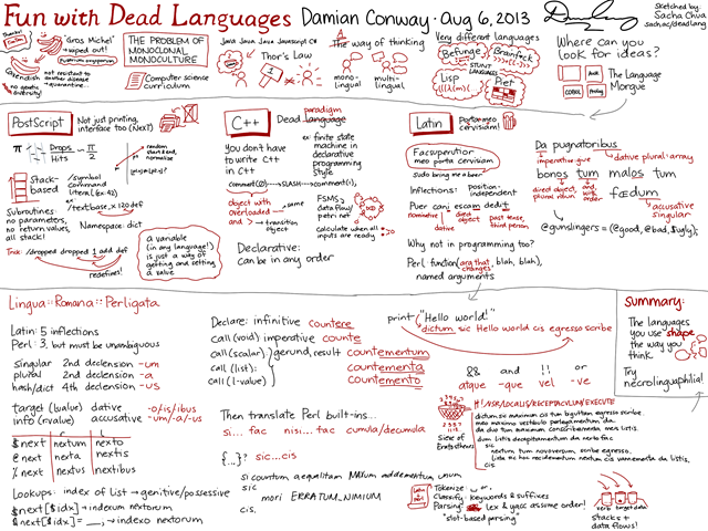
Here are my notes from Damian Conway’s talk “Fun With Dead Languages”. =) I heard him give an older version of this talk years ago, and I’m amused to find that my Latin dabbling gave me a much deeper appreciation of this talk.

As always, click on the image to view a larger version, which you can print out if you want.

20130806 Fun with Dead Languages - Damian Conway

Please feel free to share this under the Creative Commons Attribution License! =)

If you like this, check out Damian Conway’s site or this paper on Lingua::Latina::Perligata. Like these sketches? Check out my other sketchnotes and visual book reviews.

Sometimes you don’t know what you know until someone asks; why I like preparing talking points for podcasts and chats

Posted: - Modified: | connecting, drawing, learning, sketchnotes

Update 2013-07-31: You can find a table of contents and associated links at http://sach.ac/accel. Here’s the video!

Quick link to talking points as a Mural.ly map

From time to time, I say interesting-enough things that make people want to pick my brain further. When people do, this is excellent! Sometimes I don’t know what people will find useful or interesting until they ask. When the opportunity comes up, I try to wring out as much as I can. In the podcast interviews I’ve done so far, I’ve always been delighted by what we learn from the conversation.

An interview is entirely different from a presentation, and it would be a waste to treat it as one. I love where other people’s questions, interests, and experiences can lead me. So I don’t want to structure it too much – but I also want to give people the benefit of clear thoughts and useful replies. Having struggled with making good conversation myself, I also want to help people find things that they or other people will like instead of wandering until they bump into something good.

It’s a little like the media training I got when I was at IBM. One of the tips I remember is to think about your story before you talk to people. You don’t have to stick to the script, but you should know the key points you want to get across, and try some ways of expressing it so that you can be clear and concise.

So here’s what I e-mailed to Timothy Kenny in preparation for our chat about accelerated learning (which will be this afternoon):

I thought about what I do the most differently and what your subscribers will probably benefit from. Here are some topic ideas. How about picking whichever one you think will resonate the most? =) I’m sure there’ll be future conversations, so we don’t have to get everything covered in one chat.

  • Sketchnotes
    • Ideal outcome: People are inspired to take visual notes for their own use
    • Learning and reviewing presentations and books; Connecting with people; Understanding your thoughts; Sharing what you know
  • Making the most of your blog through the years
    • Ideal outcome: People are encouraged to blog for the long term; people who have been blogging a while are inspired to organize their work
    • Weekly, monthly, yearly reviews; Indexes; Other people as part of your memory; Collections; Backups
  • Tracking and experiments
    • Ideal outcome: People are inspired to make better decisions by tracking
    • Time; Money and an opportunity fund; Clothes, decisions, etc.; 5-year experiment with retirement
  • How it all fits together
    • Ideal outcome: People see how the different techniques can support each other, and they are motivated to take the next step
    • The flow of learning; How different techniques work together; Getting started; Getting better; Going from strength to strength
  • Continuous improvement in everyday life
    • Ideal outcome: People examine their processes
    • Understanding your processes; Handling weaknesses; Building on strengths; Learning from experiments

He wrote back to say that he was curious about sketchnotes, blogging, connecting, learning flow, and what I considered my strengths and weaknesses in terms of learning.

I spent some time on Saturday night thinking about what I’ve learned and what I want to help other people learn. A podcast isn’t the place for technical instruction; blog posts are better for that because I can include step-by-step tips, links, and other resources. A podcast or videocast is great at communicating enthusiasm, helping other people see that they can get started. It’s also great for the back-and-forth, bringing two people’s ideas together.

So my goals for the chat are:

  • Inspire people to learn more about some learning techniques that they might find useful
  • Encourage people to get in touch with me
  • Explore follow-up questions that I may want to write about or draw
  • Learn interesting things about Timothy Kenny or share other tidbits that can lead to further conversations

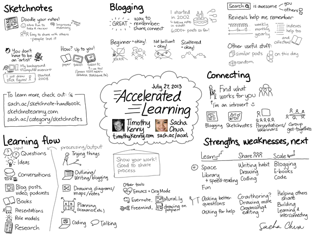
In preparation, I drew this on Saturday. (Click on the image for a larger version!)20130727 Accelerated Learning

(Not only do I sketchnote events, but I can sketchnote the future!  Winking smile)

The idea is that these talking points can let Timothy pick whatever he wants to focus on, while giving him a peripheral awareness of related topics or other things we can talk about. They also give me visual aids that I can refer to (or draw on top of!) during the chat, which is probably more interesting than watching a bunch of talking heads. And if we run out of time or focus on some things instead of others, no worries – the blog post and the sketchnote will be there as a way to follow up. =)

I’ve done this before, like the digital sketchnoting workflow that I sketched in preparation for my podcast with Mike Rohde (episode, transcript). Our target time for that was 12 minutes, so it was great to be able to zoom in and talk about key parts knowing that other things could be left for the blog post or sketchnote.

I discovered the power of sharing my notes (showing my work!) when I was giving a lot of presentations. Knowing that my talking points were on the Net somewhere (ex: my Shy Connector presentation for Women in Technology International, or my talk on How to use Evernote to improve your visual thinking) meant that I didn’t have to worry about forgetting anything important, because people can always look up my notes. It gave me more freedom to ad-lib or go off-script, too, following whatever people were interested in.

So really, the main reason to come to one of my presentations or to interview me is to ask questions and figure out answers together, which is exactly the way I want it. If I can do the braindump outside the time we have, then we can use the time for interaction. In presentations and conversations, I want to give people just enough to get good questions. Questions are my pay-off for the preparation. Questions spark my curiosity and turn into follow-up conversations and blog posts and presentations.

Unrelated observation: making my own URL shortening thing was totally worth it, even if the domains are expensive. Much better than squeezing long domain names into my sketchnotes. Although I’m still flipflopping between sach.ac and liv.gd in sketchnotes because I think my nickname is hard to spell… Any opinions?

I’ll post the recording when it’s up, and I’ll probably work on transcribing it too. Fun!


Here’s the e-mail announcement that Timothy sent:

Hundreds of years ago during the Renaissance, creative geniuses like DaVinci revolutionized science by visualizing information for the first time. Huge leaps were made in engineering, math, architecture and physics because of this new focus on visualizing information.

A new visual Renaissance is coming…

Today at 1PM EDT (New York Time) I’m interviewing Sacha Chua on her accelerated learning techniques and especially how she visualizes information to learn faster and understand new concepts better.

Click Here to Join the Hangout:

https://plus.google.com/events/c1irfbcfio2q6qn20387trhdnjk

Sacha is also a programmer. Programmers have the ability to see and create systems because coding requires that you build a system to process information.

All businesses are systems. And the more you can systematize your business the more stress free it will be for you. The starting point for understanding systems is learning how to get them down on paper as visual diagrams (much the same way programmers sketch out their program on a white board before building it) and that is a big piece of what we will be discussing today.

We’re doing it live so you can chime in with questions or observations during the interview.

Why You Should Come

Many people know about learning and productivity hacks but I have never met someone who actually put so many of them together into such a coherant system.

Sacha is also a visual genius. She created both of the images below. You will learn how she does it and why it is so important to get comfortable drawing and visualizing for your business and your learning.

What We Will Talk About

20130727 Accelerated Learning


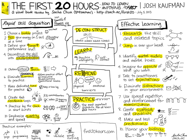
Example of Sacha’s 1 page visual book reviews

20130705 Visual Book Review - The First 20 Hours - How to Learn Anything... Fast - Josh Kaufman


See you at 1,
Timothy


PS

Sign up for the Hangout here, then check out the learning profile I did on Sacha here:

http://timothykenny.com/accelerated-learning/accelerated-learning-profile-sacha-chua

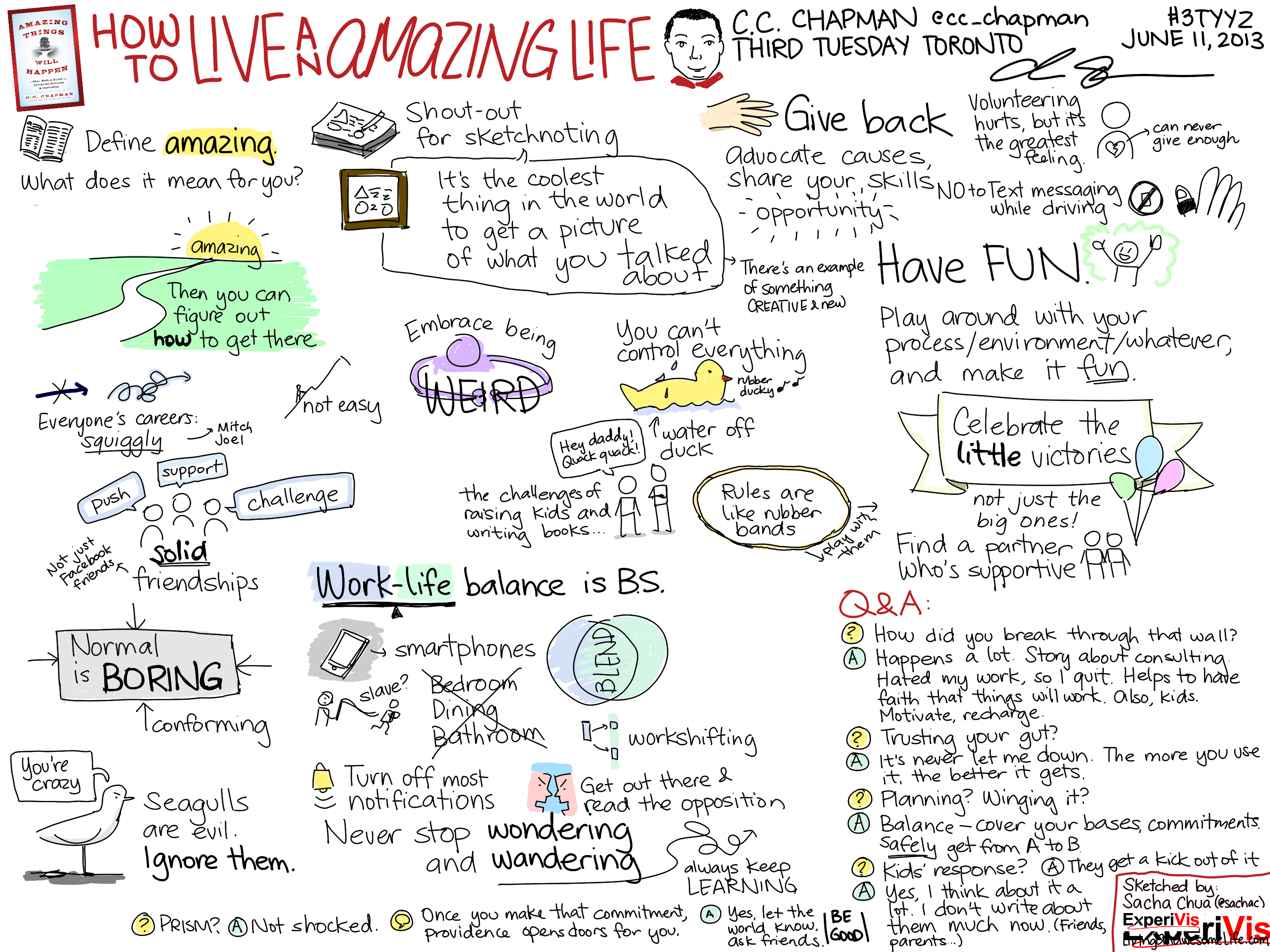
Sketchnotes: How to Live an Amazing Life (C.C. Chapman, Third Tuesday Toronto)

Posted: - Modified: | life, sketchnotes

C.C. Chapman was in town to share insights from his latest book, Amazing Things Will Happen. Here are my sketchnotes from his talk tonight at Third Tuesday Toronto. =) Click on the image for a larger version, which should also print nicely on 8.5×11” in landscape mode. (Or even 11×17”!)

Feel free to share this! (Creative Commons Attribution License – enjoy! Links are not required, but are welcome.)

For more about C.C. Chapman, check out his blog, podcast, or Twitter feed.

If you like this, you might also want to check out my other sketchnotes and visual book reviews, or download my collection of sketchnotes from 2012 (free/PWYC). It’s always fun helping good ideas spread!

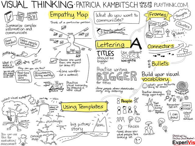
Sketchnote: Visual Thinking (Patricia Kambitsch)

| drawing, sketchnotes

It’s always a pleasure working with Patricia, and yesterday’s workshop on graphic facilitation was a lot of fun. I took digital notes during the 3-hour workshop, and we printed them and distributed them right at the end. =)

Click on the image for a larger version, which should also print nicely on 8.5×11” in landscape mode.

Visual Thinking

Feel free to share this! =)

What worked well:

  • Printing the notes right at the workshop itself – great impact, and it took only a few minutes and the organizer’s help.
  • I really like this black ink / yellow highlighter combination. It’s super-simple, lets me add emphasis after the fact, doesn’t require me to switch colours, and prints out better in black-and-white than using coloured text does.
  • I played around with a not-quite-columnar layout, using highlights and connectors to link everything together. Someone remarked that the light gray connectors helped lead the eye, so that worked out nicely.
  • Shading with light gray worked well, too. I might do that with more of the images to add some depth, and perhaps add a warm gray to my colour palette.

Things to play with next time:

More shading! More depth! =) Maybe fancier titles, too? Using elaborate frames might let me keep the text simple so that Evernote can still search it… Maybe I can start a collection of frames.

I used Autodesk Sketchbook Pro on a Lenovo X220i Tablet PC. =)

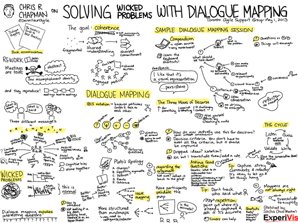
Sketchnote: Solving Wicked Problems with Dialogue Mapping (Chris Chapman, Toronto Agile Support Group)

Posted: - Modified: | sketchnotes

Click on the image for a larger version. Feel free to share this! (Creative Commons Attribution Licence)

20130501 Solving Wicked Problems with Dialogue Mapping - Chris Chapman

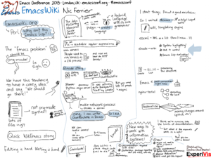
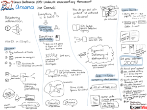
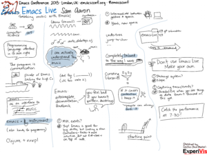
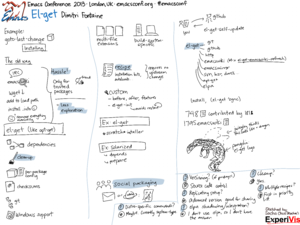
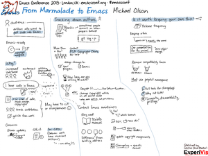
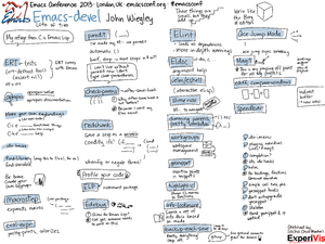
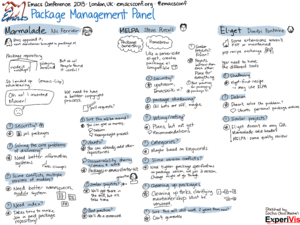
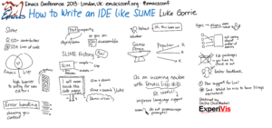
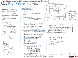
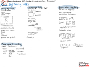
Emacs Conference 2013 Sketchnotes (also, PDF!)

Posted: - Modified: | emacs, sketchnotes
I cleaned them up a little and packaged them as a PDF for your viewing convenience.

Here they are individually, too! Click on an image to view the full-sized version, and feel free to share them under the Creative Commons Attribution Licence. Enjoy!

The Sketchnote Challenge: Those Algorithms That Govern Our Lives (Kevin Slavin)

| kaizen, sketchnotes

Eva-Lotta Lamm and a great panel of sketchnote artists are running a challenge to sketch a particular talk. I managed to squeeze in a sketchnote just before today’s deadline.

20130317 Those Algorithms That Govern Our Lives - Kevin Slavin

What do I like about this sketchnote?

I captured enough to help me remember, and I had time for little doodles too. The light blue images and dark blue text look calmer than the red-black combination I used in some of my other sketchnotes. The brush size worked out fine in terms of the proportion.

I didn’t switch pen sizes or vary the size much because I wasn’t sure what was going to be important. Instead, I used simple borders to emphasize key points.

I’ve been experimenting with using a light shade to add more depth to my images. It usually takes me five minutes to go through an image. I didn’t do it here because the size and detail of the images felt right already.

Drawing with plenty of whitespace around each element allowed me to easily reposition things when I needed to rebalance the columns and reorganize the information. I’m sometimes tempted to go for more creative, overlapping layouts, but I do like the flexibility of being able to change my mind. I usually publish things shortly after drawing, so I didn’t spend a lot of time tweaking this image.

What would I like to improve?

I’ve been experimenting with different colour schemes. The first colour I drew the images in was too light, so I used GIMP to change the curve to something darker. Depending on what I want people to focus on, I’ve been trying out light text / dark images vs dark text / light images. It would be great to find a quick way of experimenting with the same image. Experimenting would be easier if I drew text and images on separate layers, but the presentation was information-dense, so I didn’t feel comfortable switching back and forth. I’ve tweaked my standard colour palette to include a darker blue like the one I used for the images here. That way, I can keep the light blue for shading, and I don’t have to adjust the colours after drawing. Next: Tweak my colour palette, and find a way to experiment more easily.

The presentation was only 30 minutes long. It turns out that the usual size I draw things at results in a one-page-per-hour sort of density, so I used only half the page. (Hooray for consistency!) It might be good to develop a dot grid that’s calibrated for half-hour talks so that I’m encouraged to draw at a larger size while preserving my usual landscape aspect ratio. Still, these columns worked out fine. Next: Try a different-sized dot grid for short talks, or get used to drawing larger.

It was pretty fast-paced, too. I don’t feel like I’ve fully captured the overall logic of the presentation. It would be nice to make this understandable for someone who hasn’t seen the presentation yet, which I think I can do with a little post-work (adding headings, explaining things in sentences instead of keywords). It feels a little disjointed at the moment, and I think I missed potentially interesting points like the one about the monoculture. The individual components are enough to remind me of what I want to remember about the talk, though. Next: Add more time for post-processing so that I can draw anything I missed the first time around.

Check out the other submissions! First set, second set: Kevin Mears (second set) has a good printout image. I like Andy Fisher’s (second set) puppeteer image, the cute robot, and the whitespace balance of the page.