Tags: sketchnoting

RSS - Atom - Subscribe via email

Sketchnote Lessons: Quick Lettering

Posted: - Modified: | drawing

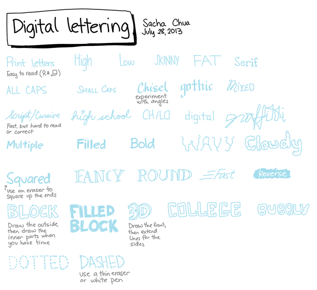
Here are some examples of different lettering styles that you can try. Some of them (like Chisel or Reverse) may be easier to do digitally than on paper. Click on the image to view or download a larger version, and have fun practicising. Enjoy!

image

I write in print instead of cursive because this is easier to read. Computers seem to be better at understanding printed letters instead of cursive. (I use Evernote to search my notes.) For emphasis, I sometimes use Multiple (draw the same letter twice), or Bold if I can anticipate the need to switch pens.

Got any favourite quick lettering techniques? I’d love to see them! Post links below, or e-mail me at sacha@sachachua.com .

Sketchnote Lessons: Banners and ribbons

Posted: - Modified: | drawing, sketches, visual

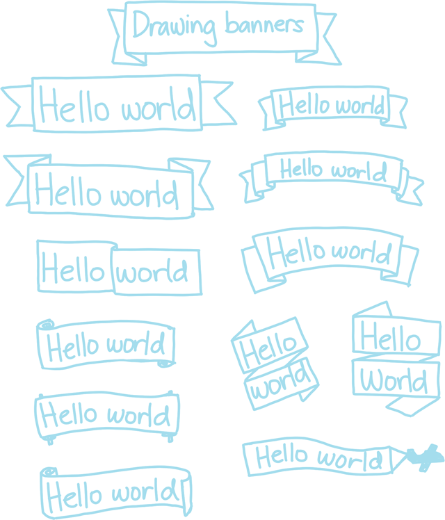
Banners and ribbons are a quick way to emphasize parts of your drawing. Instead of drawing the banner and then trying to fit the text into it, try drawing the text first and then drawing the banner around it. Here’s a step-by-step example.

1. Draw the text with plenty of space around it

image

2. Draw a box around the text.

image

3. Add two small triangles below the box.

image

4. Draw horizontal lines extending beyond the triangle, and another set of lines the same distance from the top of the box.

image

5. Add a ribbon edge if you want, or use a straight line.

image image

Want to get fancy? Add some shading, add more folds, and so on.

Here are some examples that you can practise with:

image

Check out Kevin Dulle’s tutorial for other ways to emphasize things with shadows. Enjoy!

Sketchnote Lessons: Drawing Emotions

Posted: - Modified: | drawing, sketches, visual

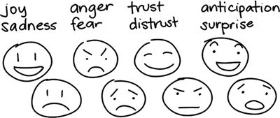
Want to make your drawings more interesting? Add emotions! Drawings of emotions can communicate so much more than words describing emotions, and they do so in an immediate, visceral way. For example, consider the list of words below, and the faces beneath them.

image

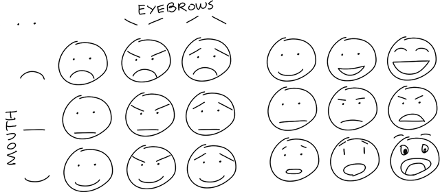
Even if you don’t think you’re an artist, you can draw basic emotions easily. Simple combinations of eyebrows and mouths say a lot. You can show different degrees of emotions by emphasizing parts.

image

You can combine emotions, too. For example, angry eyebrows + happy smile = evil overlord plotting to conquer the world. >=)

Play around, and you’ll find even more emotions that you can express with small changes to the face. For inspiration, you can look at smileys and emoticons.

image

Icons and symbols let you be even more expressive. You can pick these up from comics and smileys.

image

Emotions aren’t just expressed with the face. Posture can communicate emotions powerfully too. Explore the physicality of emotions by looking at how actors show feelings, or by imagining yourself feeling those emotions.

image

You can also show emotions in how people relate to each other.

image

Metaphors are fun to play with, too.

image

Learning how to draw emotions isn’t just useful for sketchnoting. You can draw emotions in order to understand other people better. Mindmaps or empathy maps can help. You can draw your own emotions, too. When I’m faced with a difficult situation or a confusing tangle of emotions, I try to break down the different emotions I feel and the reasons why I feel that way. When you understand why you’re happy and sad and worried and excited all at the same time, it’s easier to move forward.

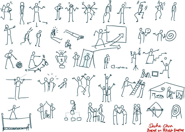
Want to learn more about drawing emotions? The best resource I’ve found so far is the Bikablo Emotions book, which has a lot of full-body emotions. Here’s a sample of the drawings I made based on part of the Bikablo Emotions book. (There are even more emotions in the book – check it out!)

emotions

Children’s books are a good source of emotions. I remember loving the Mr. Men and Little Miss series when I was growing up, and I look forward to discovering other wonderful illustrations as I go through the library’s collections. =)

Comics are another great way to learn more about expressing emotions, from the concise forms of newspaper strips to more elaborate drawings in comic books.

And then there’s learning about all these emotions in the first place, because it helps to be able to recognize the emotion and give it a name. Wikipedia has a few good pages: Contrasting and categorization of emotions, Emotion classification. HUMAINE proposes a classification of 48 emotions (see Wikipedia for an easier-to-read list) The Center for Nonviolent Communication lists 259 emotions in their feelings inventory.

I’m thinking of going through those lists and practising drawing all these different emotions. Want to join me? I’ll post stuff here once in a while, and I’d love it if you sent me links to your drawings!

Sketchnoting: Finding a balance of details and diagrams, and calibrating your writing to time

Posted: - Modified: | drawing

Cheryl Lowry wrote about something many sketchnoters struggle with: running out of sketchnoting room during a talk. It got me thinking about the style I lean towards in my notes, and how I deal with too much or too little content.

My sketchnoting style is more information-dense and more linear/column-based than many other sketchnote styles I’ve seen. You can compare my recent sketchnotes with the ones on Sketchnote Army or the Flickr Sketchnotes pool to get a sense of how they’re different. I take information-dense sketchnotes because I want to remember and I don’t trust my memory. If I want to create a summary later on, I can do that from my sketchnotes, but it’s difficult to go the other way around. I’ve learned not to trust that events will have video, that I’ll have the patience to sit through a recording, or that slides will make sense after a quick flip-through. My notes are all I can rely on if I want to make sure that the time I spend listening to a talk doesn’t just evaporate into forgetfulness. =) So even if my hand cramps a little after sketchnoting a full-day conference with few breaks (hooray for quick finger exercises and stretches), it’s worth it because I come away with much more and I can remember a lot.

I paraphrase a lot because I want to make ideas more concise, particularly when it comes to Q&A sessions where people haven’t rehearsed what they want to say.

I’ve thought about writing less and drawing more, but I’m actually pretty happy with where I am. Summarization comes afterwards, when I know what’s important to me. Most presentations do very little sign-posting of what they’re going to cover and how important each part is, and even the ones that do can sometimes go on interesting tangens. When I’m sketchnoting a presentation, I don’t want to prematurely lock into the structure or metaphor I think the speaker has (even if they say they’re going to talk about 7 things, for example). That takes me out of the moment and makes me second-guess myself when the speaker says something interesting that doesn’t fit into the pattern I want to draw. A column-based layout may feel less creative, but it frees me up to listen.

I might go back and move things around a little during the gaps in the talk, but I generally don’t go back and reorganize everything. I want to publish things as quickly as possible. My target is to publish the sketchnotes within 10 minutes after the talk ends, and I usually do. It’s a great way to delight people over social media.

I write simple letters on a plain white background. My images and text tend to be separated by whitespace so that I can move things around as needed. I draw uncomplicated figures. I generally use one or two accent colours and maybe a lighter shade for highlighting or depth. Again, I’m optimizing for speed and attention. I’ve thought about going back and revising some of my sketchnotes to be more visually engaging, but then there’s so much new material that would be interesting to draw instead. Besides, I don’t want to give people the impression that that kind of detail or layout is what they’ll get from me when live sketchnoting. I really like being done with a sketchnote shortly after a talk. This also means I don’t have to worry too much about following up and I don’t have to juggle multiple ongoing projects. I do occasionally revise sketches and help people turn them into proper illustrations for reuse, but that would definitely be a paid gig. =)

I draw over a light dot grid, and that helps me fill a page at a more consistent rate. I know that if there’s an hour-long talk, I can draw letters at my normal size. If it’s a short non-interactive talk like an Ignite presentation or a TED talk, I might put several talks on one page, or I might increase the size and be a little looser with the layout. As I listen, I adjust my writing depending on the rate that people are speaking. If they speak slowly or they repeat themselves a lot, I’ll draw more images. If they speak quickly, I’ll try to capture as much as I can, and then go back and add highlights and some icons afterwards. Because I work digitally, I can remove the grid before publishing the image. (See How I set up Autodesk Sketchbook Pro for sketchnoting)

Working digitally makes it easy for me to compensate for different talk densities. If a speaker ended up saying less than I expected, I can rearrange the text and images around to look more balanced or I can crop the image at the appropriate point. If a speaker says more, it’s easy to add another layer and save a separate image. Autodesk Sketchbook Pro isn’t a vector program, so enlarging things doesn’t work particularly well, but I can move around or reduce parts of my image if I need to squeeze in some more information.

Other sketchnoters have great tips, too. Some people write down just the first few letters of a word or phrase, and then go back and fill the rest when there’s time. The Bikablo books encourage you to practise drawing key icons the same way each time, so that you can quickly sketch the first couple of strokes to remind you of what to draw. The Sketchnote Handbook talks about using your audio memory to hold on to thoughts as you draw. These tips work for me, too, and I’m getting the hang of using them. Hope they work for you too!

One of the interesting things about sketchnoting is that now I have a better sense of how much space there is in most presentations and conversations. It’s like seeing key words light up and thinking, “Oh, I want to capture that,” and also seeing the gaps where you can write or draw. You develop a sense of how much you can squeeze into each gap. If you find that you’re picking up more keywords than you have the time to capture, you can increase your thresholds for interestingness or reduce the complexity of your capture.

You can develop this sense of timing by practising with talks of specific lengths. For example, if you go to a lot of 1-hour talks, you’ll get a sense of how much people typically cover in an hour. Every so often, it’s good to practise with something that’s really information-dense: a well-written nonfiction book, an intermediate- or advanced-level talk. Like the way you can improve your speed-reading performance by occasionally reading at a rate faster than you can comprehend, it’s good to scramble in sketchnoting from time to time.

Hope that helps!

Cheryl Lowry: “Drawing is easy. Thinking is hard.”

Reflections on sketchnoting TEDxOCADU

Posted: - Modified: | drawing, kaizen, process

I sketchnoted TEDxOCADU live, and my new workflow is working out well. I’ve been moving more of my sketchnotes over to experivis.com – do folks still want to see them here? Might be handy. Anyway, I like reflecting on what worked well and what I can do even better, so this blog is still the best place for that.

For TEDxOCADU, here were my experiments:

Set up all the layers and saved them as placeholder PNGs beforehand so that I didn’t have to type in filenames or look up speaker names.

  • Sketched during the dress rehearsal, and reused many of my images during the actual conference: great for knowing where people are going, although I still stuck with fairly regular layout.
  • Used Dropbox to get the Twitter links, copied the URLs, and set up my list of hashtagged and linked tweets using ClipMate: great for tweeting things on the fly with just my laptop
  • Set up a gallery page for updating throughout the day
  • Set up a bit.ly link to track clicks for my gallery page
  • Double-checked WiFi access: so much better than tethering through my phone
  • Followed up with social media / web person in case they needed help getting the images up on the official site
  • Eventually remembered to set up Google Analytics on experivis.com – added this to the checklist of things to do when spinning up a website…

Here are some things I can tweak next:

  • Add more images to my ClipMate library
  • Have a smoother delegation workflow so that I can get my sketchnotes typed in
  • Figure out how to integrate text into the gallery view; maybe project-sketchnote relationship?
  • More graphics! More! More!
  • Don’t forget to have Archivist or some other Twitter archiver running in the background
  • Consider Tweetreach or some other Twitter analytics report?
  • Set up tracking links for each image, too, or always send people to the gallery page

Imagining sketchnotes as a business

Posted: - Modified: | business, planning, sketchnotes

People tell me that conference/presentation sketchnotes are an amazing service. I’ve been getting paid to cover conferences and events, so I’m thinking of focusing on building this as a business in 2013. Here are some ideas I’ve been playing around with:
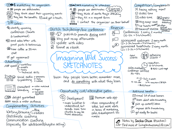
20121210 business planning - imagining wild success for sketchnotes

THE PAIN

Imagine you’re a conference or event organizer. You want to make sure your attendees get a lot of value out of your conference, and that a lot of potential attendees hear about it so that they’ll sign up for the next one. That’s why you’re using social media, you share slides, you’re working on getting videos uploaded, and so on. BUT you’re still only engaging a small fraction of your potential audience because most people don’t have the time to review all the materials, people aren’t interested in wading through lots of slides or text, or the materials are published long after people have gotten distracted by something else they need to focus on.

Sketchnotes can help you help your participants remember and share key points from the conference, increasing their ROI (and yours!). By sharing these images, people become ambassadors for your conference.

THE BENEFITS

This is about helping organizers engage participants through digital sketchnotes that are published throughout the event, taking advantage of the Twitter buzz. Sketchnotes can offer more information and more context than live-tweeted quotes, and they can reinforce the conference brand and sponsor relationships through templates. included in every sketchnote.

After the event, these notes also help participants remember and share key points from the conference. People can feel overwhelmed by all the great ideas they’ve picked up from a conference. When they get back to their offices, they probably need to justify their participation in the conference by writing a report on what they’ve learned. Few people have the time to review slides or re-watch videos. Conference sketchnotes are a quick way to trigger memory, and they can also be shared with people who have not been to the talks. This additional value gives conference organizers a good reason to follow up with participants after the event, which could influence feedback survey completion rates and scores.

Sketchnotes can also help organizers pre-market the next event. As a quick proof of the content covered in the conference, sketchnotes can spark interest in a way that slides may not. Often tweeted, reblogged, and searched for after an event, they’re an excellent way to share great ideas.

ALTERNATIVES AND DIFFERENTIATION

One of the great things about this is that I don’t have to build a market from scratch. Bloggers and live-tweeters are now part of many conferences’ social media and marketing planning, so there’s an established need for real-time sharing. Video/slidesharing is part of many conferences as well. Many companies and conferences have worked with graphic recorders and facilitators to capture and share discussions.

Organizers use several alternatives for engaging people during and after events, some of which are complementary services. Here are a few:

  • Doing nothing: No cost. However, this misses out on the opportunity for engagement.
  • Live-tweeting: Often on a volunteer basis, although sometimes there’ll be a small team dedicated to monitoring, responding to, and posting on social media networks. Live tweets are good for engagement, but are difficult to curate or read afterwards.
  • Live-blogging: Often on a volunteer basis, or in exchange for admission. Variable quality and shareability. Sometimes results in lots of text that people don’t enjoy reviewing afterwards.
  • Posting the slides: Many conferences post slides on Slideshare, Lanyrd, or similar sites. This tends to be a split between presentations that have too much text in them and take much time to review, or presentations that have practically no text in them and are impossible to share with people who have never been to the conference.
  • Posting the videos: This can take months, if it gets completed at all. It takes time to review these and find the key points.
  • Transcripts: Very few conferences post transcripts of talks. It’s expensive and time-consuming, although transcripts can increase the searchability of a talk.
  • Graphic recording / facilitation: Excellent for discussions. Visually impressive, as artists work on huge sheets of paper at the front of the room. Can be distracting if people are tempted to watch the graphic recording instead of watching the speaker. Takes time to post-process the images for posting, so not well-suited to publishing during the event itself. Less flexible when it comes to content because it’s hard to erase or move segments of a drawing. Matching colours, adding logos and sponsor information, and using other template elements may not be cost-effective.

I think there is a space right there, in the gap between

  • social media blog posts / tweets / slides / video on one hand (a “good” conference these days), and
  • full graphic recording / facilitation

where digital sketchnoting makes sense, especially considering the advantages to working with an all-digital workflow. (Quick publishing, templates, non-distracting setup…)

Also encouraging: I’m not the only one looking into this! Here are some companies offering digital sketchnoting/digital scribing services: The Grove Consultants International, Imagethink, See in Colors, The World Cafe, WrightMarks, LearningTimes, Virtual Visuals

Potential differentiators:

  • I have a technical background, which means I’m fine with acronyms, diagrams, and lots of abstract/obscure concepts (especially related to web design/development, social media, social business, mobile development, and other topics I’m personally interested in)
  • Many visual communication companies focus on large-scale graphic recording; by specializing in digital sketchnoting, I can get really, really good at it
  • Many sketchnoters / visual communicators are coming from paper-and-pen backgrounds or Mac backgrounds; I use a different toolset, and I continually experiment with making it better
  • I’m comfortable with social media, and have set up many tools to help me make even better use of it
  • I can offer complementary services, such as getting a talk transcribed and turned into an e-book
  • I speak, too! People enjoy my practical, down-to-earth illustrated talks, and hundreds of thousands of people have viewed my presentations online.

SALES AND MARKETING

Most conference and event organizers won’t be looking for sketchnoting in particular, so I’ll want to start by identifying potential clients, reaching out to people, and figuring out the possibilities together.

Another way to find potential clients would be to work with event producers who help organize lots of events. Sketchnoting becomes another capability they can offer to clients in order to add value.

People might not know how to make the most of sketchnotes as a resource. By handling the social media publishing and coordinating with the event’s social media team, I can simplify the process. I’ll also put together a guide for organizers who have existing blogs, Twitter accounts, Pinterest accounts, and other publishing platforms, so that they can take advantage of the sketchnotes that they’ll have.

My long-term evil plan

One of the reasons I’m interested in building a business around sketchnoting is because I want to learn more about sales and marketing. I could learn these business skills using web development or consulting instead, but those engagements involve longer iterations and less tangible services. Sketchnotes are easy to appreciate and share.

In addition, sketchnoting business and technology events also helps me build my visual communication skills, my understanding of topics, and my archive of content. This will come in handy when I write more books and work on more experiments. I think there’s room in the world for more visual books like the Sketchnote Handbook, especially as we shift towards reading less and wanting to understand things faster.

I think that sketchnoting might turn into an interesting 12-16 hour/week business that takes advantage of and fits in well with complementary strengths. Looking forward to trying this out!

More notes: Business idea: Digital sketchnoting agency

Visual book review: The Sketchnote Handbook–Mike Rohde

Posted: - Modified: | visual-book-notes

I know, I know, two visual book reviews in one day. But The Sketchnote Handbook is cool and I just received my copy of it this morning, so I wanted to share this with you today. =)

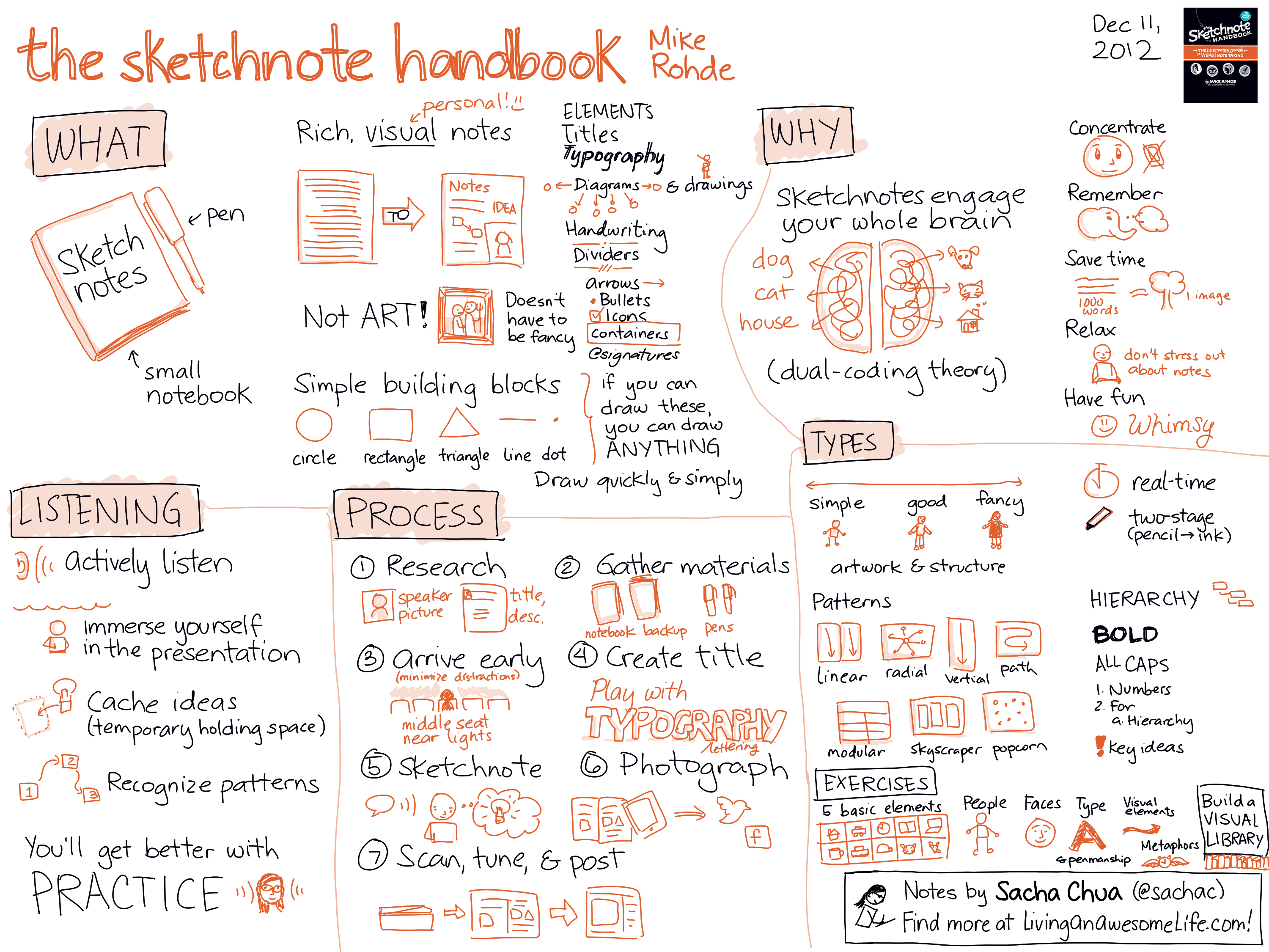
In The Sketchnote Handbook, Mike Rohde breaks down the process for sketchnotes. He found that writing his notes in pen in a small sketchbook and giving himself permission to doodle made taking notes so much more fun and less frustrating. If you’ve been having problems paying attention in class or in meetings, or you’ve been frustrated by your inability to remember key points from conferences and presentations, this is for you. No art degree required.

Here’s my one-page summary. Click on the image for a larger version, and feel free to share it!

© 2012 Sacha Chua, Creative Commons Attribution Licence

If you’ve always been curious about how to start sketchnoting, this is the best book I’ve come across so far. Read this, then read Dan Roam’s Back of the Napkin for more business-oriented visual tools.

If you’re ordering through Peachpit, use the coupon code SKETCHNOTE to get 35% until Dec 31, 2012. It’s roughly the same price on Amazon (affiliate link). Note that there’s a video edition that includes 70 minutes of video tutorials, which is great for bringing these ideas to life.

I received a review copy of this book from Peachpit Press. Props to them. =)

Check out my other sketchnotes and visual book notes for more business- and technology-related visual summaries!

Other people’s visual summaries of The Sketchnote Handbook: